Flutter InputChip lets users input labels or tags with a delete icon. Unlike the Chip widget, the InputChip lets users update or delete labels and tags.
Label, avatar, delete icon, and onPressed event are customizable InputChip widget features. The selected property sets the InputChip’s selected state.
How to Use InputChip in Flutter:
import 'package:flutter/material.dart';

void main() => runApp(MyApp());

class MyApp extends StatelessWidget {
  @override
  Widget build(BuildContext context) {
    return MaterialApp(
      title: 'InputChip Demo',
      home: Scaffold(
          appBar: AppBar(
            title: Row(children: [
              Image.asset(
                'assets/logo.png',
                height: 30,
              ),
              Text('flutterflux.com')
            ]),
          ),
          body: MyInputChipExample()),
    );
  }
}

class MyInputChipExample extends StatefulWidget {
  @override
  _MyInputChipExampleState createState() => _MyInputChipExampleState();
}

class _MyInputChipExampleState extends State<MyInputChipExample> {
  List<String> _selectedChips = [];

  @override
  Widget build(BuildContext context) {
    return Scaffold(
      body: Center(
        child: Wrap(
          spacing: 8.0,
          children: <Widget>[
            InputChip(
              label: Text('Tag 1'),
              selected: _selectedChips.contains('Tag 1'),
              onSelected: (bool selected) {
                setState(() {
                  if (selected) {
                    _selectedChips.add('Tag 1');
                  } else {
                    _selectedChips.remove('Tag 1');
                  }
                });
              },
            ),
            InputChip(
              label: Text('Tag 2'),
              selected: _selectedChips.contains('Tag 2'),
              onSelected: (bool selected) {
                setState(() {
                  if (selected) {
                    _selectedChips.add('Tag 2');
                  } else {
                    _selectedChips.remove('Tag 2');
                  }
                });
              },
            ),
            InputChip(
              label: Text('Tag 3'),
              selected: _selectedChips.contains('Tag 3'),
              onSelected: (bool selected) {
                setState(() {
                  if (selected) {
                    _selectedChips.add('Tag 3');
                  } else {
                    _selectedChips.remove('Tag 3');
                  }
                });
              },
            ),
          ],
        ),
      ),
    );
  }
}
Output
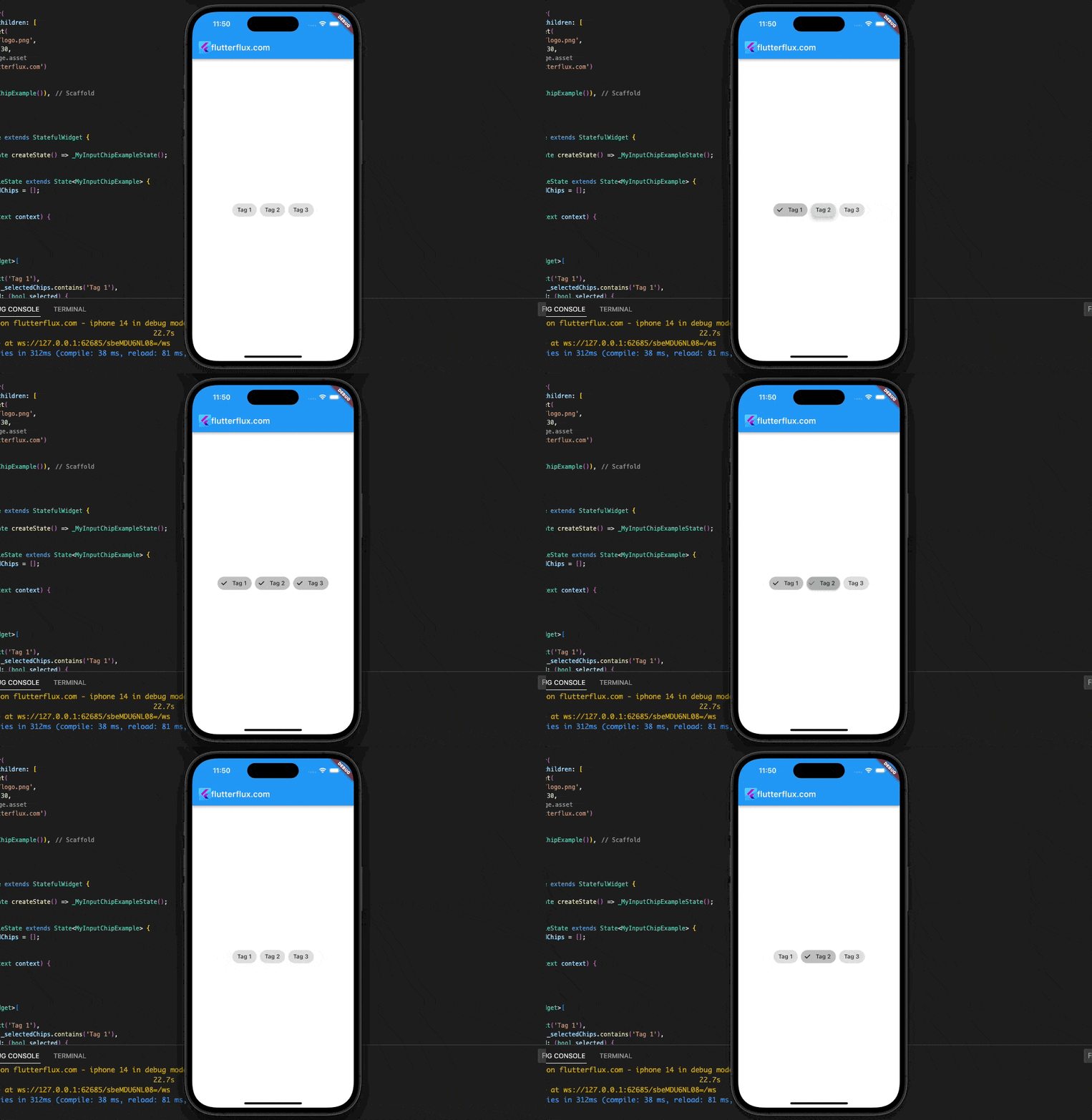
The purpose of the Wrap widget in this example is to horizontally arrange several InputChip widgets. When the user taps an InputChip, the selected state is changed and the appropriate label is added or removed from the _selectedChips list, all of which are defined by the InputChip’s label, selected state, and onSelected callback. Each chip’s selected status is established by checking to see if its matching tag appears in the _selectedChips array.
Customization Flutter InputChip
import 'package:flutter/material.dart';

void main() => runApp(MyApp());

class MyApp extends StatelessWidget {
  @override
  Widget build(BuildContext context) {
    return MaterialApp(
      title: 'InputChip Demo',
      home: Scaffold(
          appBar: AppBar(
            title: Row(children: [
              Image.asset(
                'assets/logo.png',
                height: 30,
              ),
              Text('flutterflux.com')
            ]),
          ),
          body: MyInputChipDeleteExample()),
    );
  }
}

class MyInputChipDeleteExample extends StatefulWidget {
  @override
  _MyInputChipDeleteExampleState createState() =>
      _MyInputChipDeleteExampleState();
}

class _MyInputChipDeleteExampleState extends State<MyInputChipDeleteExample> {
  final List<String> _selectedChips = ['Tag 1', 'Tag 2', 'Tag 3', 'Tag 4'];

  void _deleteChip(String label) {
    setState(() {
      _selectedChips.remove(label);
    });
  }

  @override
  Widget build(BuildContext context) {
    return Scaffold(
      body: Wrap(
        spacing: 8.0,
        children: _selectedChips.map((label) {
          return InputChip(
            avatar: CircleAvatar(
              backgroundImage: AssetImage('assets/logo.png'),
            ),
            label: Text(label),
            labelStyle: TextStyle(
              color: Colors.white,
              fontSize: 16.0,
              fontWeight: FontWeight.bold,
            ),
            backgroundColor: Colors.blue,
            selectedColor: Colors.green,
            selectedShadowColor: Colors.black.withOpacity(0.4),
            disabledColor: Colors.grey[400],
            padding: EdgeInsets.symmetric(horizontal: 12.0),
            shape: RoundedRectangleBorder(
              borderRadius: BorderRadius.circular(20.0),
              side: BorderSide(
                color: Colors.black,
                width: 1.0,
              ),
            ),
            onPressed: () {
              // Handle chip press here
            },
          );
        }).toList(),
      ),
    );
  }
}
Output
Let me explain the different properties used in this InputChip widget:
avatar: To the left of the chip label, an avatar will appear. An image serves as the backdrop for this CircleAvatar widget.label: The information shown within the chip looks like this. The Text widget, with a string or another widget as its child, allows for individualized presentation.labelStyle: The text contained within the chip will be formatted using this. Here, we’ve decided on white for the background color, 16 for the font size, and bold for the font weight.backgroundColor: The chip’s background color can now be adjusted accordingly. The default color in this case is blue.selectedColor: When a chip is chosen, its color is determined by this setting. Here, we have it on green as an example.selectedShadowColor: The shadow color that displays when the chip is selected can be adjusted here. We’ve implemented an opaque black shadow here.disabledColor:When the chip is disabled, the color is determined by this setting. Here, it’s been adjusted to a neutral grey.padding: The chip label will have more space to the left and right as a result of this. We’ve decided to use 12 pixels here.shape: The chip’s final form and rim are determined by this. Here, we’ve used a blue-bordered, rounded rectangle.onPressed: If you press the chip, this callback will be invoked. This function can be used to manage code for pressing a chip.
The InputChip widget can be adjusted in size, font family, and other ways to suit your needs.
InputChip with Textfield
import 'package:flutter/material.dart';

void main() => runApp(MyApp());

class MyApp extends StatelessWidget {
  @override
  Widget build(BuildContext context) {
    return MaterialApp(
      title: 'InputChip Demo',
      home: Scaffold(
          appBar: AppBar(
            title: Row(children: [
              Image.asset(
                'assets/logo.png',
                height: 30,
              ),
              Text('flutterflux.com')
            ]),
          ),
          body: MyInputChipTextFieldExample()),
    );
  }
}

class MyInputChipTextFieldExample extends StatefulWidget {
  @override
  _MyInputChipTextFieldExampleState createState() =>
      _MyInputChipTextFieldExampleState();
}

class _MyInputChipTextFieldExampleState
    extends State<MyInputChipTextFieldExample> {
  final TextEditingController _textEditingController = TextEditingController();
  final List<String> _selectedChips = [];

  @override
  void dispose() {
    _textEditingController.dispose();
    super.dispose();
  }

  void _addChip(String label) {
    setState(() {
      _selectedChips.add(label);
      _textEditingController.clear();
    });
  }

  @override
  Widget build(BuildContext context) {
    return Scaffold(
      body: Column(
        children: [
          Wrap(
            spacing: 8.0,
            children: _selectedChips.map((label) {
              return InputChip(
                label: Text(label),
                onDeleted: () {
                  setState(() {
                    _selectedChips.remove(label);
                  });
                },
              );
            }).toList(),
          ),
          Padding(
            padding: const EdgeInsets.all(8.0),
            child: Row(
              children: [
                Expanded(
                  child: TextField(
                    controller: _textEditingController,
                    decoration: InputDecoration(
                      hintText: 'Enter a tag',
                    ),
                    onSubmitted: (String value) {
                      _addChip(value);
                    },
                  ),
                ),
                SizedBox(width: 8.0),
                ElevatedButton(
                  onPressed: () {
                    _addChip(_textEditingController.text);
                  },
                  child: Text('Add'),
                ),
              ],
            ),
          ),
        ],
      ),
    );
  }
}
Output
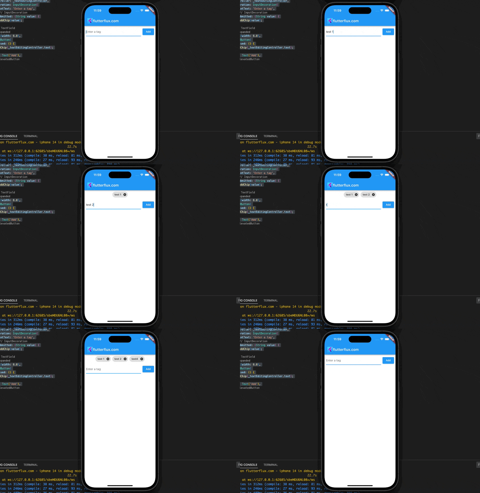
this example, we create a Column widget with a Wrap widget that displays the selected chips and a Row widget with a TextField and ElevatedButton.
When tapped, the ElevatedButton performs the _addChip method, adding the entered tag to the _selectedChips list and clearing the TextField.
The Wrap widget’s onDeleted function removes each chip from the _selectedChips list when the user presses the delete icon.
InputChip Click on Delete
import 'package:flutter/material.dart';

void main() => runApp(MyApp());

class MyApp extends StatelessWidget {
  @override
  Widget build(BuildContext context) {
    return MaterialApp(
      title: 'InputChip Demo',
      home: Scaffold(
          appBar: AppBar(
            title: Row(children: [
              Image.asset(
                'assets/logo.png',
                height: 30,
              ),
              Text('flutterflux.com')
            ]),
          ),
          body: MyInputChipDeleteExample()),
    );
  }
}

class MyInputChipDeleteExample extends StatefulWidget {
  @override
  _MyInputChipDeleteExampleState createState() =>
      _MyInputChipDeleteExampleState();
}

class _MyInputChipDeleteExampleState extends State<MyInputChipDeleteExample> {
  final List<String> _selectedChips = ['Tag 1', 'Tag 2', 'Tag 3', 'Tag 4'];

  void _deleteChip(String label) {
    setState(() {
      _selectedChips.remove(label);
    });
  }

  @override
  Widget build(BuildContext context) {
    return Scaffold(
      body: Wrap(
        spacing: 8.0,
        children: _selectedChips.map((label) {
          return InputChip(
            label: Text(label),
            onDeleted: () {
              _deleteChip(label);
            },
          );
        }).toList(),
      ),
    );
  }
}
Output
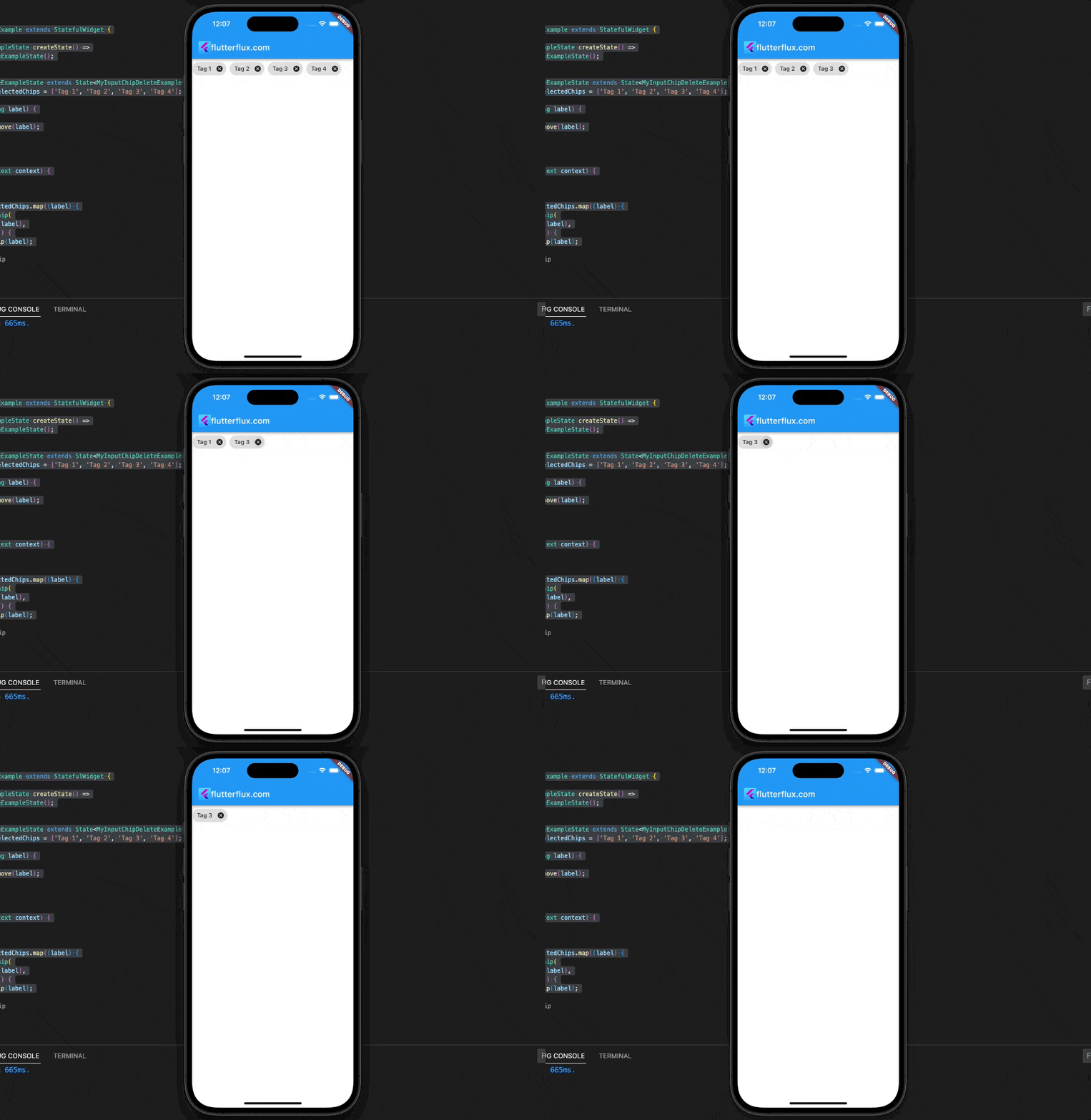
The _deleteChip method is invoked when the remove icon is tapped on the InputChip widget’s label.
The widget tree is reconstructed after the associated tag is removed via a call to setState from the _deleteChip method, which removes the tag from the _selectedChips list.
Conclusion
The InputChip widget in Flutter lets users choose from predetermined values or provide new input. It’s easy to use.
InputChip consistent for selecting options or providing custom input is one of its key benefits.
Developers can match the widget’s appearance to the application’s design by customizing InputChip. A more refined and cohesive user experience can result.

