Add a Border Widget in Flutter – Flutter lets you add a border to a widget to define it visually. Boundaries can highlight a specific region of the user interface or distinguish one widget from another.
Flutter widgets can have borders added using the Border class, which has properties for border width, color, and style. The Border class works with numerous widgets, including Container, Card, TextField, and more.
Flutter BoxDecoration class may be used to create gradients, shadows, and rounded edges in addition to borders. The BoxDecoration class can be used with the Container widget to enhance widget appearance and provide visual appeal to the user interface.
Use the Container widget and assign a BoxDecoration with a border attribute to its decoration property to give your Border Widget in Flutter. Observe this example:
Container(
 decoration: BoxDecoration(
   border: Border.all(
     color: Colors.grey,
     width: 2.0,
    ),
  ),
 child: // your widget here
)
We’ll use a BoxDecoration with a 2px grey border to demonstrate how to create a Container. Alter the hue and size to suit your preferences. To add a Border Widget in Flutter, place it in the Container child property.
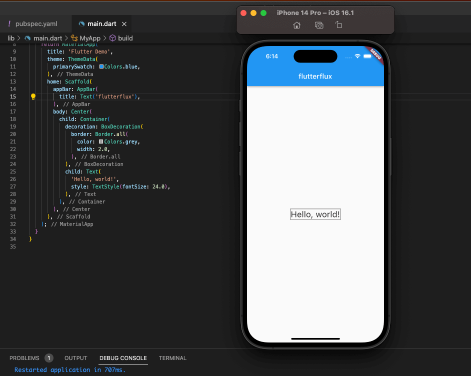
Complete example of how to add a border to a Text widget in Flutter using a Container:
import 'package:flutter/material.dart';

void main() => runApp(MyApp());

class MyApp extends StatelessWidget {
  @override
  Widget build(BuildContext context) {
    return MaterialApp(
      title: 'Flutter Demo',
      theme: ThemeData(
        primarySwatch: Colors.blue,
      ),
      home: Scaffold(
        appBar: AppBar(
          title: Text('Border Example'),
        ),
        body: Center(
          child: Container(
            decoration: BoxDecoration(
              border: Border.all(
                color: Colors.grey,
                width: 2.0,
              ),
            ),
            child: Text(
              'Hello, world!',
              style: TextStyle(fontSize: 24.0),
            ),
          ),
        ),
      ),
    );
  }
}
In this example, we’re creating a Container with a BoxDecoration that has a border of 2 pixels width and grey color. The child property of the Container is a Text widget that displays the text “Hello, world!”. When you run this app, you’ll see that the Text widget is surrounded by a border.
Next, you can learn about the different properties of the Border class in Flutter, which allow you to customize the appearance of the border around a widget. Some of the most commonly used properties include:
color: The color of the border.width: The width of the border in logical pixels.style: The style of the Border Widget in Flutter, which can be solid, dashed, dotted, or none.
Here’s an example of how to create a Container with a red solid border:
Container(
              decoration: BoxDecoration(
                border: Border.all(
                  color: Colors.red,
                  width: 2.0,
                  style: BorderStyle.solid,
                ),
              ),
              child: Padding(
                  padding: EdgeInsets.all(10), child: Text('solid border'))),
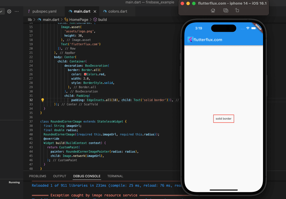
A Container is made here with a BoxDecoration that has a solid red border 2 logical pixels wide. Changing the values of these attributes allows you to make borders in a variety of styles to complement your app’s aesthetic.
Dashed Border Widget in Flutter
DottedBorder, part of the dotted border package, allows you to easily generate dashed borders in your Flutter apps. A sample of the code could look like this:
DottedBorder(
          borderType: BorderType.RRect,
          radius: Radius.circular(15),
          strokeWidth: 2,
          dashPattern: [5, 5],
          padding: EdgeInsets.symmetric(horizontal: 10),
          color: Colors.red,
          child: Container(
            height: 50,
            width: 100,
            child: Center(
              child: Text('Dotted Border'),
            ),
          ),
        )
This example uses the DottedBorder widget and BorderType. RRect for a rounded rectangle border, Radius.circular(15) for rounded corners, strokeWidth to 2 for border thickness, dashPattern to [5, 5] for alternating dashes and spaces, and Colors.red. To add content inside the dashed border, we wrap a Container widget with a Center child.
You can customize the dashed border of the DottedBorder widget.
Gradient Border Widget in Flutter
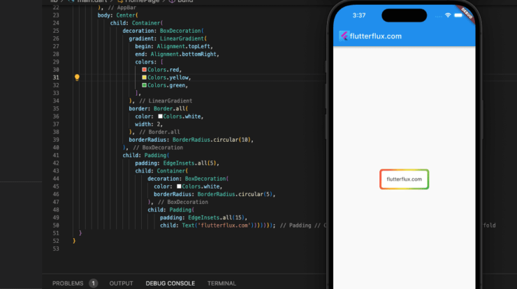
The Container widget may be used to make a gradient border widget in Flutter by setting the decoration attribute to a BoxDecoration with a gradient border.
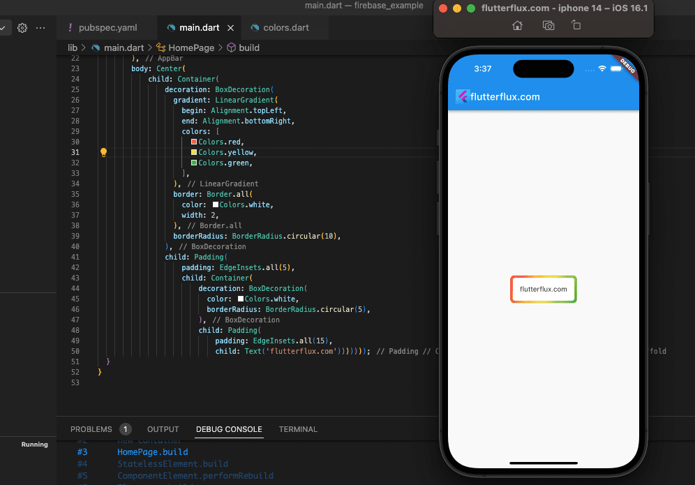
A sample of some code would look like this:
Container(
                decoration: BoxDecoration(
                  gradient: LinearGradient(
                    begin: Alignment.topLeft,
                    end: Alignment.bottomRight,
                    colors: [
                      Colors.red,
                      Colors.yellow,
                      Colors.green,
                    ],
                  ),
                  border: Border.all(
                    color: Colors.white,
                    width: 2,
                  ),
                  borderRadius: BorderRadius.circular(10),
                ),
                child: Padding(
                    padding: EdgeInsets.all(5),
                    child: Container(
                        decoration: BoxDecoration(
                          color: Colors.white,
                          borderRadius: BorderRadius.circular(5),
                        ),
                        child: Padding(
                            padding: EdgeInsets.all(15),
                            child: Text('flutterflux.com')))))
In this example, the border is a LinearGradient with three colors: Colors.red, Colors.yellow, and Colors.green. The border radius is 10 and the width is 3.
Customize gradient colors, border width, and radius. Wrap your child widget in the Container widget.
Conclusion
The Border Widget in Flutter is a flexible component of the Flutter framework for enhancing the appearance of widgets through the addition of borders. The flexibility and personalization it provides come at no extra effort.

