AppBar Color in Flutter – Flutter apps need the AppBar. It holds the app’s title, navigation buttons, and other critical controls. AppBars can change color to fit app themes. This blog post will cover Flutter AppBar color settings and how to use them to improve the user experience.
Basics AppBar Color in Flutter
Flutter Material Design framework includes pre-designed widgets like the AppBar. The AppBar widget holds the app’s title, navigation buttons, and other critical controls. It’s usually at the top of the app’s UI and part of its branding.
Flutter AppBar widget has several features for customization. Title, leading and trailing icons, elevation, and background color. This blog post covers AppBar color settings.
Flutter AppBar background color
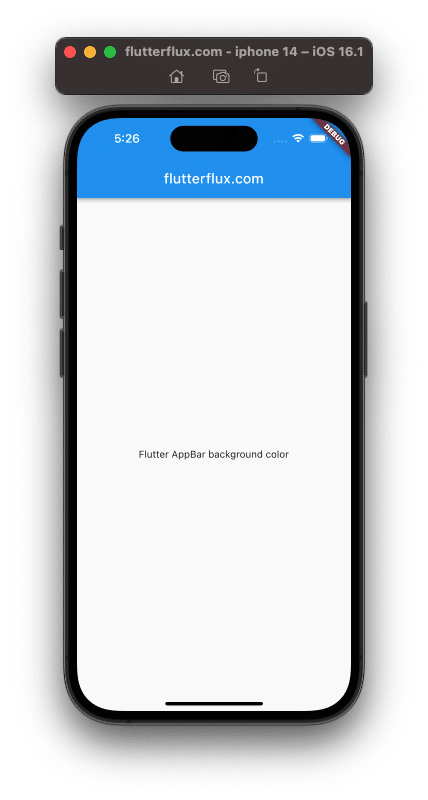
AppBar widget backgroundColor can be adjusted. This property accepts a Color object, either from the Colors class or from you.
The following code sets the AppBar background color to blue:
AppBar(
  backgroundColor: Colors.blue,
  title: Text('flutterflux.com'),
)
Output
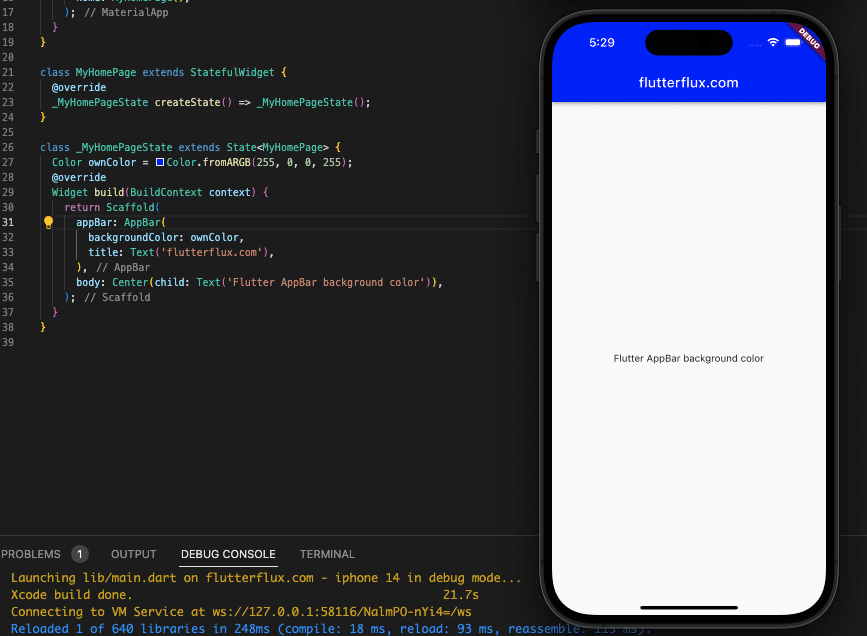
The Color.fromARGB() and Color.fromRGBO() constructors allow you to create your own unique colors. For example, 255, 0, and 0 are valid RGB values for defining a color in code (which is blue):
Color ownColor = Color.fromARGB(255, 255, 0, 0);
The AppBar background color can be changed to a custom color once it has been defined.
AppBar(
  backgroundColor: ownColor,
  title: Text('My App'),
)
Output
Text AppBar Color in Flutter: How to Change It
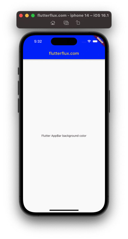
The textTheme attribute of the AppBar widget controls the AppBar’s text color. Color, font size, and font weight can all be customized for the text in the AppBar by passing in a TextTheme object to this property.
For instance, you can use this code to make the AppBar’s text white:
AppBar(
        backgroundColor: ownColor,
        title: Text(
          'flutterflux.com',
          style: TextStyle(
            color: Colors.yellow,
          ),
        ),
      ),
Output
The TextStyle object’s fontSize and fontWeight fields allow text customization.
Flutter AppBar icon color
IconTheme sets the AppBar widget’s icon color. This property accepts an IconThemeData object with multiple predefined icon styles to set the AppBar icons’ color, size, and opacity.
The following code sets the AppBar icon color to white:
AppBar(
  backgroundColor: Colors.blue,
  iconTheme: IconThemeData(
    color: Colors.white,
  ),
  title: Text('My App'),
)
IconThemeData’s size and opacity parameters allow you to change icon size and transparency.
AppBar Color in Flutter with gradient
The flexibleSpace feature of the AppBar widget lets you set a gradient background in addition to a solid color.
FlexibleSpace accepts a FlexibleSpaceBar widget with any number of child widgets. Container widgets can set the AppBar background color.
The BoxDecoration widget can produce a gradient for the Container widget’s backdrop to give the AppBar a gradient effect. Example:
AppBar(
  flexibleSpace: Container(
    decoration: BoxDecoration(
      gradient: LinearGradient(
        colors: [Colors.red, Colors.blue],
        begin: Alignment.topLeft,
        end: Alignment.bottomRight,
      ),
    ),
  ),
  title: Text('My App'),
)
Output
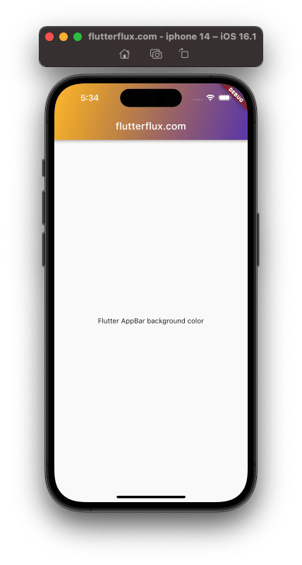
LinearGradient objects with red-to-blue gradients are created by this code. LinearGradient begin and end properties set the gradient’s beginning and end.
AppBar Color in Flutter with Animation
The AnimatedContainer widget in Flutter lets you animate the AppBar color. The AnimatedContainer widget allows you to animate container attributes, like color.
Wrap the AppBar widget in an AnimatedContainer widget to animate its color. One example:
class _MyAppState extends State<MyApp> {
  Color _appBarColor = Colors.red;

  void _changeColor() {
    setState(() {
      _appBarColor = Colors.blue;
    });
  }

  @override
  Widget build(BuildContext context) {
    return Scaffold(
      appBar: AnimatedContainer(
        duration: Duration(seconds: 1),
        color: _appBarColor,
        title: Text('My App'),
      ),
      body: Center(
        child: RaisedButton(
          child: Text('Change Color'),
          onPressed: _changeColor,
        ),
      ),
    );
  }
}
Output
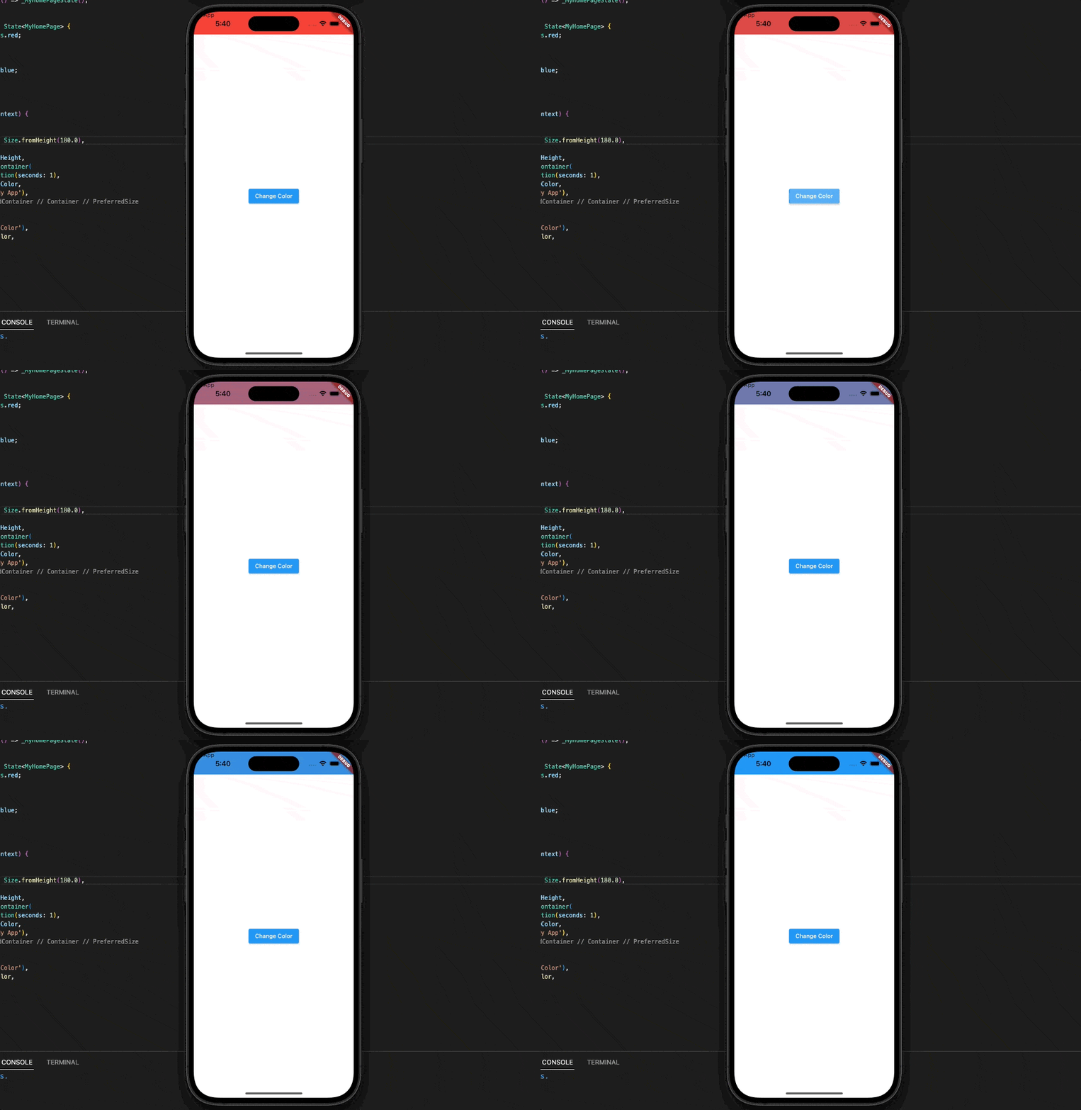
To enclose the AppBar widget, this code generates an AnimatedContainer widget. The _appBarColor variable is made to be blue by calling the _changeColor() method when the user selects the “Change Color” button. The AnimatedContainer then takes over, animating the color change over the course of a second while calling setState() to recolor the widget tree.
Best Practices for using AppBar color in Flutter
Following some guidelines for color usage in the AppBar can help maintain a unified user experience. Some things to remember are listed below.
- Colors should reflect your app’s logo and theme.
- Employ contrast to make AppBar text and icons noticeable.
- To spice up the AppBar, try a gradient effect.
- Employ animation sparingly and only when it benefits the user.
- Make sure your app’s colors are visible and readable on different devices and lighting conditions.
Conclusion:
This post covered AppBar Color in Flutter options. Set background, text, and icon colors. The AnimatedContainer widget was used to create a gradient effect to the AppBar and animate its color. Finally, we covered AppBar color best practices for consistency and usability.
Using these best practices, you may construct an AppBar that enhances your app’s design and user experience. Customizing the AppBar color might help your Flutter app stand out in a crowded market.
AppBar Color in Flutter is important for each app, basic or complicated. You may design a user-friendly app by choosing and employing the proper colors.

