How to make Checkbox in Flutter – Flutter Checkbox let users choose one or more things from a list. A checkbox has a left square box and a right label. The checkbox toggles between checked and unchecked when tapped. Forms, settings screens, and other user interfaces with several options employ checkboxes. Flutter checkboxes can be sized, colored, and aligned.
Basic Checkbox in Flutter
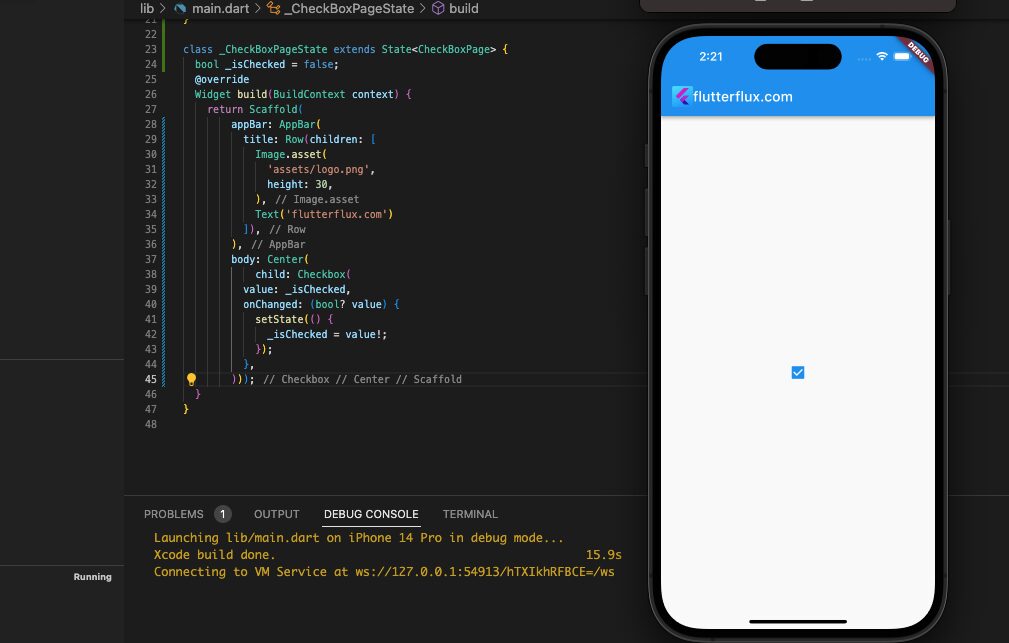
Checkbox is Flutter’s basic checkbox widget. This code creates a basic checkbox:
bool _isChecked = false;
Checkbox(
  value: _isChecked,
  onChanged: (bool? value) {
    setState(() {
      _isChecked = value!;
    });
  },
);
The boolean variable _isChecked indicates if the checkbox is checked in this case. The onChanged callback receives the checkbox new value when tapped. This callback updates _isChecked using setState to rebuild the UI and reflect the new checkbox status.
Set the Checkbox in Flutter and check mark colors using the activeColor and checkColor attributes. If you want the checkbox to have three states—checked, unchecked, and indeterminate—set tristate to true.
Multiple Checkbox in Flutter
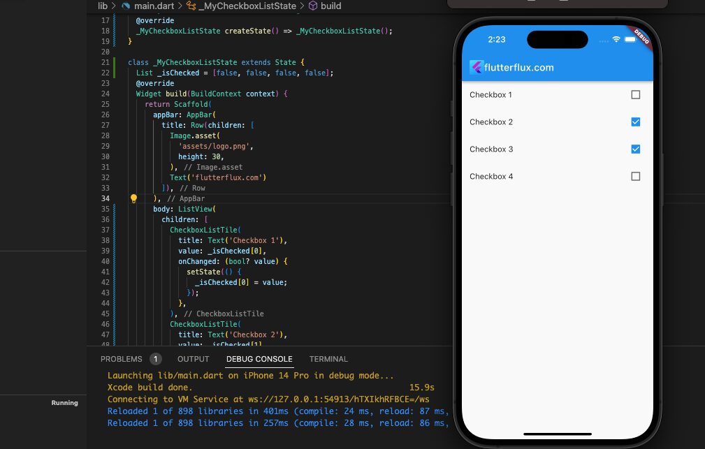
you can create multiple checkboxes by using the CheckboxListTile widget. The CheckboxListTile widget provides a title, subtitle, and trailing widget for each checkbox.
Example of how to create multiple CheckBox using the CheckboxListTile widget:
class MyCheckboxList extends StatefulWidget {
  @override
  _MyCheckboxListState createState() => _MyCheckboxListState();
}

class _MyCheckboxListState extends State {
  List _isChecked = [false, false, false, false];

  @override
  Widget build(BuildContext context) {
    return Scaffold(
      appBar: AppBar(
        title: Text('Multiple Checkbox Example'),
      ),
      body: ListView(
        children: [
          CheckboxListTile(
            title: Text('Checkbox 1'),
            value: _isChecked[0],
            onChanged: (bool value) {
              setState(() {
                _isChecked[0] = value;
              });
            },
          ),
          CheckboxListTile(
            title: Text('Checkbox 2'),
            value: _isChecked[1],
            onChanged: (bool value) {
              setState(() {
                _isChecked[1] = value;
              });
            },
          ),
          CheckboxListTile(
            title: Text('Checkbox 3'),
            value: _isChecked[2],
            onChanged: (bool value) {
              setState(() {
                _isChecked[2] = value;
              });
            },
          ),
          CheckboxListTile(
            title: Text('Checkbox 4'),
            value: _isChecked[3],
            onChanged: (bool value) {
              setState(() {
                _isChecked[3] = value;
              });
            },
          ),
        ],
      ),
    );
  }
}
A stateful widget has been designed to hold a list of boolean values that monitor the checked state of every checkbox. Four CheckboxListTile widgets have been generated with a title and value that gets modified when the checkbox is selected or deselected. To enable scrolling, these CheckboxListTile widgets have been included in a ListView.
Custom checkbox
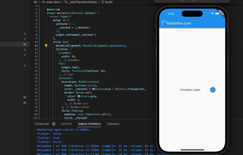
In Flutter, making a checkbox from scratch requires developing a widget that has the specific features and aesthetic you need. View this sample of a custom Checkbox in Flutter that can be made:
import 'package:flutter/material.dart';
import 'package:url_launcher/url_launcher.dart';

import 'package:flutter/material.dart';

class MyCheckbox extends StatefulWidget {
  final bool checked;
  final Function(bool) onChanged;
  final String label;

  const MyCheckbox(
      {Key? key,
      required this.checked,
      required this.onChanged,
      required this.label})
      : super(key: key);

  @override
  _MyCheckboxState createState() => _MyCheckboxState();
}

class _MyCheckboxState extends State {
  bool? _checked;

  @override
  void initState() {
    super.initState();
    _checked = widget.checked;
  }

  @override
  Widget build(BuildContext context) {
    return InkWell(
      onTap: () {
        setState(() {
          _checked = !_checked!;
        });
        if (widget.onChanged != null) {
          widget.onChanged(_checked!);
        }
      },
      child: Row(
        mainAxisAlignment: MainAxisAlignment.spaceEvenly,
        children: [
          SizedBox(
            width: 10,
          ),
          Text(
            widget.label,
            style: TextStyle(fontSize: 16),
          ),
          Container(
            decoration: BoxDecoration(
              shape: BoxShape.circle,
              color: _checked! ? Colors.blue : Colors.transparent,
              border: Border.all(
                color: Colors.grey,
                width: 2,
              ),
            ),
            child: Padding(
              padding: const EdgeInsets.all(5),
              child: _checked!
                  ? Icon(
                      Icons.check,
                      size: 20,
                      color: Colors.white,
                    )
                  : Container(
                      width: 20,
                      height: 20,
                    ),
            ),
          ),
        ],
      ),
    );
  }
}

void main() => runApp(MyApp());

class MyApp extends StatelessWidget {
  @override
  Widget build(BuildContext context) {
    return MaterialApp(
      title: 'CheckBoxPage',
      home: MyCheckboxList(),
    );
  }
}

class MyCheckboxList extends StatefulWidget {
  @override
  _MyCheckboxListState createState() => _MyCheckboxListState();
}

class _MyCheckboxListState extends State {
  List _isChecked = [false, false, false, false];
  @override
  Widget build(BuildContext context) {
    return Scaffold(
        appBar: AppBar(
          title: Row(children: [
            Image.asset(
              'assets/logo.png',
              height: 30,
            ),
            Text('flutterflux.com')
          ]),
        ),
        body: Center(
          child: MyCheckbox(
            checked: true, // whether the checkbox is initially checked
            onChanged: (value) {
              // handle checkbox change here
              print(value);
            },
            label: "Checkbox Label",
          ),
        ));
  }
}
The following settings must be specified before this bespoke Checkbox in Flutter widget can be implemented:
- value:a boolean indicating the checkbox’s status.
- onChanged: a checkbox callback function.
- activeColor: the color of the checkbox when checked.
- checkColor: the color of the checkmark within the checkbox when checked.
Simply instantiate the CustomCheckbox widget with the appropriate arguments to use it in your Flutter project.
MyCheckbox(
  checked: true, // whether the checkbox is initially checked
  onChanged: (value) {
    // handle checkbox change here
    print(value);
  },
  label: "Checkbox Label",
)
The checkbox starts off as checked (value: true), and the onChanged callback function is triggered whenever it is checked or unchecked. When checked, the Checkbox in Flutter will appear green (activeColor: Colors.green), and the checkmark inside will be black (checkColor: Colors.black).
CheckboxListTile
The Flutter widget CheckboxListTile combines the functionality of a checkbox with that of a list tile. It provides a list of choices from which the user can pick one or more. A label, a checkbox, and another widget can all be found in the CheckboxListTile.
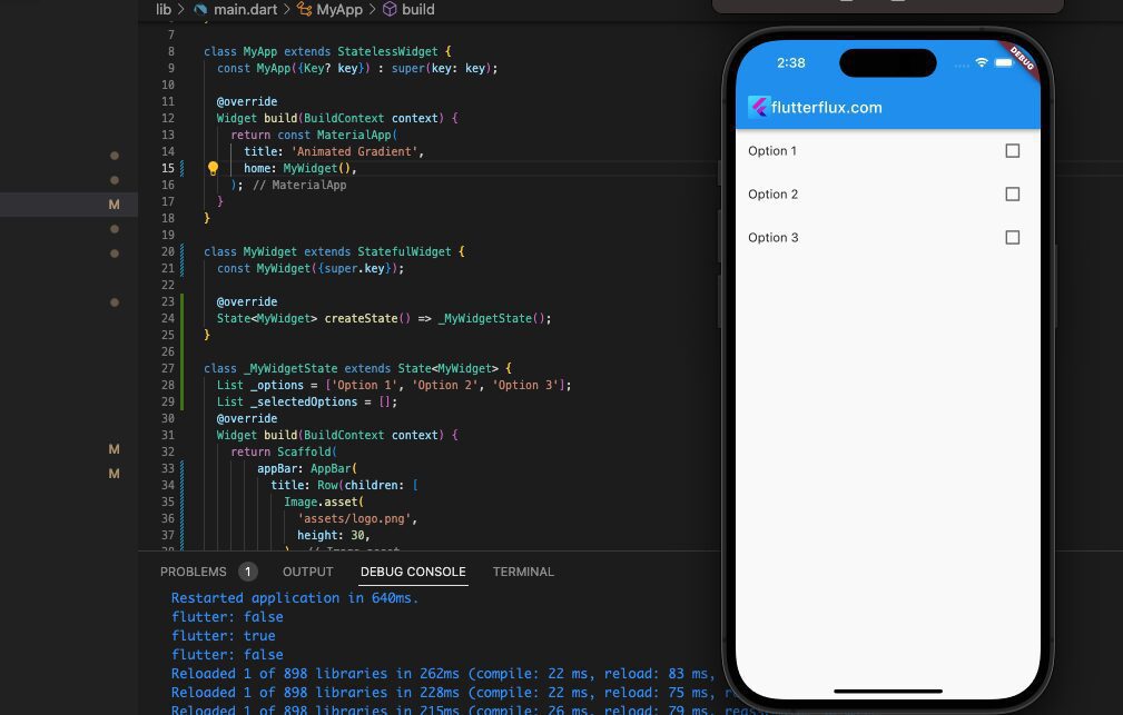
Example code of how to use CheckboxListTile:
List _options = ['Option 1', 'Option 2', 'Option 3'];
List _selectedOptions = [];

@override
Widget build(BuildContext context) {
  return ListView(
    children: _options
        .map(
          (option) => CheckboxListTile(
            title: Text(option),
            value: _selectedOptions.contains(option),
            onChanged: (value) {
              setState(() {
                if (value) {
                  _selectedOptions.add(option);
                } else {
                  _selectedOptions.remove(option);
                }
              });
            },
          ),
        )
        .toList(),
  );
}
In this instance, we establish an array of choices and an array of chosen options. We employ the ListView tool to showcase a lineup of CheckboxListTile widgets, with one for each choice. The CheckboxListTile’s value attribute is configured to true if the choice is present in the chosen options array, and false if not. Once the user selects a checkbox, the onChanged method is triggered, and we update the selected options list accordingly. To ensure the list is scrollable, we encase the CheckboxListTile array in a ListView widget.
Checkbox in ListView
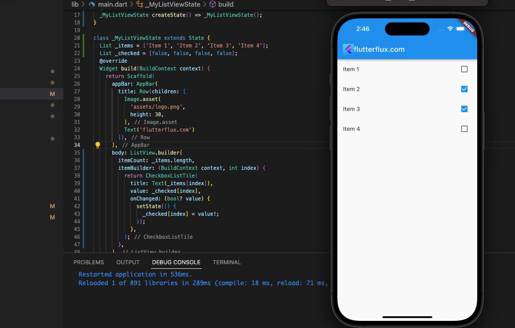
To generate a ListView with checkboxes, simply employ the ListView.builder constructor and construct each list element as a CheckboxListTile.
example:
class MyListView extends StatefulWidget {
  @override
  _MyListViewState createState() => _MyListViewState();
}

class _MyListViewState extends State {
  List _items = ['Item 1', 'Item 2', 'Item 3', 'Item 4'];
  List _checked = [false, false, false, false];

  @override
  Widget build(BuildContext context) {
    return Scaffold(
      appBar: AppBar(
        title: Text('ListView with Checkboxes'),
      ),
      body: ListView.builder(
        itemCount: _items.length,
        itemBuilder: (BuildContext context, int index) {
          return CheckboxListTile(
            title: Text(_items[index]),
            value: _checked[index],
            onChanged: (bool? value) {
              setState(() {
                _checked[index] = value!;
              });
            },
          );
        },
      ),
    );
  }
}
The list named _items is composed of strings that represent the text for each item on the list. Meanwhile, the list _checked consists of booleans that indicate whether each Checkbox in Flutter has been checked or not. The CheckboxListTile widget is responsible for displaying a checkbox and its corresponding text for each item on the list. Whenever a checkbox is toggled, the onChanged callback is triggered, updating the _checked list and causing the widget to be rebuilt.
Card with checkbox
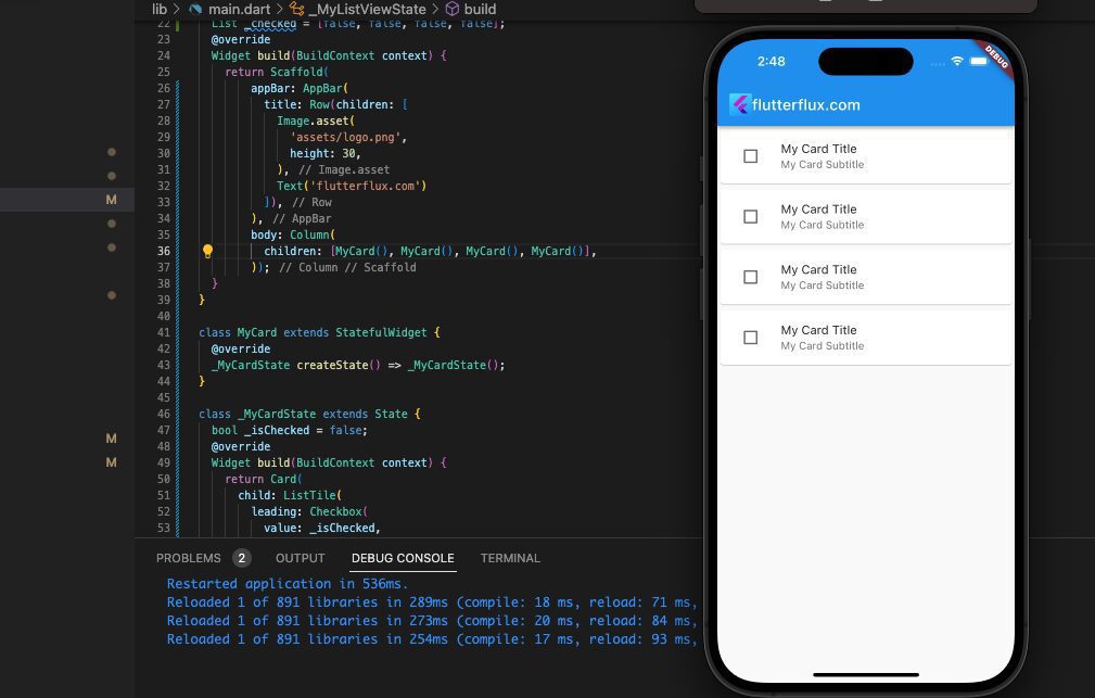
Using the Card widget and the Checkbox in Flutter widget allows you to add a Checkbox in Flutter card. Please review this snippet of sample code:
import 'package:flutter/material.dart';

class MyCard extends StatefulWidget {
  @override
  _MyCardState createState() => _MyCardState();
}

class _MyCardState extends State {
  bool _isChecked = false;

  @override
  Widget build(BuildContext context) {
    return Card(
      child: ListTile(
        leading: Checkbox(
          value: _isChecked,
          onChanged: (value) {
            setState(() {
              _isChecked = value;
            });
          },
        ),
        title: Text('My Card Title'),
        subtitle: Text('My Card Subtitle'),
      ),
    );
  }
}
A new widget named MyCard is created in the following code. This widget is stateful as the checkbox’s state needs to be maintained. The widget contains a boolean variable named _isChecked, which stores the state of the checkbox.
The Card widget is used to create the card, and the ListTile widget is used to create the card’s contents. The Checkbox in Flutter widget is used as the leading widget for the ListTile.
When the user taps on the checkbox, the onChanged callback is invoked, and the _isChecked variable is updated. To update the widget state, the setState function is used, which triggers a rebuild of the UI.
By providing additional parameters to the widgets, you can customize the card and checkbox’s appearance.
Conclusion
With the Checkbox in Flutter widget and CheckboxListTile widget, it’s simple to design interactive user interfaces that let users select options by checking and unchecking boxes. You may make a checkbox that perfectly matches the style of your app by changing its size, color, and form. read too How to Fix Flutter Command Not Found

