CircleAvatar Image in Flutterr – To adjust how the CircleAvatar Image in Flutter widget looks, there are a number of settings available in Flutter. radius, backgroundColor, foregroundColor, and child are all examples of such attributes.
The circle widget radius property specifies its circumference, while the backgroundColor property sets the color of the circle background. The child widget, which may be an image or an icon, can have its color set using the foregroundColor attribute. Last but not least, you may place an image or icon smack in the middle of the circle using the child attribute.
CircleAvatar appearance may be easily modified to match the rest of your Flutter app by modifying these settings.
The CircleAvatar Image in Flutter widget presents a circular avatar. The advantages of including CircleAvatar in your Flutter project are:
- CircleAvatar is simple to set up and utilize. It takes whatever picture or icon you provide it and displays it in a spherical format.
- The radius, background color, foreground color, border, etc., of your CircleAvatar may all be modified to your liking. This facilitates a simple adaptation to the aesthetic of your app.
- The user interface (UI) of your program will be uniform thanks to CircleAvatar, which is a great feature. Your app will have a more polished and professional appearance if you use the same widget for showing both photos and icons.
- Optimized for speed, CircleAvatar is the fourth point. Even with very huge photos, it loads them swiftly and effectively.
- CircleAvatar has accessibility options, number 5, including text labels and screen readers. Your app becomes more accessible to those who use assistive technologies in this way.
Example usage CircleAvatar Image in Flutter:
import 'package:flutter/material.dart';

class MyCircleAvatar extends StatelessWidget {
  @override
  Widget build(BuildContext context) {
    return Scaffold(
      body: Center(
        child: CircleAvatar(
          radius: 50,
          backgroundImage: AssetImage('assets/logo.png'),
        ),
      ),
    );
  }
}
I’ll use a profile photo in the form of a spherical avatar. We’ve made the circle 50 pixels wide by setting the radius property of the CircleAvatar. The image shown in the sphere’s background is controlled by the backgroundImage attribute.
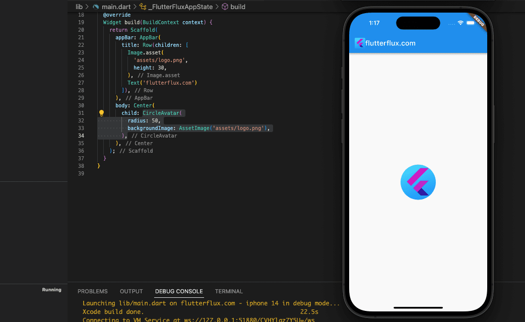
Use the backgroundColor, foregroundColor, borderColor, and borderWidth attributes to alter the CircleAvatar visual style. The kid property allows you to use icons or text in place of pictures.
CircleAvatar Image in Flutter with Border
Borders may be added to CircleAvatar widgets with the border attribute. Example code:
Container(
          decoration: BoxDecoration(
            shape: BoxShape.circle,
            border: Border.all(
              color: Colors.red,
              width: 2.0,
            ),
          ),
          child: CircleAvatar(
            radius: 50,
            backgroundImage: AssetImage(
              'assets/logo.png',
            ),
          ),
        ),
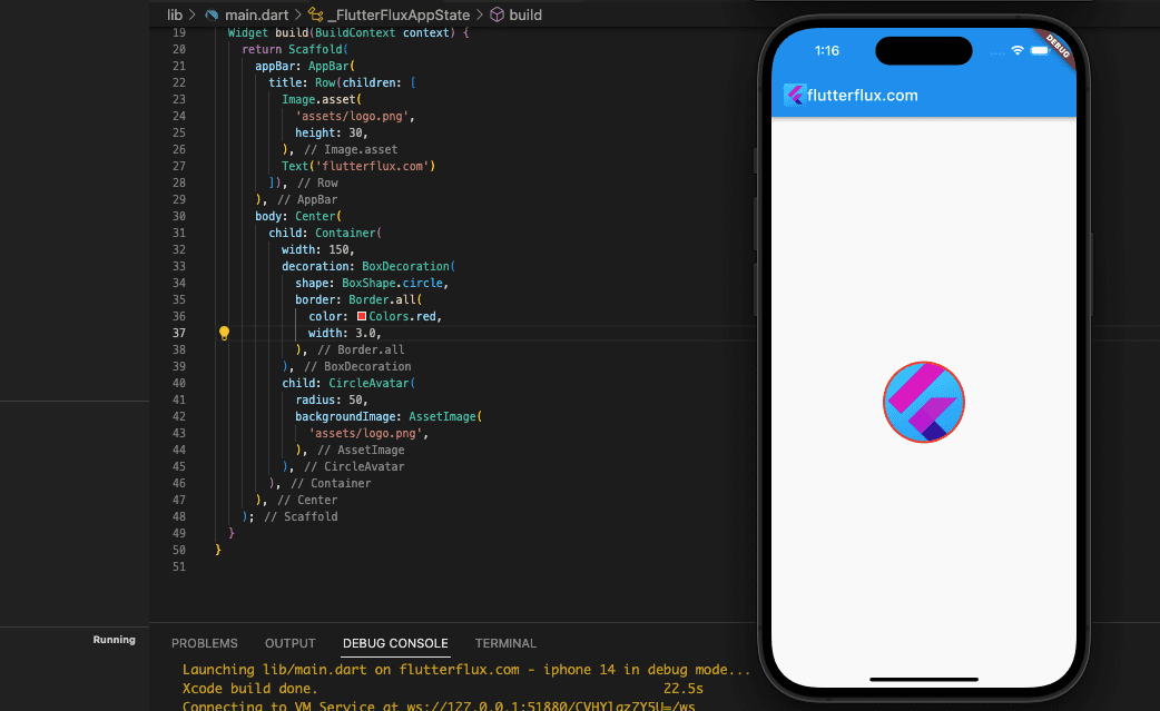
The color and size of the borders are both customizable. Other Border builders allow you to make unique border styles, such dashed.
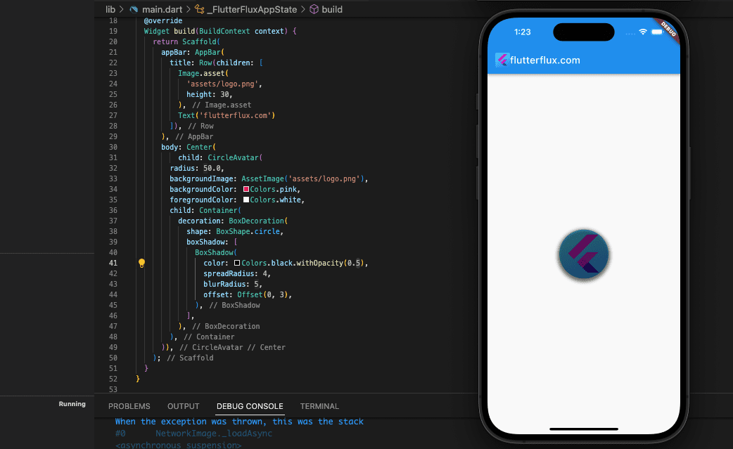
CircleAvatar Image in Flutter with Shadow
add shadow in CircleAvatar widget just using the BoxDecoration class. Here example:
CircleAvatar(
        radius: 50.0,
        backgroundImage: AssetImage('assets/logo.png'),
        backgroundColor: Colors.pink,
        foregroundColor: Colors.white,
        child: Container(
          decoration: BoxDecoration(
            shape: BoxShape.circle,
            boxShadow: [
              BoxShadow(
                color: Colors.black.withOpacity(0.5),
                spreadRadius: 4,
                blurRadius: 5,
                offset: Offset(0, 3),
              ),
            ],
          ),
        ),
      )
CircleAvatar Image in Flutter with Ripple Animation
to add ripple animation we need create CustomPaint widget, check full code below:
import 'package:flutter/material.dart';
import 'dart:math' as math show sin, pi, sqrt;

void main() {
  runApp(MaterialApp(
    home: FlutterFluxApp(),
  ));
}

class FlutterFluxApp extends StatefulWidget {
  const FlutterFluxApp({super.key});

  @override
  State createState() => _FlutterFluxAppState();
}

class _FlutterFluxAppState extends State {
  @override
  Widget build(BuildContext context) {
    return Scaffold(
      appBar: AppBar(
        title: Row(children: [
          Image.asset(
            'assets/logo.png',
            height: 30,
          ),
          Text('flutterflux.com')
        ]),
      ),
      body: Center(
          child: Ripples(
        color: Colors.deepPurple,
        onPressed: () {},
        child: Container(
          decoration: BoxDecoration(
            shape: BoxShape.circle,
            border: Border.all(
              color: Colors.red,
              width: 2.0,
            ),
          ),
          child: CircleAvatar(
            radius: 50,
            backgroundImage: AssetImage(
              'assets/logo.png',
            ),
          ),
        ),
      )),
    );
  }
}

class Ripples extends StatefulWidget {
  const Ripples({
    Key? key,
    this.size = 80.0,
    this.color = Colors.pink,
    required this.onPressed,
    required this.child,
  }) : super(key: key);

  final double size;
  final Color color;
  final Widget child;
  final VoidCallback onPressed;

  @override
  _RipplesState createState() => _RipplesState();
}

class _CirclePainter extends CustomPainter {
  _CirclePainter(
    this._animation, {
    required this.color,
  }) : super(repaint: _animation);

  final Color color;
  final Animation _animation;

  void circle(Canvas canvas, Rect rect, double value) {
    final double opacity = (1.0 - (value / 4.0)).clamp(0.0, 1.0);
    final Color _color = color.withOpacity(opacity);

    final double size = rect.width / 2;
    final double area = size * size;
    final double radius = math.sqrt(area * value / 4);

    final Paint paint = Paint()..color = _color;
    canvas.drawCircle(rect.center, radius, paint);
  }

  @override
  void paint(Canvas canvas, Size size) {
    final Rect rect = Rect.fromLTRB(0.0, 0.0, size.width, size.height);

    for (int wave = 3; wave >= 0; wave--) {
      circle(canvas, rect, wave + _animation.value);
    }
  }

  @override
  bool shouldRepaint(_CirclePainter oldDelegate) => true;
}

class _RipplesState extends State with TickerProviderStateMixin {
  late AnimationController _controller;

  @override
  void initState() {
    super.initState();
    _controller = AnimationController(
      duration: const Duration(milliseconds: 2000),
      vsync: this,
    )..repeat();
  }

  @override
  void dispose() {
    _controller.dispose();
    super.dispose();
  }

  Widget _button() {
    return Center(
      child: ClipRRect(
        borderRadius: BorderRadius.circular(widget.size),
        child: DecoratedBox(
          decoration: BoxDecoration(
            gradient: RadialGradient(
              colors: [
                widget.color,
                Color.lerp(widget.color, Colors.black, .05)!
              ],
            ),
          ),
          child: ScaleTransition(
            scale: Tween(begin: 0.95, end: 1.0).animate(
              CurvedAnimation(
                parent: _controller,
                curve: const _PulsateCurve(),
              ),
            ),
            child: widget.child,
          ),
        ),
      ),
    );
  }

  @override
  Widget build(BuildContext context) {
    return CustomPaint(
      painter: _CirclePainter(
        _controller,
        color: widget.color,
      ),
      child: SizedBox(
        width: widget.size * 2.125,
        height: widget.size * 2.125,
        child: _button(),
      ),
    );
  }
}

class _PulsateCurve extends Curve {
  const _PulsateCurve();

  @override
  double transform(double t) {
    if (t == 0 || t == 1) {
      return 0.01;
    }
    return math.sin(t * math.pi);
  }
}
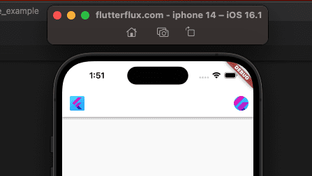
CircleAvatar Image in Flutter Appbar
Displaying a circular app icon in your Flutter app AppBar is possible using the CircleAvatar widget and the AppBar actions attribute. This is just one example:
AppBar(
          backgroundColor: Colors.white,
          title: Row(children: [
            Image.asset(
              'assets/logo.png',
              height: 30,
            ),
            Text('flutterflux.com')
          ]),
          actions: [
            Padding(
                padding: EdgeInsets.only(right: 10),
                child: CircleAvatar(
                  radius: 15,
                  backgroundColor: Colors.white,
                  backgroundImage: AssetImage('assets/logo.png'),
                )),
          ]),
CircleAvatar Image in Flutter Property
Many of the most often adjusted settings for CircleAvatar Image in Flutter widget are as follows:
- circle background color
backgroundColor. backgroundImageis the picture that will be shown in the center of the circle.- distance around a circle, or its
radius. - A
childwidget to show in place of an image within the circle. - childWidget background color or the image’s
foregroundColor, respectively. - circle rim color or
borderColor. borderWidthspecifies how wide the border is that encloses the circle.- The
onTapcallback method will be executed whenever the CircleAvatar is tapped. - When a user presses and holds the CircleAvatar, a
tooltipwith some descriptive text appears.
Flutter CircleAvatar widget has a wide variety of customizable settings, including those listed above. The documentation for Flutter has a complete set of attributes along with detailed explanations of their use.
Conclusion
CircleAvatar is widely utilized throughout several social media platforms, including user profiles, comments, chat conversations, and more. Images and icons can be shown as well.
Simply import the material.dart library into your Flutter project to gain access to the CircleAvatar Image in Flutter widget. If you want more info and examples, the official Flutter documentation has you covered. read too Button with border radius in Flutter

