Text Size in Flutter – Text is a popular Flutter widget that shows text. TextStyle class attributes let you change font, color, style, and alignment.
Text Size in Flutter widget is defined by the Text Size property. The fontSize property of the TextStyle class allows you to specify the font size, which is normally specified in logical pixels (or device-independent pixels).
Text Size in Flutter Widget Usage:
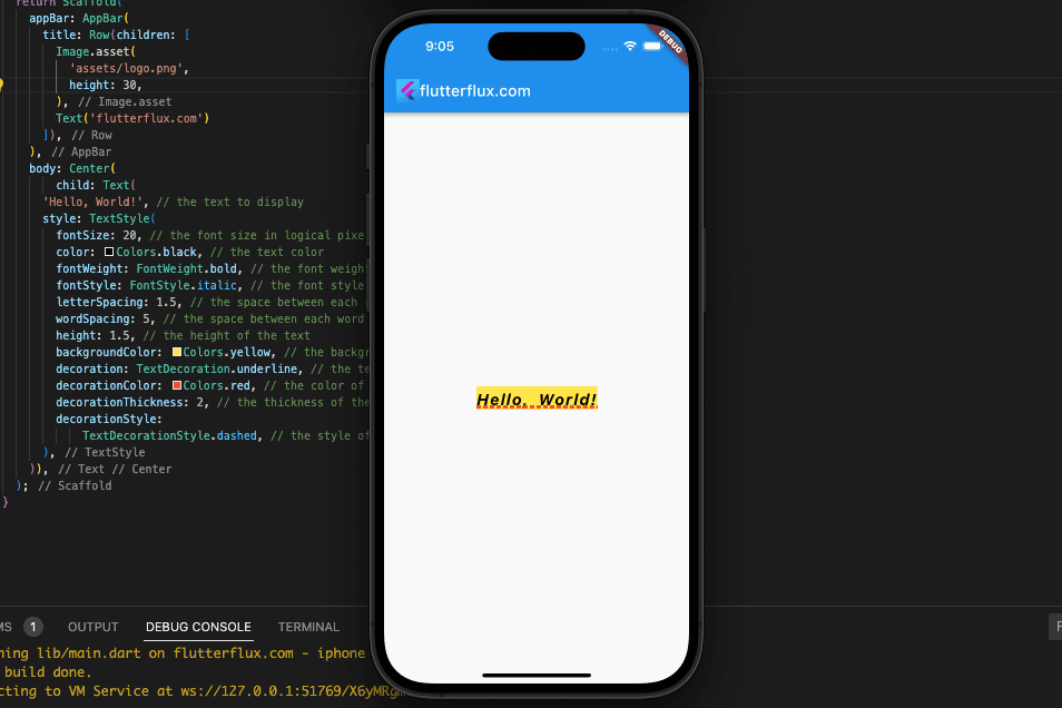
Text(
  'Hello, World!', // the text to display
  style: TextStyle(
    fontSize: 20, // the font size in logical pixels
    color: Colors.black, // the text color
    fontWeight: FontWeight.bold, // the font weight
    fontStyle: FontStyle.italic, // the font style
    letterSpacing: 1.5, // the space between each character
    wordSpacing: 5, // the space between each word
    height: 1.5, // the height of the text
    backgroundColor: Colors.yellow, // the background color of the text
    decoration: TextDecoration.underline, // the text decoration
    decorationColor: Colors.red, // the color of the text decoration
    decorationThickness: 2, // the thickness of the text decoration
    decorationStyle: TextDecorationStyle.dashed, // the style of the text decoration
  ),
);
Text Size in Flutter Best Practice
Best practices for adjusting font sizes in Flutter include the following:
- Use sp for text sizes: When working with text in Flutter, you have the option of using either flutter font size pixel (px) or scalable pixels (sp). Nevertheless, sp is suggested due to its adaptability to the user’s device font settings. If a user has their device set to use larger fonts, the text in your app will automatically scale to fit the larger size.
- Use Theme for consistent styling: Setting font sizes for each widget is tedious; instead, define a theme for your app and apply it uniformly across all widgets. This manner, you can keep your app’s text uniform in tone and presentation.
- Use different font sizes for different types of text: It’s best practice to differentiate between headers, body content, and captions with varying font sizes. In most cases, you should make headings and body text a bit bigger than captions.
- Use responsive font sizes: By using media queries, you may modify the font size for each viewport. This might assist make sure your text displays properly across all platforms.
- Test your font sizes: Verify that the font size you’ve chosen is legible and appealing across a variety of devices. Depending on the size of the device and the amount of text being displayed, you may need to modify the font sizes.
Responsive Text Size in Flutter
Adjusting font size to screen size or space creates responsive text. This keeps text legible across screen sizes and device orientations.
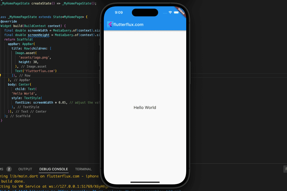
- Media query: MediaQuery’s screen size information can be used to create responsive text. MediaQuery lets you set font size based on device width or height. An example:
final double screenWidth = MediaQuery.of(context).size.width;
final double screenHeight = MediaQuery.of(context).size.height;

Text(
  'Hello World',
  style: TextStyle(
    fontSize: screenWidth * 0.05, // adjust the value as needed
  ),
);
Output
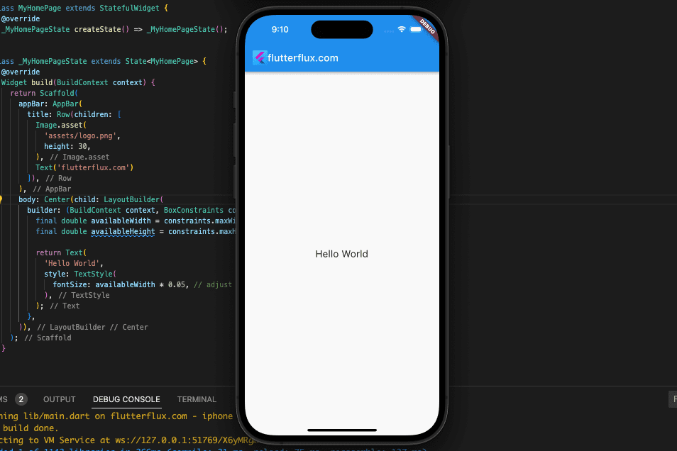
- LayoutBuilder: LayoutBuilder shows widget space. This widget sets text size dependent on space. An example:
LayoutBuilder(
  builder: (BuildContext context, BoxConstraints constraints) {
    final double availableWidth = constraints.maxWidth;
    final double availableHeight = constraints.maxHeight;

    return Text(
      'Hello World',
      style: TextStyle(
        fontSize: availableWidth * 0.05, // adjust the value as needed
      ),
    );
  },
);
Output
- FittedBox:
FittedBoxscales its child to fit. This widget auto-sizes text based on space. An example:
FittedBox(
  fit: BoxFit.fitWidth,
  child: Text(
    'Hello World',
    style: TextStyle(fontSize: 20), // set a default font size
  ),
);
Output
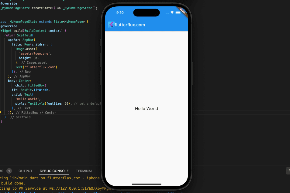
These are merely some of the methods for achieving fluid font sizes in Flutter. Further tools and methods, such the MediaQueryData class, the OrientationBuilder tool, and the Sizer package, are available for your perusal.
Text Size Using Sizer Package
Flutter sizer package offers a simple approach to implementing responsive text. The text is automatically adjusted to the appropriate size for the device’s screen by means of a plugin called flutter screenutil.
You must include the following in your pubspec.yaml file in order to use the sizer package:
dependencies:
  flutter:
    sdk: flutter
  sizer: ^2.0.15 # add this line
Then, import the package in Dart:
import 'package:sizer/sizer.dart';
The SizerUtil class is available after package import for adjusting the font size relative to the viewport. Here’s an example:
import 'package:flutter/material.dart';
import 'package:sizer/sizer.dart';

void main() {
  runApp(MyApp());
}

class MyApp extends StatelessWidget {
  @override
  Widget build(BuildContext context) {
    return Sizer(builder: (context, orientation, deviceType) {
      return MaterialApp(
        title: 'sizer in Flutter',
        home: MyHomePage(),
      );
    });
  }
}

class MyHomePage extends StatefulWidget {
  @override
  _MyHomePageState createState() => _MyHomePageState();
}

class _MyHomePageState extends State<MyHomePage> {
  @override
  Widget build(BuildContext context) {
    return Scaffold(
      appBar: AppBar(
        title: Row(children: [
          Image.asset(
            'assets/logo.png',
            height: 30,
          ),
          Text('flutterflux.com')
        ]),
      ),
      body: Center(
          child: Text(
        'Hello, World!',
        style: TextStyle(
          fontSize: SizerUtil.deviceType == DeviceType.mobile
              ? SizerUtil.orientation == Orientation.portrait
                  ? 8.0.sp // set the font size for mobile portrait mode
                  : 6.0.sp // set the font size for mobile landscape mode
              : SizerUtil.orientation == Orientation.portrait
                  ? 4.0.sp // set the font size for tablet portrait mode
                  : 3.sp, // set the font size for tablet landscape mode
        ),
      )),
    );
  }
}
Output
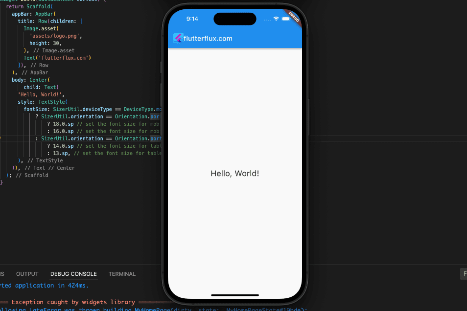
This sets the font size to 18.0 sp for mobile portrait, 16.0 sp for mobile landscape, 14.0 sp for tablet portrait, and 13 sp for tablet landscape. “Scale-independent pixels” are font size units that scale with device pixel density.
DeviceType, orientation, screenHeight, screenWidth, statusBarHeight, bottomBarHeight, and textScaleFactor are some of the SizerUtil class’s attributes that can be used to modify font size based on screen size. With SizerUtil.setSp(), you can set your app’s default font size.
Conclusion
For a consistent and pleasant user experience across all devices and screen sizes, it is essential that the font size used in your Flutter app be responsive. Flutter MediaQuery widget, LayoutBuilder widget, and FittedBox widget are just a few of the tools at your disposal for making text that adapts to its container. The sizer package additionally provides a simple method to make text responsive by automatically adjusting the font size to match the resolution of the viewing device. read too Send notification in flutter with specified time


