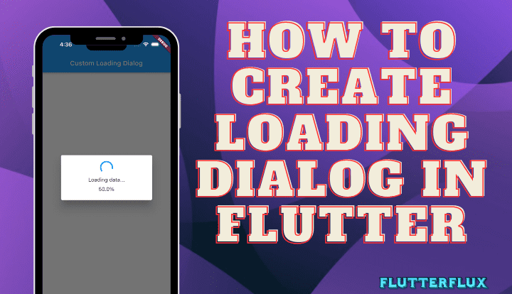
When an app needs to do something lengthy, like downloading data from the internet, a Loading Dialog in Flutter can let users know. Flutter showDialog function and the CircularProgressIndicator widget make it easy to implement a loading dialog.
Basic Loading Dialog in Flutter
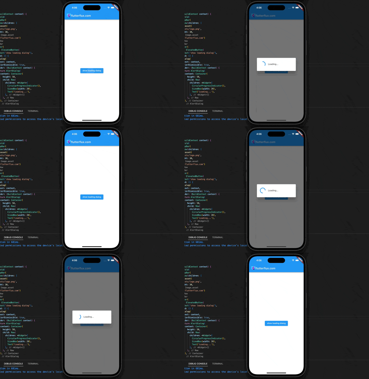
An example of a basic loading dialog built with Flutter is shown below.
showDialog(
  context: context,
  barrierDismissible: false,
  builder: (BuildContext context) {
    return AlertDialog(
      content: Container(
        height: 50,
        child: Row(
          children: <Widget>[
            CircularProgressIndicator(),
            SizedBox(width: 20),
            Text('Loading...'),
          ],
        ),
      ),
    );
  },
);
showDialog to display an AlertDialog. To prevent the user from dismissing the dialog by tapping outside it, set barrierDismissible to false.
The builder function creates an AlertDialog with a Container, CircularProgressIndicator, and Text widget. The Text widget displays “Loading…” while the CircularProgressIndicator widget spins.
Changing AlertDialog content customizes the loading dialog. To signify the operation, add an icon or edit the wording. Use Navigator.pop to dismiss the loading dialog. Such as:
Navigator.pop(context);
Removing the Loading Dialog in Flutter returns control to the previous screen.
Output
Custom Loading Dialog with percentage
Follow these steps to make a custom Loading Dialog in Flutter with a percentage in Flutter:
- Create a new Class Widget called
LoadingDialog:
import 'package:flutter/material.dart';

class LoadingDialog extends StatefulWidget {
  final String message;
  final double progress;

  LoadingDialog({this.message, this.progress});

  @override
  _LoadingDialogState createState() => _LoadingDialogState();
}

class _LoadingDialogState extends State<LoadingDialog> {
  @override
  Widget build(BuildContext context) {
    return AlertDialog(
      content: Column(
        mainAxisSize: MainAxisSize.min,
        children: <Widget>[
          CircularProgressIndicator(),
          SizedBox(height: 10),
          Text(widget.message ?? 'Loading...'),
          SizedBox(height: 10),
          Text('${widget.progress ?? 0}%'),
        ],
      ),
    );
  }
}
- Make a new CircularProgressIndicator widget in the
_LoadingDialogStateclass to display the loading status. A Text widget can be used to display the loading message, and a second Text widget can display the loading progress in percentage form. - Calling showDialog with the LoadingDialog widget as the builder parameter will display the bespoke loading dialog. For instance:
showDialog(
  context: context,
  barrierDismissible: false,
  builder: (BuildContext context) {
    return LoadingDialog(message: 'Loading data...', progress: 50);
  },
);
The message and progress parameters can be changed to suit your preferences.
- The
LoadingDialogwidget’s progress variable can be updated via a call tosetStateto reflect the current percentage of progress. For example:
setState(() {
  _progress = 75;
});
This will reflect a 75% complete load in the Loading Dialog in Flutter and update the progress variable accordingly.
Full Code
import 'package:flutter/material.dart';

class LoadingDialog extends StatefulWidget {
  final String message;
  final double progress;

  LoadingDialog({this.message, this.progress});

  @override
  _LoadingDialogState createState() => _LoadingDialogState();
}

class _LoadingDialogState extends State<LoadingDialog> {
  @override
  Widget build(BuildContext context) {
    return AlertDialog(
      content: Column(
        mainAxisSize: MainAxisSize.min,
        children: <Widget>[
          CircularProgressIndicator(),
          SizedBox(height: 10),
          Text(widget.message ?? 'Loading...'),
          SizedBox(height: 10),
          Text('${widget.progress ?? 0}%'),
        ],
      ),
    );
  }
}

void main() {
  runApp(MyApp());
}

class MyApp extends StatelessWidget {
  @override
  Widget build(BuildContext context) {
    return MaterialApp(
      title: 'Custom Loading Dialog',
      home: HomePage(),
    );
  }
}

class HomePage extends StatelessWidget {
  @override
  Widget build(BuildContext context) {
    return Scaffold(
      appBar: AppBar(
        title: Row(children: [
          Image.asset(
            'assets/logo.png',
            height: 30,
          ),
          Text('flutterflux.com')
        ]),
      ),
      body: Center(
        child: ElevatedButton(
          onPressed: () {
            showDialog(
              context: context,
              barrierDismissible: false,
              builder: (BuildContext context) {
                return LoadingDialog(message: 'Loading data...', progress: 50);
              },
            );

            // Simulating loading process
            Future.delayed(Duration(seconds: 2), () {
              setState(() {
                Navigator.pop(context);
              });
            });
          },
          child: Text('Show Loading Dialog'),
        ),
      ),
    );
  }
}
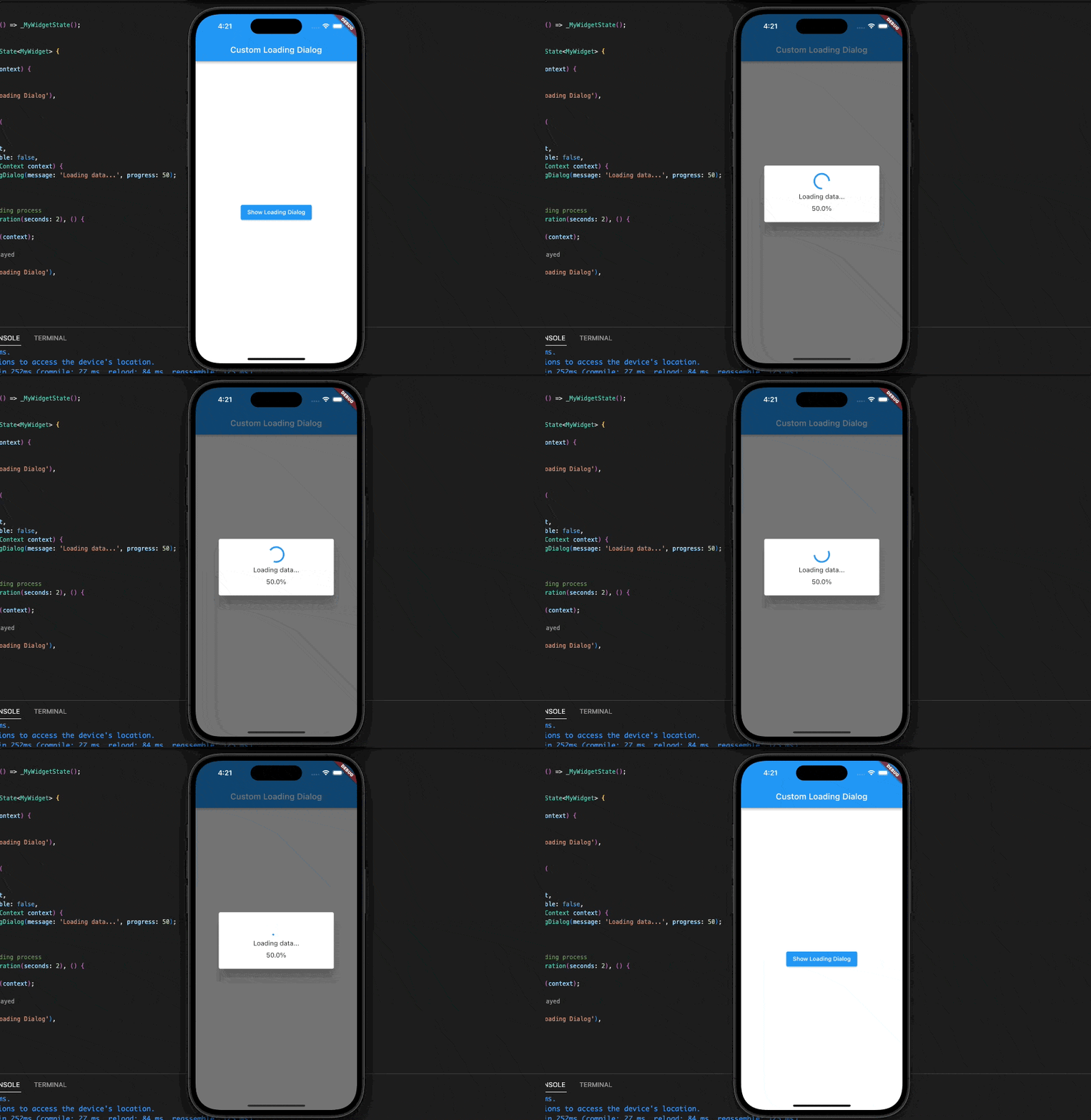
When the ElevatedButton is pressed, a bespoke loading dialogue appears. The showDialog method accepts the Loading Dialog in Flutter widget as a builder parameter, along with a user-supplied label and percentage complete.
The code pretends to be a loading screen by delaying the close of the dialog for two seconds with the help of the Future.delayed function.
Output
Note: setState is only available inside a StatefulWidget, so if you want to use it in the onPressed function of the HomePage widget’s ElevatedButton, you’ll need to wrap it in a StatefulBuilder widget first.
Conclusion
Flutter apps need loading dialog. They give the user visible feedback while a background task is being done, improving the user experience and preventing confusion or frustration. The showDialog() function lets you design custom loading dialogs or use Flutter CircularProgressIndicator and LinearProgressIndicator widgets. Consider the task kind, duration, and application design and user experience while implementing Loading Dialog in Flutter. You may build a smooth and straightforward user experience by carefully examining these criteria and adding loading dialogs.

