What is text field in Flutter – TextField Flutter widget enables users to input text and is ideal for creating forms, search bars, and other text input fields. It can be customized to suit the design and functional requirements of an application.
Text Field in Flutter offers various properties to personalize the text field’s behavior and look. One can specify the input’s maximum length, keyboard type, and text style. Furthermore, a controller can be added to the Text Field in Flutter widget to manage the text value programmatically.
Flutter provides various types of text fields, including:
- Standard text field: A basic text field that allows users to enter text.
- Password text field: A text field that hides the entered text with asterisks or dots to protect sensitive information.
- Multiline text field: A text field that allows users to input multiple lines of text.
- Number text field: A text field that only accepts numerical input.
- Email text field: A text field that validates email addresses.
- Date and time text field: Text field that allow users to input dates and times.
- Dropdown text field: A text field that displays a dropdown menu of options for the user to select.
- Autocomplete text field: A text field that suggests options to the user as they type.
Standard text field
To create a standard Text Field in Flutter, you can use the TextField widget.
Example code snippet:
TextField(
  decoration: InputDecoration(
    labelText: 'Enter your name',
  ),
);
Password text field
To create password text field in Flutter, you can utilize the TextField widget and modify its obscureText property to true. This will mask the characters entered in the field and display them as dots or asterisks.
Example code snippet:
TextField(
  obscureText: true,
  decoration: InputDecoration(
    labelText: 'Password',
    hintText: 'Enter your password',
    // other decoration properties
  ),
);
You can adjust the decoration properties according to your design requirements. To create password text field that enables the user to toggle between showing or hiding the password in Flutter, you can combine the Text Field in Flutter and IconButton widgets.
Complete code:
import 'package:flutter/material.dart';

void main() => runApp(MyApp());

class MyApp extends StatelessWidget {
  @override
  Widget build(BuildContext context) {
    return MaterialApp(
      title: 'TextField with Decoration Button',
      home: Scaffold(
        appBar: AppBar(
          title: Row(children: [
            Image.asset(
              'assets/logo.png',
              height: 30,
            ),
            Text('flutterflux.com')
          ]),
        ),
        body: Center(
          child: Padding(
            padding: EdgeInsets.all(16.0),
            child: PasswordField(),
          ),
        ),
      ),
    );
  }
}

class PasswordField extends StatefulWidget {
  @override
  _PasswordFieldState createState() => _PasswordFieldState();
}

class _PasswordFieldState extends State {
  bool _showPassword = false;

  @override
  Widget build(BuildContext context) {
    return TextField(
      obscureText: !_showPassword,
      decoration: InputDecoration(
        labelText: 'Password',
        hintText: 'Enter your password',
        suffixIcon: IconButton(
          icon: Icon(
            _showPassword ? Icons.visibility : Icons.visibility_off,
          ),
          onPressed: () {
            setState(() {
              _showPassword = !_showPassword;
            });
          },
        ),
        border: OutlineInputBorder(
          borderRadius: BorderRadius.circular(10.0),
        ),
      ),
    );
  }
}
this example, we create a PasswordField widget that maintains the state of whether the password should be shown or hidden. We set the obscureText property of the TextField to the opposite of _showPassword so that the password is hidden when _showPassword is false and shown when _showPassword is true. We add an IconButton to the suffixIcon property of the InputDecoration to allow the user to toggle the visibility of the password. When the user taps the IconButton, we call setState to update the state of _showPassword.
You can customize the InputDecoration and IconButton properties to suit your design needs. For example, you can change the icon used for the IconButton or add additional decoration properties to the InputDecoration.
Multiline textfield
One way to make a Text Field in Flutter with multiple lines in Flutter is by using the TextField widget and adjusting the maxLines property to a value that’s more than 1.
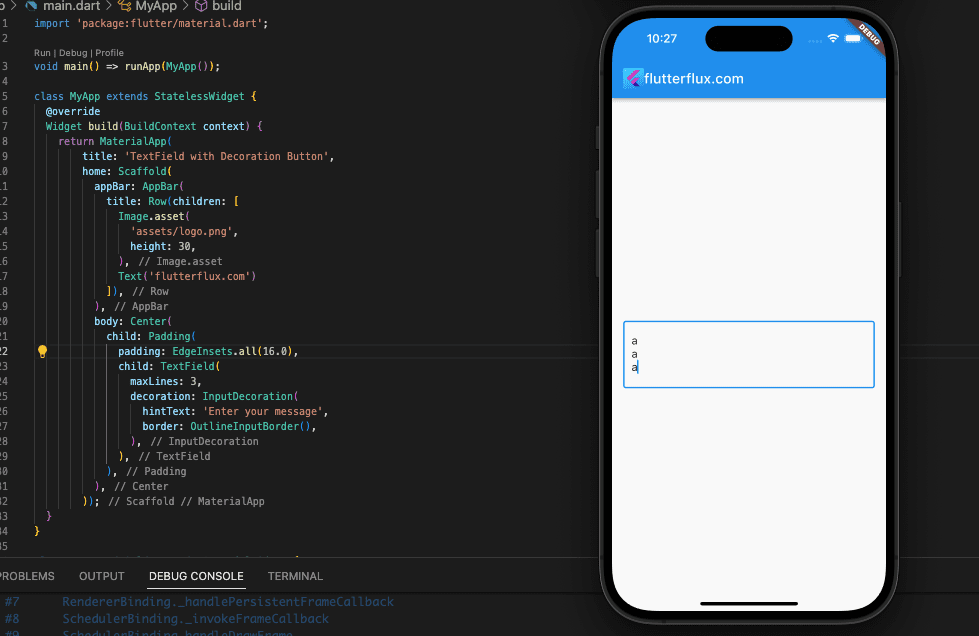
Example:
TextField(
  maxLines: 3,
  decoration: InputDecoration(
    hintText: 'Enter your message',
    border: OutlineInputBorder(),
  ),
)
The Text Field in Flutter have three lines because the MaxLines attribute has been set to 3. With the aid of the decoration attribute, a border and a suggestion can be added to a text box. The minimum number of lines can be set via the minLines property. In addition, you can make the text box grow as the user types by setting the expands property to true.
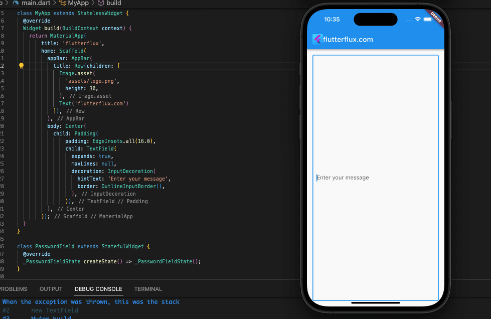
Example:
TextField(
                  expands: true,
                  maxLines: null,
                  decoration: InputDecoration(
                    hintText: 'Enter your message',
                    border: OutlineInputBorder(),
                  ),
                )
this example, the minLines property is set to 3, which means the text field will have at least three lines. The maxLines property is set to null, which means the text field can have any number of lines. The expands property is set to true, which means the Text Field in Flutter will expand as the user types.
Number text field
A numeric text field is an Text Field in Flutter that can only take numbers. The TextField widget’s keyboardType attribute can be set to TextInputType.number to provide this effect. Non-numerical characters cannot be entered into this field when a user taps on it and a numeric keyboard appears.
Example code:
TextField(
  keyboardType: TextInputType.number,
  decoration: InputDecoration(
    labelText: 'Enter a number',
    border: OutlineInputBorder(),
  ),
),
A text box with a label “Input a number” and a border can be created with the right settings to limit user input to numbers.
Email text field
To implement an email Text Field in Flutter, we recommended use the TextFormField widget and assign its keyboardType property to TextInputType.emailAddress. Doing so will present a keyboard designed for entering email addresses and validate the input to confirm that it is a legitimate email address.
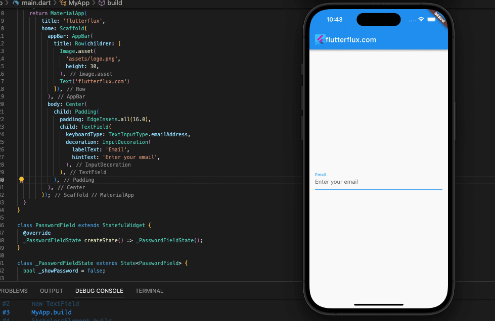
Example code:
TextFormField(
  keyboardType: TextInputType.emailAddress,
  decoration: InputDecoration(
    labelText: 'Email',
    hintText: 'Enter your email',
  ),
  validator: (value) {
    if (value.isEmpty) {
      return 'Please enter your email';
    } else if (!RegExp(r'\b[A-Z0-9._%+-]+@[A-Z0-9.-]+\.[A-Z]{2,}\b', caseSensitive: false).hasMatch(value)) {
      return 'Please enter a valid email';
    }
    return null;
  },
),
In this example, TextFormField is equipped with a validator function that examines whether the input is either empty or an invalid email address using a regular expression. The decoration and validation can be tailored to your specifications.
Date and time text field
To create a date and time textfield in Flutter, you can use the DateTimePickerFormField widget from the flutter_form_builder package.
Eexample code:
import 'package:flutter/material.dart';
import 'package:flutter_form_builder/flutter_form_builder.dart';

void main() => runApp(MyApp());

class MyApp extends StatelessWidget {
  @override
  Widget build(BuildContext context) {
    return MaterialApp(
        title: 'flutterflux',
        home: Scaffold(
          appBar: AppBar(
            title: Row(children: [
              Image.asset(
                'assets/logo.png',
                height: 30,
              ),
              Text('flutterflux.com')
            ]),
          ),
          body: Center(
            child: Padding(
              padding: EdgeInsets.all(16.0),
              child: MyForm(),
            ),
          ),
        ));
  }
}

class MyForm extends StatefulWidget {
  @override
  _MyFormState createState() => _MyFormState();
}

class _MyFormState extends State {
  final GlobalKey _formKey = GlobalKey();

  @override
  Widget build(BuildContext context) {
    return Scaffold(
      body: Padding(
        padding: const EdgeInsets.all(10.0),
        child: FormBuilder(
          key: _formKey,
          child: Column(
            children: [
              FormBuilderDateTimePicker(
                name: 'date',
                decoration: InputDecoration(labelText: 'Date'),
                inputType: InputType.date,
                initialDate: DateTime.now(),
              ),
              SizedBox(height: 10.0),
              FormBuilderDateTimePicker(
                name: 'time',
                decoration: InputDecoration(labelText: 'Time'),
                inputType: InputType.time,
                initialTime: TimeOfDay.now(),
              ),
            ],
          ),
        ),
      ),
      floatingActionButton: FloatingActionButton(
        onPressed: () {
          if (_formKey.currentState!.saveAndValidate()) {
            final formData = _formKey.currentState!.value;
            print(formData);
          }
        },
        child: Icon(Icons.save),
      ),
    );
  }
}
In this example, we are using the FormBuilderDateTimePicker widget to create two textfields, one for the date and one for the time. We are setting the initial values to the current date and time, and using the saveAndValidate method to print the form data when the user clicks the save button. You can customize the appearance and behavior of the textfields by passing different parameters to the FormBuilderDateTimePicker widget.
Dropdown text field
To create a dropdown text field in Flutter, you can use the DropdownButtonFormField widget.
Example code:
import 'package:flutter/material.dart';

void main() {
  runApp(MyApp());
}

class MyApp extends StatelessWidget {
  @override
  Widget build(BuildContext context) {
    return MaterialApp(
      title: 'My App',
      home: MyHomePage(),
    );
  }
}

class MyHomePage extends StatefulWidget {
  MyHomePage({Key? key}) : super(key: key);

  @override
  _MyHomePageState createState() => _MyHomePageState();
}

class _MyHomePageState extends State {
  String _selectedValue = '';

  @override
  Widget build(BuildContext context) {
    return Scaffold(
      appBar: AppBar(
        title: Row(children: [
          Image.asset(
            'assets/logo.png',
            height: 30,
          ),
          Text('flutterflux.com')
        ]),
      ),
      body: Padding(
        padding: const EdgeInsets.all(16.0),
        child: Column(
          crossAxisAlignment: CrossAxisAlignment.stretch,
          children: [
            DropdownTextField(
              labelText: 'Select a value',
              dropdownValues: ['Option 1', 'Option 2', 'Option 3'],
              onChanged: (value) {
                setState(() {
                  _selectedValue = value;
                });
              },
            ),
            SizedBox(height: 16.0),
            Text('Selected value: $_selectedValue'),
          ],
        ),
      ),
    );
  }
}

class DropdownTextField extends StatefulWidget {
  final String labelText;
  final List dropdownValues;
  final Function(String) onChanged;

  const DropdownTextField({
    Key? key,
    required this.labelText,
    required this.dropdownValues,
    required this.onChanged,
  }) : super(key: key);

  @override
  _DropdownTextFieldState createState() => _DropdownTextFieldState();
}

class _DropdownTextFieldState extends State {
  String? _selectedValue;

  @override
  Widget build(BuildContext context) {
    return Padding(
      padding: const EdgeInsets.symmetric(vertical: 8.0),
      child: InputDecorator(
        decoration: InputDecoration(
          labelText: widget.labelText,
          border: OutlineInputBorder(),
        ),
        child: DropdownButtonHideUnderline(
          child: DropdownButton(
            value: _selectedValue,
            isDense: true,
            onChanged: (newValue) {
              setState(() {
                _selectedValue = newValue;
              });
              widget.onChanged(newValue!);
            },
            items: widget.dropdownValues
                .map<DropdownMenuItem>((String value) {
              return DropdownMenuItem(
                value: value,
                child: Text(value),
              );
            }).toList(),
          ),
        ),
      ),
    );
  }
}
This code creates a simple dropdown text field with three options. The selected option is stored in the _selectedValue variable.
Autocomplete Text Field in Flutter
A Flutter autocomplete text field widget takes user input and returns a suggested list of items. This widget is frequently seen in auto-completion-enabled text fields including search bars and address fields.
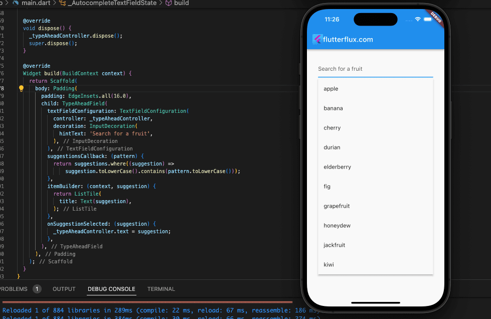
To create an autocomplete text field in Flutter, you can utilize the flutter_typeahead package to your project by adding it to your pubspec.yaml file and running flutter pub get.
Example code:
import 'package:flutter/material.dart';
import 'package:flutter_typeahead/flutter_typeahead.dart';

void main() {
  runApp(MyApp());
}

class MyApp extends StatelessWidget {
  @override
  Widget build(BuildContext context) {
    return MaterialApp(
      title: 'My App',
      home: MyHomePage(),
    );
  }
}

class MyHomePage extends StatefulWidget {
  MyHomePage({Key? key}) : super(key: key);

  @override
  _MyHomePageState createState() => _MyHomePageState();
}

class _MyHomePageState extends State {
  String _selectedValue = '';

  @override
  Widget build(BuildContext context) {
    return Scaffold(
      appBar: AppBar(
        title: Row(children: [
          Image.asset(
            'assets/logo.png',
            height: 30,
          ),
          Text('flutterflux.com')
        ]),
      ),
      body: Padding(
        padding: const EdgeInsets.all(16.0),
        child: AutocompleteTextField(),
      ),
    );
  }
}

class AutocompleteTextField extends StatefulWidget {
  @override
  _AutocompleteTextFieldState createState() => _AutocompleteTextFieldState();
}

class _AutocompleteTextFieldState extends State {
  final TextEditingController _typeAheadController = TextEditingController();

  final List suggestions = [
    'apple',
    'banana',
    'cherry',
    'durian',
    'elderberry',
    'fig',
    'grapefruit',
    'honeydew',
    'jackfruit',
    'kiwi',
  ];

  @override
  void dispose() {
    _typeAheadController.dispose();
    super.dispose();
  }

  @override
  Widget build(BuildContext context) {
    return Scaffold(
      body: Padding(
        padding: EdgeInsets.all(16.0),
        child: TypeAheadField(
          textFieldConfiguration: TextFieldConfiguration(
            controller: _typeAheadController,
            decoration: InputDecoration(
              hintText: 'Search for a fruit',
            ),
          ),
          suggestionsCallback: (pattern) {
            return suggestions.where((suggestion) =>
                suggestion.toLowerCase().contains(pattern.toLowerCase()));
          },
          itemBuilder: (context, suggestion) {
            return ListTile(
              title: Text(suggestion),
            );
          },
          onSuggestionSelected: (suggestion) {
            _typeAheadController.text = suggestion;
          },
        ),
      ),
    );
  }
}
The TypeAheadField widget uses a TextFieldConfiguration that delegates text manipulation to a TextEditingController. In addition, it makes use of the suggestionsCallback argument to generate a list of suggestions, the itemBuilder parameter to indicate how each proposal should be shown in the dropdown, and the onSuggestionSelected function to handle the action to be made when a suggestion is selected.
Conclusion
Text Field in Flutter is a powerful tool for building text-input user interfaces. It allows text color, font, and size customization. It also accepts email, password, and phone number inputs, making it versatile.
Text Field in Flutter validates user input. Developers can set rules for user input, including length, characters, and format. This ensures the application’s data is accurate.
Text Field in Flutter is a crucial widget that lets developers create interactive and user-friendly interfaces. Forms, search bars, and other text input features in mobile and web apps can be built using its flexibility, customization, and validation. read too How to Create ActionChip in Flutter

