Custom Appbar in Flutter – a Material Design widget, displays the app’s title, navigation buttons, and other actions or widgets in the top app bar. It is a typical UI element used to navigate and access app functionalities. The top-of-screen Custom AppBar can be customized with attributes and widgets to match the app’s style and functionality. Customize the backdrop color, elevation, header text, leading and trailing icons, and more. Custom Appbar in Flutter widget helps create a consistent and user-friendly design.
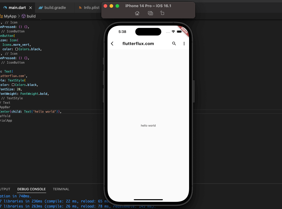
With the AppBar widget and some tweaks to its parameters, you can make a unique appbar in Flutter that has the features and appearance you want.
Example Custom Appbar in Flutter:
AppBar(
  backgroundColor: Colors.white,
  elevation: 0,
  leading: IconButton(
    icon: Icon(
      Icons.arrow_back_ios,
      color: Colors.black,
    ),
    onPressed: () {
      Navigator.pop(context);
    },
  ),
  actions: [
    IconButton(
      icon: Icon(
        Icons.search,
        color: Colors.black,
      ),
      onPressed: () {},
    ),
    IconButton(
      icon: Icon(
        Icons.more_vert,
        color: Colors.black,
      ),
      onPressed: () {},
    ),
  ],
  title: Text(
    'My Custom Appbar',
    style: TextStyle(
      color: Colors.black,
      fontSize: 20,
      fontWeight: FontWeight.bold,
    ),
  ),
)
In this example, we’ve customized the following properties of the AppBar widget:
- backgroundColor: set to white to create a white appbar
- elevation: set to 0 to remove the shadow below the appbar
- leading: added an IconButton widget with a back arrow icon and a navigation function to go back to the previous screen
- actions: added two IconButton widgets with search and more_vert icons, and empty onPressed functions for now
- title: added a Text widget with custom text style properties, including black color, bold font weight, and font size of 20
More widgets can be added to the leading and actions attributes, the appbar’s background color can be changed, a logo can be added, and more. The list of potential outcomes is limitless.
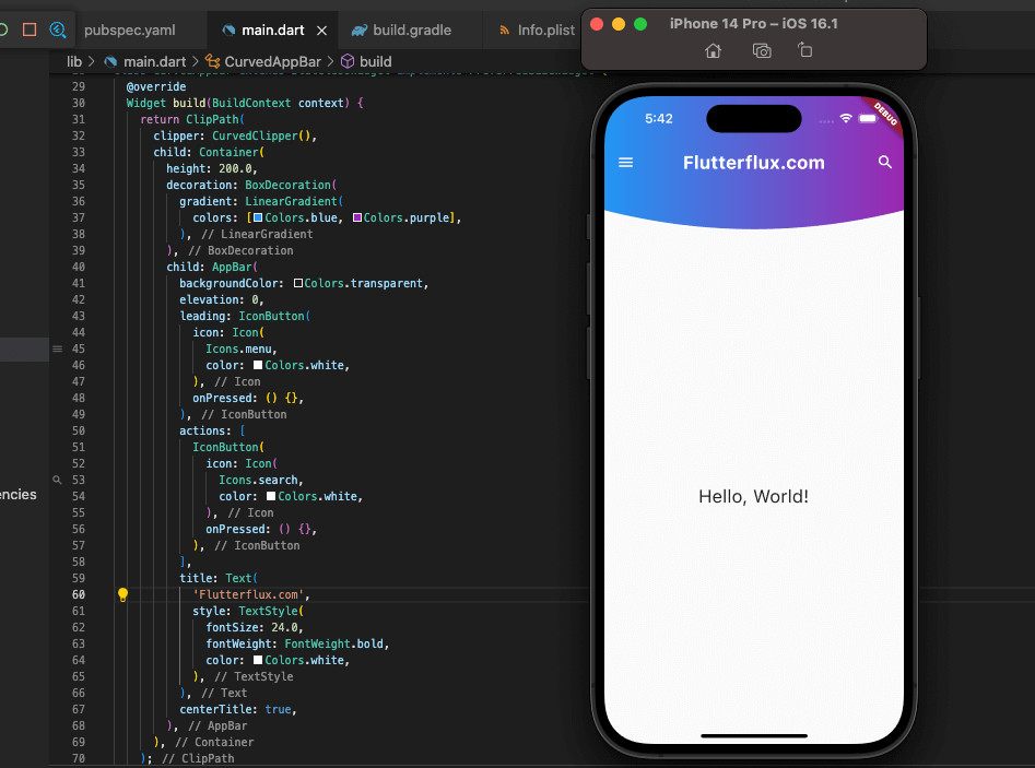
Custom Curved appbar in flutter
you can use the ClipPath widget along with the CustomClipper class.
Example CurvedAppBar:
class CurvedAppBar extends StatelessWidget implements PreferredSizeWidget {
  @override
  Widget build(BuildContext context) {
    return ClipPath(
      clipper: CurvedClipper(),
      child: Container(
        height: 200.0,
        decoration: BoxDecoration(
          gradient: LinearGradient(
            colors: [Colors.blue, Colors.purple],
          ),
        ),
        child: AppBar(
          backgroundColor: Colors.transparent,
          elevation: 0,
          leading: IconButton(
            icon: Icon(
              Icons.menu,
              color: Colors.white,
            ),
            onPressed: () {},
          ),
          actions: [
            IconButton(
              icon: Icon(
                Icons.search,
                color: Colors.white,
              ),
              onPressed: () {},
            ),
          ],
          title: Text(
            'Curved AppBar',
            style: TextStyle(
              fontSize: 24.0,
              fontWeight: FontWeight.bold,
              color: Colors.white,
            ),
          ),
          centerTitle: true,
        ),
      ),
    );
  }

  @override
  Size get preferredSize => Size.fromHeight(200.0);
}

class CurvedClipper extends CustomClipper<Path> {
  @override
  Path getClip(Size size) {
    var path = Path();
    path.lineTo(0, size.height - 50);
    path.quadraticBezierTo(
        size.width / 2, size.height, size.width, size.height - 50);
    path.lineTo(size.width, 0);
    path.close();
    return path;
  }

  @override
  bool shouldReclip(CustomClipper<Path> oldClipper) => false;
}
In this example, we’ve created a custom widget called CurvedAppBar that implements the PreferredSizeWidget interface to set the height of the appbar. The appbar is wrapped inside a Container with a height of 200.0 and a gradient background. The AppBar widget has been customized with the following properties:
- backgroundColor: set to transparent to make the appbar background transparent
- elevation: set to 0 to remove the shadow below the appbar
- leading: added an IconButton widget with a menu icon and an empty onPressed function for now
- actions: added an IconButton widget with a search icon and an empty onPressed function for now
- title: added a Text widget with custom text style properties, including white color, bold font weight, and font size of 24
- centerTitle: set to true to center the appbar title
The CurvedClipper class is employed for constructing a curved design for the appbar. It is an extension of the CustomClipper class and replaces its getClip method with a Path object that defines the curved shape. The shouldReclip method is disabled to prevent superfluous clipping. The ClipPath widget is utilized to clip the Container with the curved shape.
To personalize the curved appbar even more, you can modify the gradient colors, supplement more widgets to the leading and actions properties, and more. The CurvedAppBar widget can be substituted for the customary AppBar in your Flutter application.
Complete Code for a Curved AppBar in Flutter:
import 'package:flutter/material.dart';

void main() {
  runApp(MyApp());
}

class MyApp extends StatelessWidget {
  @override
  Widget build(BuildContext context) {
    return MaterialApp(
      title: 'Curved AppBar Demo',
      theme: ThemeData(
        primarySwatch: Colors.blue,
      ),
      home: Scaffold(
        appBar: CurvedAppBar(),
        body: Center(
          child: Text(
            'Hello, World!',
            style: TextStyle(fontSize: 24.0),
          ),
        ),
      ),
    );
  }
}

class CurvedAppBar extends StatelessWidget implements PreferredSizeWidget {
  @override
  Widget build(BuildContext context) {
    return ClipPath(
      clipper: CurvedClipper(),
      child: Container(
        height: 200.0,
        decoration: BoxDecoration(
          gradient: LinearGradient(
            colors: [Colors.blue, Colors.purple],
          ),
        ),
        child: AppBar(
          backgroundColor: Colors.transparent,
          elevation: 0,
          leading: IconButton(
            icon: Icon(
              Icons.menu,
              color: Colors.white,
            ),
            onPressed: () {},
          ),
          actions: [
            IconButton(
              icon: Icon(
                Icons.search,
                color: Colors.white,
              ),
              onPressed: () {},
            ),
          ],
          title: Text(
            'Curved AppBar',
            style: TextStyle(
              fontSize: 24.0,
              fontWeight: FontWeight.bold,
              color: Colors.white,
            ),
          ),
          centerTitle: true,
        ),
      ),
    );
  }

  @override
  Size get preferredSize => Size.fromHeight(200.0);
}

class CurvedClipper extends CustomClipper<Path> {
  @override
  Path getClip(Size size) {
    var path = Path();
    path.lineTo(0, size.height - 50);
    path.quadraticBezierTo(
        size.width / 2, size.height, size.width, size.height - 50);
    path.lineTo(size.width, 0);
    path.close();
    return path;
  }

  @override
  bool shouldReclip(CustomClipper<Path> oldClipper) => false;
}
Flutter application features a curved appbar created using the CurvedAppBar widget within the Scaffold widget, instead of the typical AppBar. The CurvedClipper class is used to produce a curved shape for the appbar, with the shouldReclip method set to false to minimize unnecessary clipping. The ClipPath widget is employed to clip the Container with the curved shape. Numerous properties and widgets are customized to achieve the desired appearance and functionality of the appbar.
AppBar with search
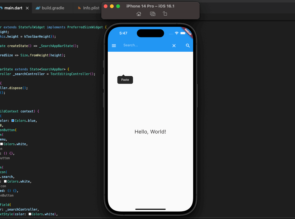
To create a search bar in a Flutter AppBar, just drop a TextField widget into the AppBar and adjust its parameters to suit your needs.
example SearchAppBar:
class SearchAppBar extends StatefulWidget implements PreferredSizeWidget {
  final double height;

  SearchAppBar({this.height = kToolbarHeight});

  @override
  _SearchAppBarState createState() => _SearchAppBarState();

  @override
  Size get preferredSize => Size.fromHeight(height);
}

class _SearchAppBarState extends State<SearchAppBar> {
  TextEditingController _searchController = TextEditingController();

  @override
  void dispose() {
    _searchController.dispose();
    super.dispose();
  }

  @override
  Widget build(BuildContext context) {
    return AppBar(
      backgroundColor: Colors.blue,
      elevation: 0,
      leading: IconButton(
        icon: Icon(
          Icons.menu,
          color: Colors.white,
        ),
        onPressed: () {},
      ),
      actions: [
        IconButton(
          icon: Icon(
            Icons.search,
            color: Colors.white,
          ),
          onPressed: () {},
        ),
      ],
      title: TextField(
        controller: _searchController,
        style: TextStyle(color: Colors.white),
        decoration: InputDecoration(
          hintText: 'Search...',
          hintStyle: TextStyle(color: Colors.white60),
          border: InputBorder.none,
          suffixIcon: IconButton(
            icon: Icon(
              Icons.clear,
              color: Colors.white,
            ),
            onPressed: () {
              _searchController.clear();
            },
          ),
        ),
      ),
    );
  }
}
In this example, we’ve created a custom widget called SearchAppBar that implements the PreferredSizeWidget interface to set the height of the appbar. The appbar is customized with the following properties:
- backgroundColor: set to blue to make the appbar background blue
- elevation: set to 0 to remove the shadow below the appbar
- leading: added an IconButton widget with a menu icon and an empty onPressed function for now
- actions: added an IconButton widget with a search icon and an empty onPressed function for now
- title: added a TextField widget with custom text style properties and an InputDecoration widget with a search hint text and a clear button
The _searchController variable is used to control the search input and clear button. The TextField widget has been customized with the following properties:
- controller: set to the
_searchControllervariable to control the search input and clear button - style: set to white to make the search text white
- decoration: added an InputDecoration widget with a search hint text, a hint text style with white60 color, a border set to none to remove the underline, and a clear button with an IconButton widget
You can further customize the search appbar by changing the background color, adding more widgets to the leading and actions properties, and more. The SearchAppBar widget can be used in place of the regular AppBar in your Flutter app.
complete example of an AppBar with search function in Flutter:
import 'package:flutter/material.dart';

void main() {
  runApp(MyApp());
}

class MyApp extends StatelessWidget {
  @override
  Widget build(BuildContext context) {
    return MaterialApp(
      title: 'Search AppBar Demo',
      theme: ThemeData(
        primarySwatch: Colors.blue,
      ),
      home: Scaffold(
        appBar: SearchAppBar(),
        body: Center(
          child: Text(
            'Hello, World!',
            style: TextStyle(fontSize: 24.0),
          ),
        ),
      ),
    );
  }
}

class SearchAppBar extends StatefulWidget implements PreferredSizeWidget {
  final double height;

  SearchAppBar({this.height = kToolbarHeight});

  @override
  _SearchAppBarState createState() => _SearchAppBarState();

  @override
  Size get preferredSize => Size.fromHeight(height);
}

class _SearchAppBarState extends State<SearchAppBar> {
  TextEditingController _searchController = TextEditingController();

  @override
  void dispose() {
    _searchController.dispose();
    super.dispose();
  }

  @override
  Widget build(BuildContext context) {
    return AppBar(
      backgroundColor: Colors.blue,
      elevation: 0,
      leading: IconButton(
        icon: Icon(
          Icons.menu,
          color: Colors.white,
        ),
        onPressed: () {},
      ),
      actions: [
        IconButton(
          icon: Icon(
            Icons.search,
            color: Colors.white,
          ),
          onPressed: () {},
        ),
      ],
      title: TextField(
        controller: _searchController,
        style: TextStyle(color: Colors.white),
        decoration: InputDecoration(
          hintText: 'Search...',
          hintStyle: TextStyle(color: Colors.white60),
          border: InputBorder.none,
          suffixIcon: IconButton(
            icon: Icon(
              Icons.clear,
              color: Colors.white,
            ),
            onPressed: () {
              _searchController.clear();
            },
          ),
        ),
      ),
    );
  }
}
A Flutter app with a search function has been developed in this instance, featuring an AppBar. To replace the standard AppBar in the Scaffold widget, the SearchAppBar widget is employed. To obtain the desired appearance and functionality, the appbar is customized with various properties and widgets. The _searchController variable is utilized to manage the search input and clear button. The TextField widget has been adjusted with several properties to handle the search input.
Conclusion
The Flutter AppBar is a simple way to give your app’s navigation bar a unique appearance and feel. You may create your own unique AppBar utilizing multiple widgets like Container, Row, and Column and altering its design with characteristics like color, height, and padding.

