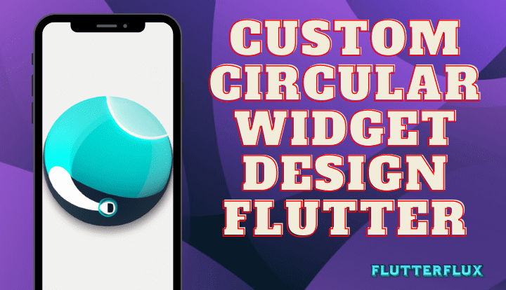
Custom Circular Widget in Flutter are UI elements of that shape that we customize. You can use these widgets for everything from buttons and icons to progress bars and user avatars.
With Flutter, developers can easily create custom circular widget using the Container widget and BoxDecoration class. By setting the shape property of the BoxDecoration to BoxShape.circle, developers can create circular containers that can be further customized with colors, borders, shadows, and other properties.
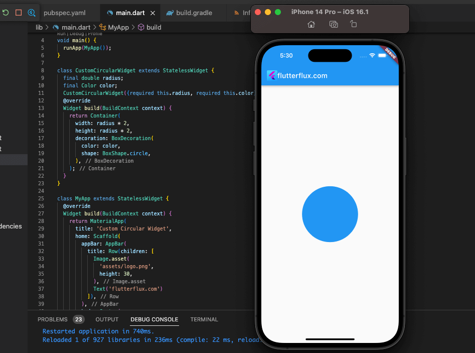
Custom Circular Widget in Flutter can help app developers make designs that look good and work well together.
However, I can provide you with the steps to create Custom Circular Widget in Flutter:
- Import the required libraries:
import 'package:flutter/material.dart';
import 'dart:math';
- Create a custom widget class:
class CustomCircularWidget extends StatelessWidget {
  final double radius;
  final Color color;

  CustomCircularWidget({required this.radius, required this.color});

  @override
  Widget build(BuildContext context) {
    return Container(
      width: radius * 2,
      height: radius * 2,
      decoration: BoxDecoration(
        color: color,
        shape: BoxShape.circle,
      ),
    );
  }
}
- Use the custom widget in your app:
class MyApp extends StatelessWidget {
  @override
  Widget build(BuildContext context) {
    return MaterialApp(
     title: 'Custom Circular Widget',
     home: Scaffold(
       appBar: AppBar(
         title: Text('Custom Circular Widget'),
        ),
       body: Center(
         child: CustomCircularWidget(
           radius: 50.0,
           color: Colors.blue,
          ),
        ),
      ),
    );
  }
}
- Run the app and see the custom circular widget in action.
Note: Other features, like as border, shadow, etc., allow for even greater widget customization.
Complete example of a custom circular widget in Flutter:
import 'package:flutter/material.dart';
import 'dart:math';

void main() {
  runApp(MyApp());
}

class CustomCircularWidget extends StatelessWidget {
  final double radius;
  final Color color;

  CustomCircularWidget({required this.radius, required this.color});

  @override
  Widget build(BuildContext context) {
    return Container(
      width: radius * 2,
      height: radius * 2,
      decoration: BoxDecoration(
        color: color,
        shape: BoxShape.circle,
      ),
    );
  }
}

class MyApp extends StatelessWidget {
  @override
  Widget build(BuildContext context) {
    return MaterialApp(
      title: 'Custom Circular Widget',
      home: Scaffold(
        appBar: AppBar(
          title: Text('Custom Circular Widget'),
        ),
        body: Center(
          child: CustomCircularWidget(
            radius: 50.0,
            color: Colors.blue,
          ),
        ),
      ),
    );
  }
}
this example, we created a custom circular widget class called CustomCircularWidget. This widget takes two required parameters: radius and color. We used these parameters to create a circular container with the specified radius and color using the BoxDecoration class.
Then, we put the custom widget to use in our app by making a Scaffold widget with a CustomCircularWidget instance within its body.
The next step was to encase our program in a MaterialApp widget and give it a title in an AppBar at the top of the screen.
Conclusion
Circular Widget in Flutter are a popular and helpful tool for developing engaging and modern UIs. Buttons, icons, avatars, and progress indicators are just some of the many uses for SVGs. Circular widgets like as the CircularProgressIndicator, CircularAvatar, and CircularIconButton are pre-installed in Flutter, and they can be styled and animated as desired. Making circular widgets and integrating them into your Flutter app is a breeze with Flutter’s robust development tools and community assistance. read too Create Random Colors in listview Flutter

