ExpansionTile in Flutter widget allows developers to make tiles that may be collapsed or expanded. To utilize this widget, build a list of elements, each of which may be extended and collapsed to reveal and conceal sub-information or sub-items.
A Flutter widget tile has a header and a body. The title of the tile is normally displayed in the header, which is a Text widget, while the tile’s body, which is a widget, displays any further information or sub-items.
Some of the ExpansionTile in Flutter widget features allow for fine-grained control over its visual look and its interaction with other widgets. Some examples of such characteristics are:
- leading: A widget to display before the title of the tile.
- trailing: A widget to display after the title of the tile.
- initiallyExpanded: The default state for the tile, either expanded or collapsed.
- children: A list of widgets to display when the tile is expanded.
ExpansionTile in Flutter is a useful widget for creating collapsible/expandable lists of items in a Flutter app. It provides a clean and organized way to display additional information or sub-items without cluttering the UI.
list ExpansionTile in flutter:
ExpansionTile:
An expandable widget consisting of a header and body may be made with this material design widget. If you click the header, the main section will enlarge to show you more details.
import 'package:flutter/material.dart';

void main() {
  runApp(MyApp());
}

class MyApp extends StatelessWidget {
  @override
  Widget build(BuildContext context) {
    return MaterialApp(
      title: 'ExpansionTile Example',
      home: MyHomePage(),
    );
  }
}

class MyHomePage extends StatefulWidget {
  @override
  _MyHomePageState createState() => _MyHomePageState();
}

class _MyHomePageState extends State {
  bool _isExpanded = false;

  @override
  Widget build(BuildContext context) {
    return Scaffold(
      appBar: AppBar(
        title: Row(children: [
          Image.asset(
            'assets/logo.png',
            height: 30,
          ),
          Text('flutterflux.com')
        ]),
      ),
      body: Center(
        child: ExpansionTile(
          title: Text('Click me to expand'),
          trailing: Icon(Icons.arrow_drop_down),
          backgroundColor: Colors.grey.shade100,
          children: [
            ListTile(
              title: Text('Option 1'),
            ),
            ListTile(
              title: Text('Option 2'),
            ),
            ListTile(
              title: Text('Option 3'),
            ),
          ],
          onExpansionChanged: (bool isExpanded) {
            setState(() {
              _isExpanded = isExpanded;
            });
          },
        ),
      ),
    );
  }
}
The MyHomePage StatefulWidget is created with a boolean _isExpanded variable to track if the ExpansionTile is expanded. The Scaffold widget is returned by the build method of MyHomePage and contains a Center widget, which has an ExpansionTile in Flutter widget as its child.
When text is provided for the ExpansionTile in Flutter title property, it appears above the tile. To the right of the tile, we’ve added an Icon widget whose trailing property is set to the Icons.arrow drop down icon.
The tile’s background has a light gray color because the backgroundColor attribute was set to Colors.grey.shade100. Furthermore, we specify that the children property is a collection of ListTile widgets, each of which presents a unique menu item.
finally, a callback function is assigned to the onExpansionChanged property; this method is triggered whenever the tile’s expansion state changes (as indicated by the isExpanded parameter). As the tile is enlarged, we check this variable to see if the expansion state has changed and update the app accordingly.
CustomExpansionTile in Flutter:
This widget allows you to modify the widget’s appearance and is an expansion of the ExpansionTile in Flutter widget. You have control over aesthetic elements like background color and font size.
import 'package:flutter/material.dart';

class CustomExpansionTile extends StatefulWidget {
  final String title;
  final Widget leading;
  final Widget trailing;
  final List children;

  CustomExpansionTile(
      {required this.title,
      required this.leading,
      required this.trailing,
      required this.children});

  @override
  _CustomExpansionTileState createState() => _CustomExpansionTileState();
}

class _CustomExpansionTileState extends State {
  bool _isExpanded = false;

  @override
  Widget build(BuildContext context) {
    return ExpansionTile(
      title: Row(
        children: [
          if (widget.leading != null) widget.leading,
          Expanded(
            child: Text(
              widget.title,
              style: Theme.of(context).textTheme.subtitle1,
            ),
          ),
          if (widget.trailing != null) widget.trailing,
        ],
      ),
      onExpansionChanged: (isExpanded) {
        setState(() {
          _isExpanded = isExpanded;
        });
      },
      children: widget.children,
    );
  }
}

class MyApp extends StatelessWidget {
  @override
  Widget build(BuildContext context) {
    return MaterialApp(
      title: 'CustomExpansionTile Example',
      home: Scaffold(
        appBar: AppBar(
          title: Row(children: [
            Image.asset(
              'assets/logo.png',
              height: 30,
            ),
            Text('flutterflux.com')
          ]),
        ),
        body: ListView(
          children: [
            CustomExpansionTile(
              title: 'Tile 1',
              leading: Icon(Icons.ac_unit),
              trailing: Icon(Icons.keyboard_arrow_down),
              children: [
                Text('Child 1'),
                Text('Child 2'),
                Text('Child 3'),
              ],
            ),
            CustomExpansionTile(
              title: 'Tile 2',
              leading: Icon(Icons.access_alarm),
              trailing: Icon(Icons.keyboard_arrow_down),
              children: [
                Text('Child 1'),
                Text('Child 2'),
                Text('Child 3'),
              ],
            ),
            CustomExpansionTile(
              title: 'Tile 3',
              leading: Icon(Icons.accessibility),
              trailing: Icon(Icons.keyboard_arrow_down),
              children: [
                Text('Child 1'),
                Text('Child 2'),
                Text('Child 3'),
              ],
            ),
          ],
        ),
      ),
    );
  }
}

void main() {
  runApp(MyApp());
}
We have utilized a MaterialApp in this case, which comprises a ListView that comprises three occurrences of the CustomExpansionTile widget. Each widget has its individual titles, leading and trailing icons, and children widgets. As the tile is expanded, its corresponding children widgets will appear.
GroupedExpansionTile:
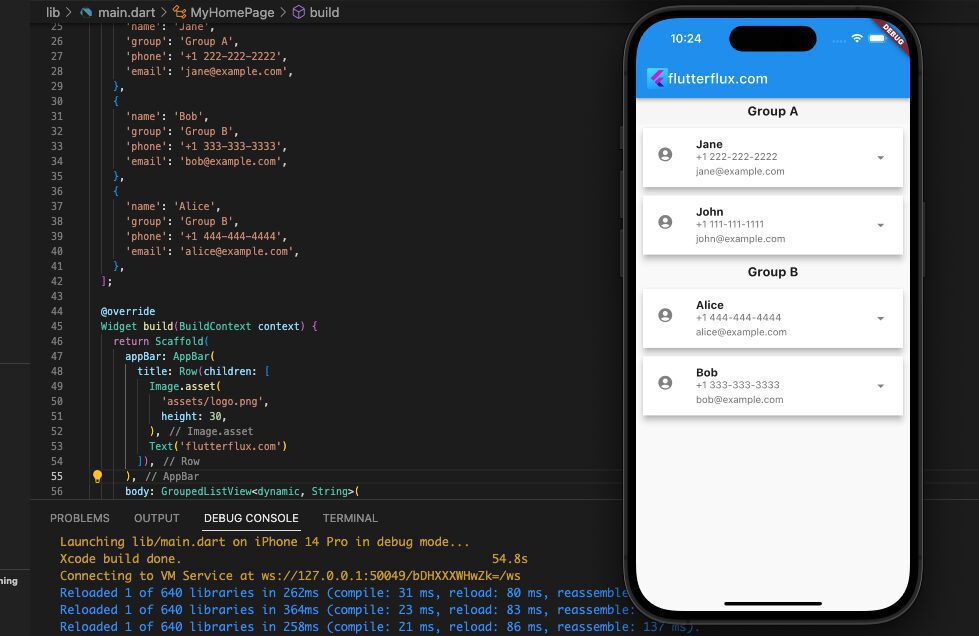
This widget is for displaying a list of grouped ExpansionTiles. When you need to categorize a big number of ExpansionTile in Flutter, this tool comes in handy. The GroupedExpansionTile widget is not a core component of Flutter. The grouped list package, however, makes its creation possible. See a full implementation of the GroupedExpansionTile widget in Flutter right here.
AnimatedExpansionTile:
This widget is quite similar to the ExpansionTile in Flutter widget; however, it includes an animation when the tile is extended or collapsed. Including this feature can make your app more engaging.
import 'package:flutter/material.dart';

void main() {
  runApp(MyApp());
}

class MyApp extends StatelessWidget {
  @override
  Widget build(BuildContext context) {
    return MaterialApp(
      title: 'Animated Expansion Tile Demo',
      home: MyHomePage(),
    );
  }
}

class MyHomePage extends StatefulWidget {
  @override
  _MyHomePageState createState() => _MyHomePageState();
}

class _MyHomePageState extends State {
  bool _isExpanded = false;

  @override
  Widget build(BuildContext context) {
    return Scaffold(
      appBar: AppBar(
        title: Row(children: [
          Image.asset(
            'assets/logo.png',
            height: 30,
          ),
          Text('flutterflux.com')
        ]),
      ),
      body: Center(
        child: AnimatedExpansionTile(
          leading: Icon(Icons.verified_user),
          trailing: Icon(Icons.arrow_downward),
          title: Text('Click to expand'),
          onExpansionChanged: (bool value) {
            setState(() {
              _isExpanded = value;
            });
          },
          children: [
            _isExpanded
                ? Container(
                    padding: EdgeInsets.all(16.0),
                    child: Text(
                      'Hello, world!',
                      style: TextStyle(fontSize: 18.0),
                    ),
                  )
                : SizedBox.shrink(),
          ],
        ),
      ),
    );
  }
}

class AnimatedExpansionTile extends StatefulWidget {
  final Widget title;
  final Widget leading;
  final Widget trailing;
  final List children;
  final bool initiallyExpanded;
  final ValueChanged onExpansionChanged;

  const AnimatedExpansionTile({
    Key? key,
    required this.title,
    required this.leading,
    required this.trailing,
    this.children = const [],
    this.initiallyExpanded = false,
    required this.onExpansionChanged,
  }) : super(key: key);

  @override
  _AnimatedExpansionTileState createState() => _AnimatedExpansionTileState();
}

class _AnimatedExpansionTileState extends State
    with SingleTickerProviderStateMixin {
  AnimationController? _controller;
  Animation? _heightFactor;

  bool _isExpanded = false;

  @override
  void initState() {
    super.initState();
    _isExpanded = widget.initiallyExpanded;
    _controller = AnimationController(
      vsync: this,
      duration: Duration(milliseconds: 200),
    );
    _heightFactor = _controller!.drive(
      CurveTween(curve: Curves.fastOutSlowIn),
    );
    if (_isExpanded) {
      _controller!.value = 1.0;
    }
  }

  @override
  void dispose() {
    _controller!.dispose();
    super.dispose();
  }

  void _handleTap() {
    setState(() {
      _isExpanded = !_isExpanded;
      if (_isExpanded) {
        _controller!.forward();
      } else {
        _controller!.reverse().then((void value) {
          if (!mounted) return;
          setState(() {
            // Rebuild without widget.children.
          });
        });
      }
      widget.onExpansionChanged(_isExpanded);
    });
  }

  Widget _buildChildren(BuildContext context, Widget? child) {
    return Container(
      padding: EdgeInsets.symmetric(vertical: 8.0),
      child: Column(
        mainAxisSize: MainAxisSize.min,
        children: [
          ListTile(
            onTap: _handleTap,
            title: widget.title,
            leading: widget.leading,
            trailing: widget.trailing,
          ),
          ClipRect(
            child: Align(
              heightFactor: _heightFactor!.value,
              child: child,
            ),
          ),
        ],
      ),
    );
  }

  @override
  Widget build(BuildContext context) {
    final bool closed = !_isExpanded && _controller!.isDismissed;
    return AnimatedBuilder(
      animation: _controller!.view,
      builder: _buildChildren,
      child: closed ? null : Column(children: widget.children),
    );
  }
}
AccordionTile:
The ExpansionTile in Flutter widget is quite similar to this one, except that just a single tile can be enlarged at a time. The expansion of a single tile causes the collapse of all other tiles.
import 'package:flutter/material.dart';

void main() {
  runApp(MyApp());
}

class MyApp extends StatelessWidget {
  @override
  Widget build(BuildContext context) {
    return MaterialApp(
      title: 'AccordionTile Example',
      debugShowCheckedModeBanner: false,
      home: Scaffold(
        appBar: AppBar(
          title: Row(children: [
            Image.asset(
              'assets/logo.png',
              height: 30,
            ),
            Text('flutterflux.com')
          ]),
        ),
        body: ListView(
          padding: EdgeInsets.all(1.0),
          children: [
            AccordionTile(
              title: 'Accordion Title 1',
              content: Text(
                  'This app will display three AccordionTile widgets in a ListView. When the user taps on the expand/collapse button, the content of the AccordionTile will be displayed or hidden..'),
            ),
            AccordionTile(
              title: 'Accordion Title 2',
              content: Text(
                  'This app will display three AccordionTile widgets in a ListView. When the user taps on the expand/collapse button, the content of the AccordionTile will be displayed or hidden.'),
            ),
            AccordionTile(
              title: 'Accordion Title 3',
              content: Text(
                  'This app will display three AccordionTile widgets in a ListView. When the user taps on the expand/collapse button, the content of the AccordionTile will be displayed or hidden..'),
            ),
          ],
        ),
      ),
    );
  }
}

class AccordionTile extends StatefulWidget {
  final String title;
  final Widget content;

  AccordionTile({required this.title, required this.content});

  @override
  _AccordionTileState createState() => _AccordionTileState();
}

class _AccordionTileState extends State {
  bool _isExpanded = false;

  @override
  Widget build(BuildContext context) {
    return Card(
      child: Column(
        children: [
          ListTile(
            title: Text(widget.title),
            trailing: IconButton(
              icon: Icon(_isExpanded ? Icons.expand_less : Icons.expand_more),
              onPressed: () {
                setState(() {
                  _isExpanded = !_isExpanded;
                });
              },
            ),
          ),
          if (_isExpanded) widget.content,
        ],
      ),
    );
  }
}
This app will display three AccordionTile widgets in a ListView. When the user taps on the expand/collapse button, the content of the AccordionTile will be displayed or hidden.
MultiLevelExpansionTile:
You may make a multilevel ExpansionTile with the help of this handy widget. If you have a lot of data to present and want to classify it, this is a helpful tool.
import 'package:flutter/material.dart';

void main() {
  runApp(MyApp());
}

class MyApp extends StatelessWidget {
  @override
  Widget build(BuildContext context) {
    return MaterialApp(
      title: 'AccordionTile Example',
      debugShowCheckedModeBanner: false,
      home: Scaffold(
          appBar: AppBar(
            title: Row(children: [
              Image.asset(
                'assets/logo.png',
                height: 30,
              ),
              Text('flutterflux.com')
            ]),
          ),
          body: MultiLevelExpansionTile()),
    );
  }
}

class MultiLevelExpansionTile extends StatefulWidget {
  @override
  _MultiLevelExpansionTileState createState() =>
      _MultiLevelExpansionTileState();
}

class _MultiLevelExpansionTileState extends State {
  bool _isExpanded1 = false;
  bool _isExpanded2 = false;
  bool _isExpanded3 = false;

  @override
  Widget build(BuildContext context) {
    return Scaffold(
      body: SingleChildScrollView(
        child: Column(
          children: [
            ExpansionTile(
              title: Text('Level 1'),
              children: [
                ListTile(
                  title: Text('Level 1 - Item 1'),
                  onTap: () {},
                ),
                ListTile(
                  title: Text('Level 1 - Item 2'),
                  onTap: () {},
                ),
                ExpansionTile(
                  title: Text('Level 2'),
                  children: [
                    ListTile(
                      title: Text('Level 2 - Item 1'),
                      onTap: () {},
                    ),
                    ListTile(
                      title: Text('Level 2 - Item 2'),
                      onTap: () {},
                    ),
                    ExpansionTile(
                      title: Text('Level 3'),
                      children: [
                        ListTile(
                          title: Text('Level 3 - Item 1'),
                          onTap: () {},
                        ),
                        ListTile(
                          title: Text('Level 3 - Item 2'),
                          onTap: () {},
                        ),
                      ],
                      onExpansionChanged: (value) {
                        setState(() {
                          _isExpanded3 = value;
                        });
                      },
                      initiallyExpanded: _isExpanded3,
                    ),
                  ],
                  onExpansionChanged: (value) {
                    setState(() {
                      _isExpanded2 = value;
                    });
                  },
                  initiallyExpanded: _isExpanded2,
                ),
              ],
              onExpansionChanged: (value) {
                setState(() {
                  _isExpanded1 = value;
                });
              },
              initiallyExpanded: _isExpanded1,
            ),
          ],
        ),
      ),
    );
  }
}
This example creates a three-level MultiLevelExpansionTile. We utilize boolean variables _isExpanded1–3 to track each level’s condition. OnExpansionChanged modifies the boolean variable when a tile is expanded or collapsed. initiallyExpanded determines each tile’s initial condition.
ExpansionPanelList:
You can make a list of ExpansionPanel with this widget. Each panel can be made bigger or smaller to show more or less information. When you have a lot of information to show and want to divide it into sections, this widget can help.
import 'package:flutter/material.dart';

void main() {
  runApp(MyApp());
}

class MyApp extends StatelessWidget {
  @override
  Widget build(BuildContext context) {
    return MaterialApp(
      title: 'AccordionTile Example',
      debugShowCheckedModeBanner: false,
      home: Scaffold(
          appBar: AppBar(
            title: Row(children: [
              Image.asset(
                'assets/logo.png',
                height: 30,
              ),
              Text('flutterflux.com')
            ]),
          ),
          body: MyExpansionPanelList()),
    );
  }
}

class MyExpansionPanelList extends StatefulWidget {
  @override
  _MyExpansionPanelListState createState() => _MyExpansionPanelListState();
}

class _MyExpansionPanelListState extends State {
  List _items = [
    Item(
      headerValue: 'Item 1',
      expandedValue: 'Details for Item 1',
    ),
    Item(
      headerValue: 'Item 2',
      expandedValue: 'Details for Item 2',
    ),
    Item(
      headerValue: 'Item 3',
      expandedValue: 'Details for Item 3',
    ),
  ];

  @override
  Widget build(BuildContext context) {
    return Scaffold(
      body: SingleChildScrollView(
        child: Container(
          padding: EdgeInsets.all(16),
          child: ExpansionPanelList(
            expansionCallback: (int index, bool isExpanded) {
              setState(() {
                _items[index].isExpanded = !isExpanded;
              });
            },
            children: _items.map((Item item) {
              return ExpansionPanel(
                headerBuilder: (BuildContext context, bool isExpanded) {
                  return ListTile(
                    title: Text(item.headerValue),
                  );
                },
                body: ListTile(
                  title: Text(item.expandedValue),
                  subtitle: Text('Click to edit'),
                  trailing: Icon(Icons.edit),
                  onTap: () {
                    // Navigate to edit screen
                  },
                ),
                isExpanded: item.isExpanded,
              );
            }).toList(),
          ),
        ),
      ),
    );
  }
}

class Item {
  String headerValue;
  String expandedValue;
  bool isExpanded;

  Item({
    required this.headerValue,
    required this.expandedValue,
    this.isExpanded = false,
  });
}
Using the Item class, this example generates a list of items with both a header value and an expanded value. The widget ExpansionPanelList is used to show the expandable/collapsible list of objects.
The expansionCallback function is used to toggle the expansion of each item when it is clicked. The children property of the ExpansionPanelList is set to a List of ExpansionTile in Flutter widgets, each with a header and a body.
In the body, there is a ListTile widget that displays the expanded value of the item, along with a subtitle and a trailing icon. The onTap function is used to navigate to an edit screen when the item is clicked.
Conclusion
ExpansionTile in Flutter widget lets users expand and collapse content. Its simple but robust API makes it a good choice for many applications. The ExpansionTile in Flutter widget may help you create a clean and straightforward user experience for a basic app with a few expandable sections or a complicated interface with many nested levels of content. Flutter reactive programming paradigm lets you keep your app fluid and efficient as your user interface grows. read too Types of Button in Flutter with Example


