Set Initial Value Dropdown Flutter – Flutter dropdown widget presents a user-selectable list. Design your app’s dropdown button widget. Flutter simple dropdown example:
To set initial value dropdown flutter, you need to:
- Make a dropdown list.
- Choose items to set as initial values.
- Define an item variable.
- Wrap the value dropdown flutter widget with a StatefulBuilder.
- Set the dropdown to the specified item variable.
- In the onChanged callback, update the selected items variable with the new selected number of items.
To get an illustration of how to populate a multiselect Set initial value dropdown flutter, take a look at this sample of code:
List<String> items = ['Item 1', 'Item 2', 'Item 3', 'Item 4'];
List<String> selectedItems = ['Item 1', 'Item 3'];

String dropdownValue;

StatefulBuilder(
  builder: (BuildContext context, StateSetter setState) {
   return DropdownButton<String>(
      value: dropdownValue,
      onChanged: (String newValue) {
        setState(() {
          dropdownValue = newValue;
          selectedItems.add(newValue);
        });
      },
      items: items.map<DropdownMenuItem<String>>((String value) {
       return DropdownMenuItem<String>(
          value: value,
          child: Row(
            children: <Widget>[
              Checkbox(
                value: selectedItems.contains(value),
                onChanged: (bool selected) {
                  setState(() {
                   if (selected) {
                      selectedItems.add(value);
                    }else {
                      selectedItems.remove(value);
                    }
                  });
                },
              ),
              Text(value),
            ],
          ),
        );
      }).toList(),
    );
  },
);
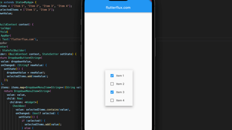
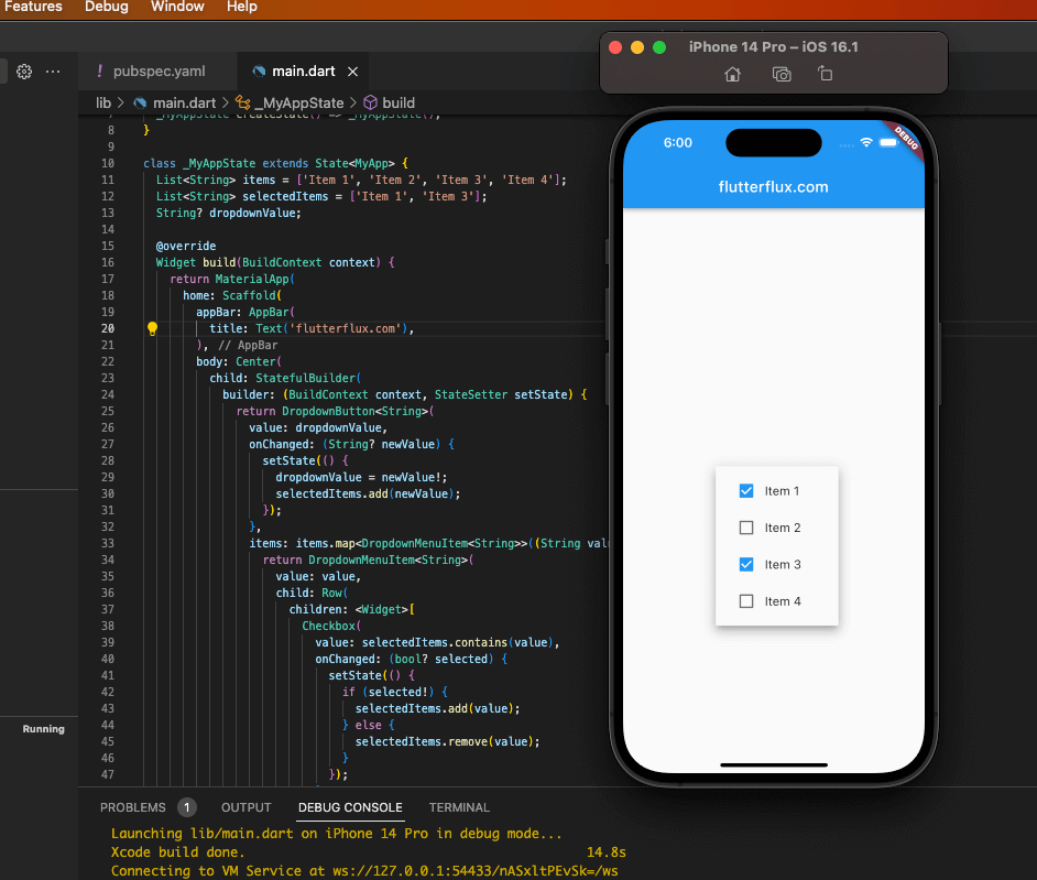
Here, “Item 1” and “Item 3” are used as the default values for the specified items. The onChanged event handler receives a new set of selected items and stores them in the selectedItems array. DropdownValue stores the widget value. StatefulBuilder reconstructs the widget when selections change. Checkboxes and labels list items.
Complete example of a multiselect dropdown in Flutter with initial values:
import 'package:flutter/material.dart';

void main() => runApp(MyApp());

class MyAppextends StatefulWidget {
  @override
  _MyAppState createState() => _MyAppState();
}

class _MyAppStateextends State<MyApp> {
  List<String> items = ['Item 1', 'Item 2', 'Item 3', 'Item 4'];
  List<String> selectedItems = ['Item 1', 'Item 3'];
  String dropdownValue;

  @override
  Widget build(BuildContext context) {
   return MaterialApp(
      home: Scaffold(
        appBar: AppBar(
          title: Text('Multiselect Dropdown Example'),
        ),
        body: Center(
          child: StatefulBuilder(
            builder: (BuildContext context, StateSetter setState) {
             return DropdownButton<String>(
                value: dropdownValue,
                onChanged: (String newValue) {
                  setState(() {
                    dropdownValue = newValue;
                    selectedItems.add(newValue);
                  });
                },
                items: items.map<DropdownMenuItem<String>>((String value) {
                 return DropdownMenuItem<String>(
                    value: value,
                    child: Row(
                      children: <Widget>[
                        Checkbox(
                          value: selectedItems.contains(value),
                          onChanged: (bool selected) {
                            setState(() {
                             if (selected) {
                                selectedItems.add(value);
                              }else {
                                selectedItems.remove(value);
                              }
                            });
                          },
                        ),
                        Text(value),
                      ],
                    ),
                  );
                }).toList(),
              );
            },
          ),
        ),
      ),
    );
  }
}
The items list has four items, however the selectedItems list only has two (‘Item 1’ and ‘Item 3’ in this case). Editing dropdownValue changes the widget value. StatefulBuilder recreates the widget after a new selection. Checkboxes and labels list items. The widget recomputes the selectedItems list when a checkbox is selected or deselected.
Conclusion
Using the DropdownButton widget is straightforward and customizable, allowing developers to control the appearance and behavior of the drop-down menu to suit their specific application needs.

