How to Use Radio Button in Flutter – Radio buttons are a type of UI widget commonly used in mobile and web applications to present a set of mutually exclusive options to the user. In Flutter, Radio Button in Flutter can be created using the Radio widget.
To create a group of radio buttons, you can use the RadioListTile widget. This widget combines the Radio widget with a ListTile, which provides additional features such as a label and a trailing icon.
Radio Button in Flutter
An example of Radio Button in Flutter:
enum Gender { male, female }

class MyRadioGroup extends StatefulWidget {
  @override
  _MyRadioGroupState createState() => _MyRadioGroupState();
}

class _MyRadioGroupState extends State {
  Gender _gender = Gender.male;

  @override
  Widget build(BuildContext context) {
    return Column(
      children: [
        RadioListTile(
          title: const Text('Male'),
          value: Gender.male,
          groupValue: _gender,
          onChanged: (Gender value) {
            setState(() {
              _gender = value;
            });
          },
        ),
        RadioListTile(
          title: const Text('Female'),
          value: Gender.female,
          groupValue: _gender,
          onChanged: (Gender value) {
            setState(() {
              _gender = value;
            });
          },
        ),
      ],
    );
  }
}
Example options (male and female) are represented by an enum, and a stateful widget is built to remember the user’s selection (via the _gender variable). The _gender variable is updated whenever the user selects a new option, and we do this by creating two RadioListTile widget, one for each option, and using the groupValue and value attributes to determine the selected choice.
Take into account that RadioListTile is only a handy encasing for the Radio widget with a label and a description. If you want more control over the look and feel of the radio buttons, you may alternatively utilize the Radio Button in Flutter widget directly.
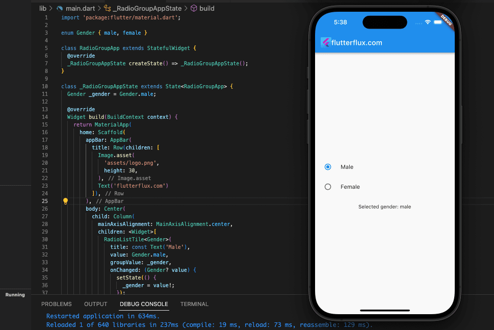
Here is a full implementation of a radio button group in a Flutter app:
import 'package:flutter/material.dart';

enum Gender { male, female }

class RadioGroupApp extends StatefulWidget {
  @override
  _RadioGroupAppState createState() => _RadioGroupAppState();
}

class _RadioGroupAppState extends State {
  Gender _gender = Gender.male;

  @override
  Widget build(BuildContext context) {
    return MaterialApp(
      home: Scaffold(
        appBar: AppBar(
          title: Row(children: [
            Image.asset(
              'assets/logo.png',
              height: 30,
            ),
            Text('flutterflux.com')
          ]),
        ),
        body: Center(
          child: Column(
            mainAxisAlignment: MainAxisAlignment.center,
            children: [
              RadioListTile(
                title: const Text('Male'),
                value: Gender.male,
                groupValue: _gender,
                onChanged: (Gender? value) {
                  setState(() {
                    _gender = value!;
                  });
                },
              ),
              RadioListTile(
                title: const Text('Female'),
                value: Gender.female,
                groupValue: _gender,
                onChanged: (Gender? value) {
                  setState(() {
                    _gender = value!;
                  });
                },
              ),
              SizedBox(height: 20),
              Text('Selected gender: ${_gender.toString().split('.').last}')
            ],
          ),
        ),
      ),
    );
  }
}

void main() {
  runApp(RadioGroupApp());
}
With the use of the _gender variable, we can construct a stateful widget, or “stateful widget,” RadioGroupApp, that remembers the gender that was last chosen. Then, we’ll make two RadioListTile widget, one for each gender, and set their _gender variable based on the groupValue and value properties when a user makes a selection. Also, a Text widget is placed beneath the Radio Button in Flutter group to show the presently selected gender.
Simply copy and paste the code into a new Flutter project, and then execute it in your preferred Flutter environment.
Horizontal Radio Button in Flutter
With the Row widget and a collection of Radio widgets, you can make horizontal Radio Button in Flutter. this full code:
import 'package:flutter/material.dart';

class HorizontalRadioButtonsScreen extends StatefulWidget {
  @override
  _HorizontalRadioButtonsScreenState createState() => _HorizontalRadioButtonsScreenState();
}

class _HorizontalRadioButtonsScreenState extends State {
  int _selectedOption = 1;

  @override
  Widget build(BuildContext context) {
    return Scaffold(
      appBar: AppBar(
        title: Text('Horizontal Radio Buttons Example'),
      ),
      body: Center(
        child: Column(
          mainAxisAlignment: MainAxisAlignment.center,
          children: [
            Text('Select an option:'),
            SizedBox(height: 10),
            Row(
              mainAxisAlignment: MainAxisAlignment.center,
              children: [
                Radio(
                  value: 1,
                  groupValue: _selectedOption,
                  onChanged: (value) {
                    setState(() {
                      _selectedOption = value;
                    });
                  },
                ),
                Text('Option 1'),
                SizedBox(width: 20),
                Radio(
                  value: 2,
                  groupValue: _selectedOption,
                  onChanged: (value) {
                    setState(() {
                      _selectedOption = value;
                    });
                  },
                ),
                Text('Option 2'),
                SizedBox(width: 20),
                Radio(
                  value: 3,
                  groupValue: _selectedOption,
                  onChanged: (value) {
                    setState(() {
                      _selectedOption = value;
                    });
                  },
                ),
                Text('Option 3'),
              ],
            ),
            SizedBox(height: 20),
            Text('Selected option: $_selectedOption'),
          ],
        ),
      ),
    );
  }
}
Here’s some code for the statefulWidget HorizontalRadioButtonsScreen, We make a Text widget inside the Column to show the user a prompt, a Row widget to hold the Radio Button in Flutter and their labels, and a third Text widget to show the user’s choice.
Selecting a radio button will trigger the onChanged function, which will then update the _selectedOption variable. In order to update the widget tree to reflect the new selection, the setState function is needed.
Custom Radio Button GridView Flutter
Following these instructions will allow you to build a unique Radio Button in Flutter GridView:
- Make a new Radio Button class:
class RadioButtonModel {
  String label;
  bool isSelected;

  RadioButtonModel({required this.label, required this.isSelected});
}
- Initiate a set of RadioButtonModel objects:
List radioButtonList = [
  RadioButtonModel(label: 'Option 1', isSelected: false),
  RadioButtonModel(label: 'Option 2', isSelected: false),
  RadioButtonModel(label: 'Option 3', isSelected: false),
  RadioButtonModel(label: 'Option 4', isSelected: false),
  RadioButtonModel(label: 'Option 5', isSelected: false),
];
- Create a stateful control for the Radio Button in Flutter gridview:
class CustomRadioGrid extends StatefulWidget {
  @override
  _CustomRadioGridState createState() => _CustomRadioGridState();
}

class _CustomRadioGridState extends State {
  int selectedIndex = -1;

  @override
  Widget build(BuildContext context) {
    return GridView.builder(
      gridDelegate: SliverGridDelegateWithFixedCrossAxisCount(
        crossAxisCount: 2,
        childAspectRatio: 3,
        crossAxisSpacing: 10,
        mainAxisSpacing: 10,
      ),
      itemCount: radioButtonList.length,
      itemBuilder: (BuildContext context, int index) {
        return InkWell(
          onTap: () {
            setState(() {
              selectedIndex = index;
              radioButtonList.forEach((element) => element.isSelected = false);
              radioButtonList[index].isSelected = true;
            });
          },
          child: Container(
            decoration: BoxDecoration(
              borderRadius: BorderRadius.circular(5),
              border: Border.all(color: Colors.grey),
              color: selectedIndex == index ? Colors.blue : Colors.white,
            ),
            child: Center(
              child: Text(
                radioButtonList[index].label,
                style: TextStyle(
                  color: selectedIndex == index ? Colors.white : Colors.black,
                ),
              ),
            ),
          ),
        );
      },
    );
  }
}
- The CustomRadioGrid widget may do the following for your app:
class MyApp extends StatelessWidget {
  @override
  Widget build(BuildContext context) {
    return MaterialApp(
      title: 'Custom Radio Button GridView',
      home: Scaffold(
        appBar: AppBar(
          title: Text('Custom Radio Button GridView'),
        ),
        body: Padding(
          padding: EdgeInsets.all(10),
          child: CustomRadioGrid(),
        ),
      ),
    );
  }
}
To implement the Radio Button in Flutter display in the preceding code, we employ the GridView.builder() widget. The InkWell widget is also being utilized to track when the Radio Button in Flutter are tapped. If a user selects a radio button, the selectedIndex variable will be modified and the accompanying RadioButtonModel object’s isSelected property will be set to true. At last, we’re modifying the user interface to work with the selectedIndex variable and the isSelected attribute of the RadioButtonModel objects.
Complete Example Radio Button GridView Flutter
here is the full code for the custom Radio Button GridView:
import 'package:flutter/material.dart';

class RadioButtonModel {
  String label;
  bool isSelected;

  RadioButtonModel({required this.label, required this.isSelected});
}

List radioButtonList = [
  RadioButtonModel(label: 'Option 1', isSelected: false),
  RadioButtonModel(label: 'Option 2', isSelected: false),
  RadioButtonModel(label: 'Option 3', isSelected: false),
  RadioButtonModel(label: 'Option 4', isSelected: false),
  RadioButtonModel(label: 'Option 5', isSelected: false),
];

class CustomRadioGrid extends StatefulWidget {
  @override
  _CustomRadioGridState createState() => _CustomRadioGridState();
}

class _CustomRadioGridState extends State {
  int selectedIndex = -1;

  @override
  Widget build(BuildContext context) {
    return GridView.builder(
      gridDelegate: SliverGridDelegateWithFixedCrossAxisCount(
        crossAxisCount: 2,
        childAspectRatio: 3,
        crossAxisSpacing: 10,
        mainAxisSpacing: 10,
      ),
      itemCount: radioButtonList.length,
      itemBuilder: (BuildContext context, int index) {
        return InkWell(
          onTap: () {
            setState(() {
              selectedIndex = index;
              radioButtonList.forEach((element) => element.isSelected = false);
              radioButtonList[index].isSelected = true;
            });
          },
          child: Container(
            decoration: BoxDecoration(
              borderRadius: BorderRadius.circular(5),
              border: Border.all(color: Colors.grey),
              color: selectedIndex == index ? Colors.blue : Colors.white,
            ),
            child: Center(
              child: Text(
                radioButtonList[index].label,
                style: TextStyle(
                  color: selectedIndex == index ? Colors.white : Colors.black,
                ),
              ),
            ),
          ),
        );
      },
    );
  }
}

class MyApp extends StatelessWidget {
  @override
  Widget build(BuildContext context) {
    return MaterialApp(
      title: 'Custom Radio Button GridView',
      home: Scaffold(
        appBar: AppBar(
        title: Row(children: [
          Image.asset(
            'assets/logo.png',
            height: 30,
          ),
          Text('flutterflux.com')
        ]),
      ),
        body: Padding(
          padding: EdgeInsets.all(10),
          child: CustomRadioGrid(),
        ),
      ),
    );
  }
}

void main() {
  runApp(MyApp());
}
Here, we use the CustomRadioGrid widget to generate a GridView of radio buttons. We are also constructing a list of RadioButtonModel objects to contain all the Radio Button in Flutter, and a RadioButtonModel class to represent individual Radio Button.
After a Radio Button in Flutter is tapped, its selectedIndex is incremented and its corresponding RadioButtonModel object’s isSelected field is set to true. As a last step, we are using the selectedIndex variable and the isSelected attribute of the RadioButtonModel objects to modify the user interface. Mostly, the app’s entry point is the MyApp class, which in turn shows the CustomRadioGrid widget inside Scaffold
The RadioListTile widget allows for the creation of a row of selectable options. example:
enum Gender { male, female }

class MyWidget extends StatefulWidget {
  @override
  _MyWidgetState createState() => _MyWidgetState();
}

class _MyWidgetState extends State {
  Gender _gender = Gender.male;

  @override
  Widget build(BuildContext context) {
    return Row(
      mainAxisAlignment: MainAxisAlignment.center,
      children: [
        RadioListTile(
          title: Text('Male'),
          value: Gender.male,
          groupValue: _gender,
          onChanged: (value) {
            setState(() {
              _gender = value;
            });
          },
        ),
        RadioListTile(
          title: Text('Female'),
          value: Gender.female,
          groupValue: _gender,
          onChanged: (value) {
            setState(() {
              _gender = value;
            });
          },
        ),
      ],
    );
  }
}
The available selections for the radio buttons are defined as members of the enumeration Gender in this case. We then make a MyWidget stateful widget that stores the gender selection as a value.
Using a Row widget, we can line up our two RadioListTile widgets in MyWidget construct method. Each button in a RadioListTile consists of a title, value, groupValue, and onChanged callback. The title displays the button label, while the value represents the button value and the groupValue indicates the selected value. By default, when a user clicks one of these radio button, the value of MyWidget is changed to reflect the user’s selection.
Radio Button in Alertdialog Flutter
StatefulWidget and State classes can be used to construct a Radio Button in Flutter inside an AlertDialog in Flutter, with the selected radio button state being managed by the AlertDialog.
A sample of the Flutter code for an AlertDialog with radio button is as follows:
import 'package:flutter/material.dart';

void main() {
  runApp(MyApp());
}

class MyAlertDialog extends StatefulWidget {
  @override
  _MyAlertDialogState createState() => _MyAlertDialogState();
}

class _MyAlertDialogState extends State {
  int? _selectedRadio;

  @override
  void initState() {
    super.initState();
    _selectedRadio = 0;
  }

  setSelectedRadio(int val) {
    setState(() {
      _selectedRadio = val;
    });
  }

  @override
  Widget build(BuildContext context) {
    return AlertDialog(
      title: Text('Choose an option'),
      content: Column(
        mainAxisSize: MainAxisSize.min,
        children: [
          RadioListTile(
            groupValue: _selectedRadio,
            title: Text('Option 1'),
            value: 1,
            onChanged: (val) {
              setSelectedRadio(val!);
            },
          ),
          RadioListTile(
            groupValue: _selectedRadio,
            title: Text('Option 2'),
            value: 2,
            onChanged: (val) {
              setSelectedRadio(val!);
            },
          ),
          RadioListTile(
            groupValue: _selectedRadio,
            title: Text('Option 3'),
            value: 3,
            onChanged: (val) {
              setSelectedRadio(val!);
            },
          ),
        ],
      ),
      actions: [
        ElevatedButton(
          onPressed: () {
            Navigator.of(context).pop();
          },
          child: Text('Cancel'),
        ),
        ElevatedButton(
          onPressed: () {
            // do something with the selected option
            switch (_selectedRadio) {
              case 1:
                // perform action for option 1
                break;
              case 2:
                // perform action for option 2
                break;
              case 3:
                // perform action for option 3
                break;
            }
            Navigator.of(context).pop();
          },
          child: Text('OK'),
        ),
      ],
    );
  }
}

class MyApp extends StatelessWidget {
  @override
  Widget build(BuildContext context) {
    return MaterialApp(title: 'flutterflux', home: MyHomePage());
  }
}

class MyHomePage extends StatefulWidget {
  const MyHomePage({super.key});

  @override
  State createState() => _MyHomePageState();
}

class _MyHomePageState extends State {
  @override
  Widget build(BuildContext context) {
    return Scaffold(
      appBar: AppBar(
        title: Row(children: [
          Image.asset(
            'assets/logo.png',
            height: 30,
          ),
          Text('flutterflux.com')
        ]),
      ),
      body: Center(
        child: Padding(
          padding: EdgeInsets.all(10),
          child: ElevatedButton(
              onPressed: () {
                showDialog(
                    context: context,
                    builder: (BuildContext context) {
                      return MyAlertDialog();
                    });
              },
              child: Text('show dialog')),
        ),
      ),
    );
  }
}
Here, we’ll make a StatefulWidget called MyAlertDialog and assign a variable named _selectedRadio to it so that we can keep track of which radio button is currently selected.
Each Radio Button in Flutter is individually generated by the RadioListTile widget, and the _selectedRadio variable is kept up-to-date by using setSelectedRadio on each one. At last, we build the AlertDialog with the radio buttons and add the cancel and OK buttons as ElevatedButton widgets
Conclusion
Radio Button in Flutter make it easy for users to pick one item from a list. They need a Radio widget, which needs a groupValue, value, and onChanged callback method. Updating the application state when the radio button is selected is essential to its correct operation. read read too How to make Checkbox in Flutter

