ChoiceChip in Flutter – One option among several is represented by a ChoiceChip, a widget in the material design style. It is generally employed when a user must choose between two or more alternatives that cannot both be correct.
The state of a stateful widget like ChoiceChip can be changed with a tap. The visual depiction of a ChoiceChip changes to reflect its status as a selected option.
Basic Example ChoiceChip in Flutter
ChoiceChip(
  label: Text('Option 1'),
  selected: true,
  onSelected: (bool selected) {
    // Do something when the chip is selected
  },
)
Output

We make a ChoiceChip and label it “Option 1,” making it the default option. The onSelected callback receives the current selection when a user taps a ChoiceChip. This callback can be used to reflect the chosen ChoiceChip status in your app or to trigger other actions.
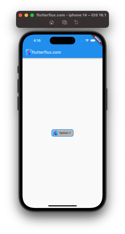
ChoiceChip with Avatar Flutter
With the widget’s avatar attribute, you can insert an image into a ChoiceChip. The icon for the ChoiceChip is represented by a widget that can be set as the avatar property.
use of an image file as the icon for a ChoiceChip widget:
ChoiceChip(
  avatar: Icon(Icons.add),
  label: Text('Add'),
  selected: true,
  onSelected: (bool selected) {
    // Do something when the chip is selected
  },
)
Output
Flutter ChoiceChip Border
The ShapeBorder feature lets users customize ChoiceChip borders. A widget’s outline and shape can be specified using the ShapeBorder class.
ChoiceChip with a custom border:
ChoiceChip(
  label: Text('Option 1'),
  selected: true,
  shape: RoundedRectangleBorder(
    borderRadius: BorderRadius.circular(10),
    side: BorderSide(color: Colors.blue, width: 2),
  ),
  onSelected: (bool selected) {
    // Do something when the chip is selected
  },
)
Output
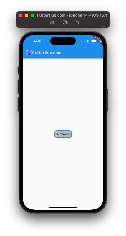
We decided on a RoundedRectangleBorder with a borderRadius of 10 for the ChoiceChip’s form. The border is given a new blue side and a width of 2 pixels.
Multiple ChoiceChip Flutter
Users can select several items at once by creating numerous ChoiceChip widgets. To do this, wrap your ChoiceChip widgets in a Wrap widget and use a Set or List to keep track of the user’s selections.
For several ChoiceChip widgets, see this full example:
import 'package:flutter/material.dart';

void main() => runApp(MyApp());

class MyApp extends StatelessWidget {
  @override
  Widget build(BuildContext context) {
    return MaterialApp(
      title: 'ChoiceChip Demo',
      home: Scaffold(
          appBar: AppBar(
            title: Row(children: [
              Image.asset(
                'assets/logo.png',
                height: 30,
              ),
              Text('flutterflux.com')
            ]),
          ),
          body: Center(child: MultipleChoiceChipWidget())),
    );
  }
}

class MultipleChoiceChipWidget extends StatefulWidget {
  @override
  _MultipleChoiceChipWidgetState createState() =>
      _MultipleChoiceChipWidgetState();
}

class _MultipleChoiceChipWidgetState extends State<MultipleChoiceChipWidget> {
  List<String> selectedChoices = [];

  void _handleChipSelection(String choice) {
    setState(() {
      if (selectedChoices.contains(choice)) {
        selectedChoices.remove(choice);
      } else {
        selectedChoices.add(choice);
      }
    });
  }

  @override
  Widget build(BuildContext context) {
    List<String> choices = ['Option 1', 'Option 2', 'Option 3'];

    return Wrap(
      children: choices
          .map((choice) => ChoiceChip(
                selectedColor: Colors.deepPurple.withOpacity(0.5),
                label: Text(choice),
                selected: selectedChoices.contains(choice),
                onSelected: (selected) => _handleChipSelection(choice),
              ))
          .toList(),
    );
  }
}
Output
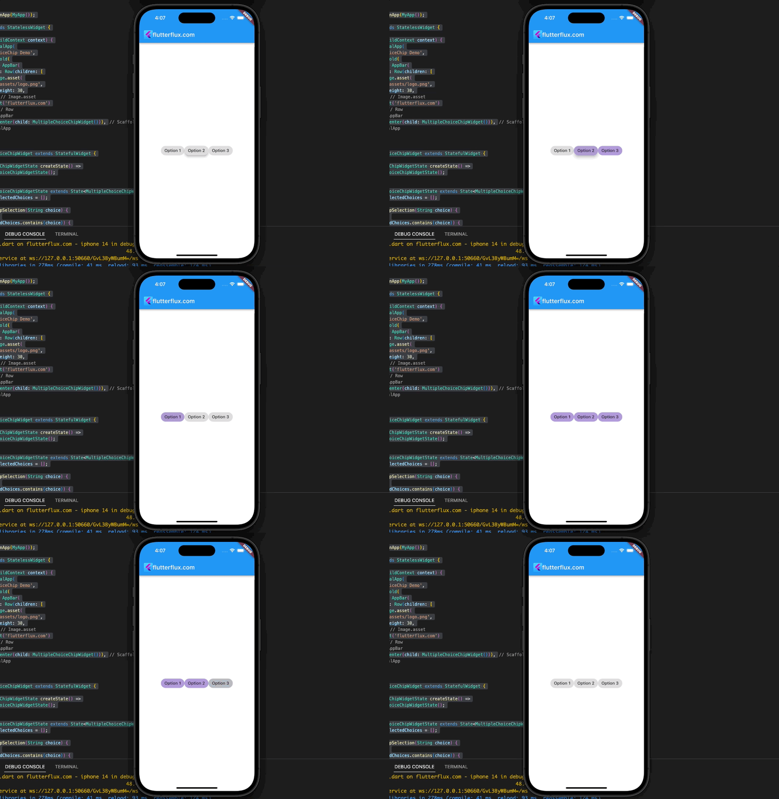
In this example, we’ll make a MultipleChoiceChipWidget that uses a List of String objects named selectedChoices to keep track of the currently chosen options. In order to record the currently picked option in the selectedChoices list, we define a method called _handleChipSelection.
Wrap acts as a container for our ChoiceChip widgets, and for each option in our list, we make a separate ChoiceChip widget with the option’s label and a selected state that is determined by whether or not the option is included in the selectedChoices list. When a user taps a ChoiceChip, the _handleChipSelection method is invoked to reflect their most recent selections.
Change ChoiceChip Size in Flutter
Padding and labelStyle attributes allow you to resize a ChoiceChip widget. An example:
ChoiceChip(
  label: Text('Choice Chip'),
  labelStyle: TextStyle(
    fontSize: 20, // Set the font size of the label
  ),
  padding: EdgeInsets.symmetric(horizontal: 15, vertical: 8), // Set the padding of the chip
  onSelected: (isSelected) {},
),
Output
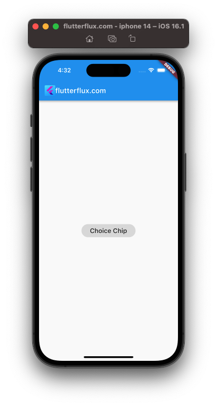
To make the text label within the ChoiceChip more legible, we’ve set its fontSize attribute to 20. Also, we’re telling the ChoiceChip widget that its padding should be an EdgeInsets.symmetric (horizontal: 15, vertical: 8). Because of the extra space required for the label, the overall size of the ChoiceChip will increase.
To make your ChoiceChip widget the perfect size, play around with the fontSize and padding parameters. Case in point:
Transform.scale(
  scale: 1.5, // Set the scale factor
  child: ChoiceChip(
    label: Text('Choice Chip'),
    onSelected: (isSelected) {},
  ),
),

Which is better, a ChoiceChip or a FilterChip?
ChoiceChip selects one option from a list. It shows a list of options and highlights the one the user chooses. ChoiceChip is helpful when you have a limited number of options to present and want to make it clear that the customer can only select one.
When the user wants to choose many options, FilterChip is employed. The user highlights a choice from a list. The user can highlight numerous alternatives till deselecting them. FilterChip is ideal for displaying many options and letting users select numerous options.
Your use case determines which is best. ChoiceChip lets users choose one choice from a list. FilterChip is best for multiple-choice selections.
Conclusion
Developers creating Flutter apps that solicit user input can benefit from using ChoiceChip. ChoiceChip is a viable solution for presenting options and collecting user input in any Flutter app thanks to its adaptability and versatility. read too Flutter InputChip Example


