How to Create Number input field in Flutter – Flutter allows users to enter integers and decimals in text fields and other input widgets. Flutter additionally validates and formats user input.
To create a number input field in Flutter, you can use the TextFormField widget and set its keyboardType property to TextInputType.number. Here is an example:
TextFormField(
 keyboardType: TextInputType.number,
 decoration: InputDecoration(
   labelText: 'Enter a number',
   border: OutlineInputBorder(),
  ),
);
In this example, we have created a TextFormField with a number keyboard type and added a label and border to the input field using the InputDecoration class.
You can also add additional properties to the TextFormField to customize its behavior, such as validator to add input validation, onChanged to handle changes in the Number Input field in Flutter value, and controller to control the value of the input field programmatically.
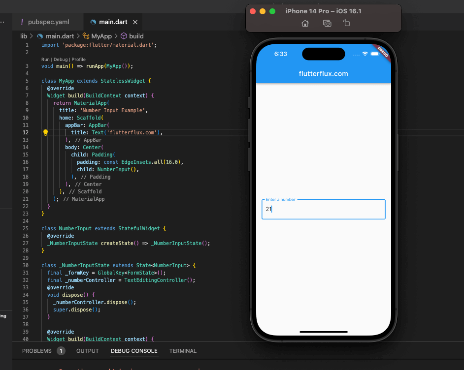
Complete example of a Number Input field in Flutter using a TextFormField widget:
import 'package:flutter/material.dart';

void main() => runApp(MyApp());

class MyAppextends StatelessWidget {
  @override
  Widget build(BuildContext context) {
   return MaterialApp(
      title: 'Number Input Example',
      home: Scaffold(
        appBar: AppBar(
          title: Text('Number Input Example'),
        ),
        body: Center(
          child: Padding(
            padding: const EdgeInsets.all(16.0),
            child: NumberInput(),
          ),
        ),
      ),
    );
  }
}

class NumberInputextends StatefulWidget {
  @override
  _NumberInputState createState() => _NumberInputState();
}

class _NumberInputStateextends State<NumberInput> {
 final _formKey = GlobalKey<FormState>();
 final _numberController = TextEditingController();

  @override
  void dispose() {
    _numberController.dispose();
   super.dispose();
  }

  @override
  Widget build(BuildContext context) {
   return Form(
      key: _formKey,
      child: TextFormField(
        keyboardType: TextInputType.number,
        controller: _numberController,
        validator: (value) {
         if (value == null || value.isEmpty) {
           return 'Please enter a number';
          }
         final number = num.tryParse(value);
         if (number == null) {
           return 'Please enter a valid number';
          }
         return null;
        },
        decoration: InputDecoration(
          labelText: 'Enter a number',
          border: OutlineInputBorder(),
        ),
      ),
    );
  }
}
Here we have a Number Input field in Flutter widget that validates entered numbers using a TextFormField. The TextFormField is contained within the Form widget, which also serves as a validation tool. The input value is tested by the validator function, which reports an error if it is not a valid number. Lastly, the TextEditingController is used to edit the Number Input field in Flutter value from code.
Custom Keyboard Design Flutter
To create a custom keyboard design Number Input field in Flutter, you can follow these steps:
- Create a fresh Flutter project, or load an existing one.
- my_keyboard.dart is an example of a custom keyboard file.
- Import the necessary packages:
flutter/material.dart,flutter/widgets.dart,flutter/services.dart. - Create a new
StatefulWidgetcalledMyKeyboard. TextEditingControllersets keyboard initial state.- Create a
buildmethod for theMyKeyboardwidget that returns aScaffoldwith aTextField. - Change the keyboard appearance by changing
ScaffoldandTextFieldattributes likebackgroundColor,decoration,style, etc. - Add event listeners to the
TextFieldto handle user input and update theTextEditingController. - To process physical keyboard input, use the
RawKeyboardListenerwidget. - To control when the custom keyboard appears and disappears and how text is entered, use the
TextInputservice.
import 'package:flutter/material.dart';

void main() {
  runApp(MaterialApp(
    home: HomePage(),
  ));
}

class HomePage extends StatelessWidget {
  @override
  Widget build(BuildContext context) {
    return Scaffold(
      appBar: AppBar(
        title: Row(children: [
          Image.asset(
            'assets/logo.png',
            height: 30,
          ),
          Text('flutterflux.com')
        ]),
      ),
      body: Center(
          child: Container(
        child: MyKeyboard(),
      )),
    );
  }
}

TextEditingController _textController = TextEditingController();

class MyKeyboard extends StatefulWidget {
  @override
  _MyKeyboardState createState() => _MyKeyboardState();
}

class _MyKeyboardState extends State {
  @override
  Widget build(BuildContext context) {
    return Scaffold(
      backgroundColor: Colors.grey[200],
      body: Column(
        children: [
          Expanded(
            child: Padding(
              padding: EdgeInsets.all(16.0),
              child: TextField(
                controller: _textController,
                decoration: InputDecoration(
                  border: OutlineInputBorder(),
                  hintText: 'Enter text',
                ),
                style: TextStyle(fontSize: 24.0),
                onChanged: (text) {
                  setState(() {
                    _textController.text = text;
                  });
                },
              ),
            ),
          ),
          Keyboard(),
        ],
      ),
    );
  }
}

class Keyboard extends StatelessWidget {
  final List keys = [
    '1',
    '2',
    '3',
    '4',
    '5',
    '6',
    '7',
    '8',
    '9',
    '0',
    'Q',
    'W',
    'E',
    'R',
    'T',
    'Y',
    'U',
    'I',
    'O',
    'P',
    'A',
    'S',
    'D',
    'F',
    'G',
    'H',
    'J',
    'K',
    'L',
    'Z',
    'X',
    'C',
    'V',
    'B',
    'N',
    'M',
    '<',
  ];
  void _handleKeyPress(String key) {
    if (key == '<') {
      String text = _textController.text;
      if (text.isNotEmpty) {
        _textController.text = text.substring(0, text.length - 1);
      }
    } else {
      _textController.text = _textController.text + key;
    }
  }

  @override
  Widget build(BuildContext context) {
    return Container(
      height: 650,
      color: Colors.white,
      child: Column(
        children: [
          Expanded(
            child: GridView.count(
              crossAxisCount: 5,
              children: keys.map((key) {
                return InkWell(
                  onTap: () {
                    _handleKeyPress(key);
                  },
                  child: Container(
                    decoration: BoxDecoration(
                      border: Border.all(color: Colors.grey[300]!),
                    ),
                    child: Center(
                      child: Text(
                        key,
                        style: TextStyle(fontSize: 24.0),
                      ),
                    ),
                  ),
                );
              }).toList(),
            ),
          ),
        ],
      ),
    );
  }
}
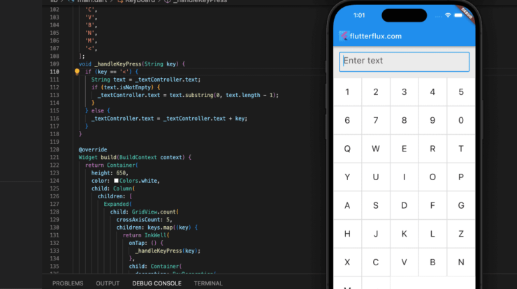
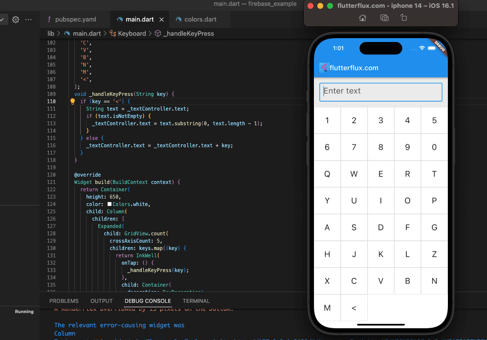
This code produces a MyKeyboard widget that contains a TextField and a custom keyboard design, implemented as a Keyboard widget. The keyboard consists of a grid of buttons depicting the characters and keys. The "<" key deletes the last character in the input box.
Conslucion
Flutter makes bespoke keyboards difficult but rewarding. It’s possible with the correct strategy and resources.
There are numerous ways to create a custom keyboard in Flutter, including using the raw keyboard input APIs, building a soft keyboard using widgets, or using a third-party keyboard library.

