Listview in Flutter widget enables programmers to include a scrollable list of widgets into their Flutter projects. It’s useful for showing off a ton of data neatly and orderly in a grid, columnar, or rowar format. The ListView widget allows for a wide range of customization, including the addition of headers and footers, the setting of individual item heights, and the introduction of separator lines.
There are several types of ListView in Flutter, including:
- ListView: A basic list that scrolls vertically or horizontally.
- ListView.builder: A list that builds its items lazily based on an index, which is useful for large data sets.
- ListView.separated: A list that separates its items with a specified separator widget.
- ListView.custom: A list that uses a custom delegate to build its items.
ListView, one of Flutter’s most popular widgets, organizes and simplifies data presentation.
ListView:
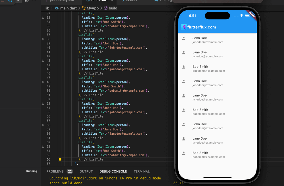
import 'package:flutter/material.dart';

void main() => runApp(FlutterfluxApp());

class FlutterfluxApp extends StatelessWidget {
  @override
  Widget build(BuildContext context) {
    return MaterialApp(
      title: 'Flutter ListView Example',
      home: Scaffold(
        appBar: AppBar(
        title: Row(children: [
          Image.asset(
            'assets/logo.png',
            height: 30,
          ),
          Text('flutterflux.com')
        ]),
      ),
        body: ListView(
          children: [
            ListTile(
              leading: Icon(Icons.person),
              title: Text('John Doe'),
              subtitle: Text('[email protected]'),
            ),
            ListTile(
              leading: Icon(Icons.person),
              title: Text('Jane Doe'),
              subtitle: Text('[email protected]'),
            ),
            ListTile(
              leading: Icon(Icons.person),
              title: Text('Bob Smith'),
              subtitle: Text('[email protected]'),
            ),
          ],
        ),
      ),
    );
  }
}
We have created a MaterialApp with a Scaffold as its home. Inside the Scaffold, we have added a ListView in Flutter widget with three ListTiles. Each ListTile has a leading Icon and a title, which are created using the Icon and Text widgets respectively. Run the app, and you should see a screen with three items in a ListView, each with an icon and a title.
In this case, we’ll see a simple ListView implementation in the Flutter programming language. The number of ListTiles in the ListView in Flutter, their names and icons, and even additional widgets may all be modified.
ListView.builder:
import 'package:flutter/material.dart';

void main() => runApp(FlutterfluxApp());

class FlutterfluxApp extends StatelessWidget {
  @override
  Widget build(BuildContext context) {
    return MaterialApp(
      title: 'ListView.builder Example',
      home: Scaffold(
        appBar: AppBar(
        title: Row(children: [
          Image.asset(
            'assets/logo.png',
            height: 30,
          ),
          Text('flutterflux.com')
        ]),
      ),
        body: ListView.builder(
          itemCount: 20,
          itemBuilder: (BuildContext context, int index) {
            return ListTile(
              title: Text('Item $index'),
              subtitle: Text('Subtitle for item $index'),
              leading: Icon(Icons.account_circle),
              trailing: Icon(Icons.arrow_forward),
              onTap: () {
                print('Tapped on item $index');
              },
            );
          },
        ),
      ),
    );
  }
}
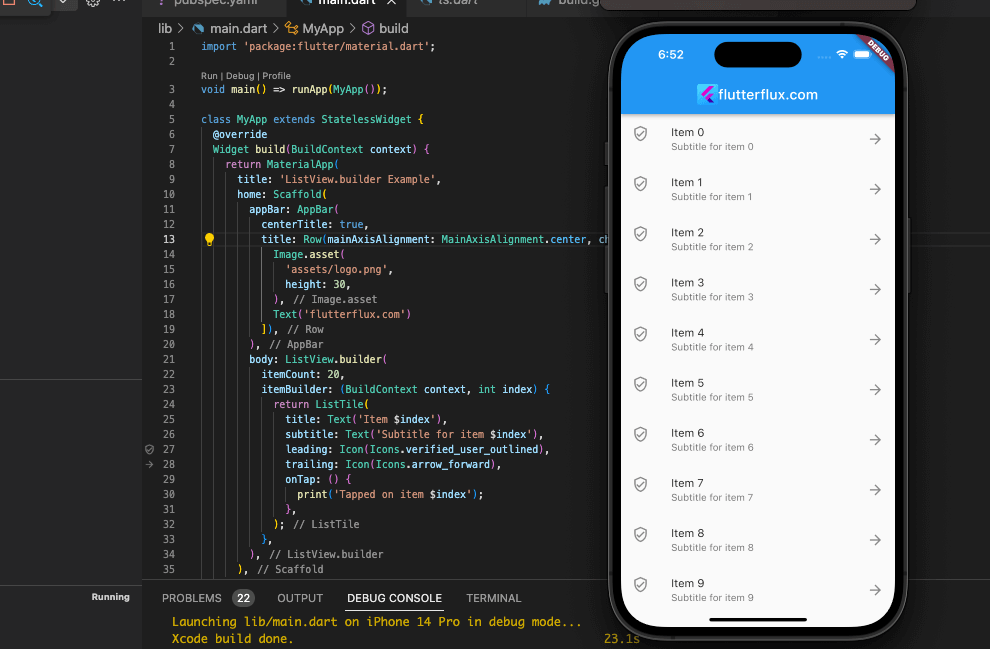
Here, we have a ListView.builder that shows out 20 items as an example. Each item is represented by a ListTile widget that includes a title, subtitle, first icon, last icon, and a onTap callback that records a message when the item is touched. Once each list item is added, a call is made to the itemBuilder method, which produces a ListTile widget. Instructing ListView.builder with the desired number of items to show may be done using the itemCount argument.
ListView.separated:
import 'package:flutter/material.dart';

void main() {
  runApp(FlutterfluxApp());
}

class FlutterfluxApp extends StatelessWidget {
  @override
  Widget build(BuildContext context) {
    return MaterialApp(
      title: 'ListView.separated Example',
      home: Scaffold(
        appBar: AppBar(
        title: Row(children: [
          Image.asset(
            'assets/logo.png',
            height: 30,
          ),
          Text('flutterflux.com')
        ]),
      ),
        body: ListView.separated(
          itemCount: 10,
          separatorBuilder: (BuildContext context, int index) => Divider(),
          itemBuilder: (BuildContext context, int index) {
            return ListTile(
              title: Text('Item $index'),
              subtitle: Text('Subtitle for item $index'),
              leading: CircleAvatar(
                child: Text('$index'),
              ),
              onTap: () {
                print('Tapped on item $index');
              },
            );
          },
        ),
      ),
    );
  }
}
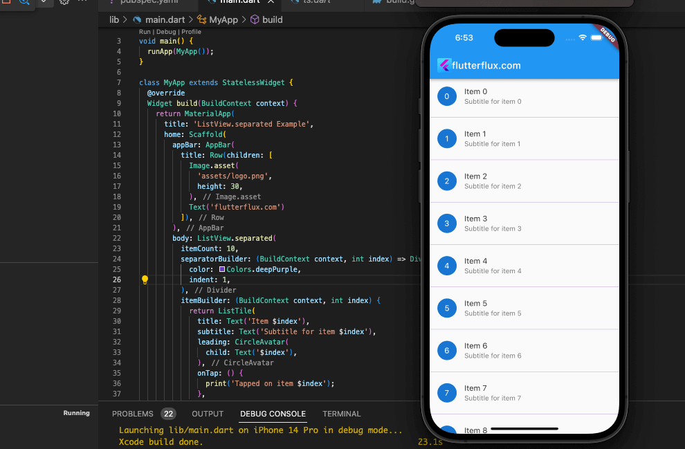
The following code demonstrates how to use List.generate to build a list of 20 items and then show that list in a ListView.separated widget. Each list item is constructed as a ListTile with a title and a onTap method that logs a message to the console when pressed using the itemBuilder argument, and a Divider is added between the items using the separatorBuilder option.
ListView.custom:
import 'package:flutter/material.dart';

void main() => runApp(FlutterfluxApp());

class FlutterfluxApp extends StatelessWidget {
  @override
  Widget build(BuildContext context) {
    return MaterialApp(
      title: 'Custom ListView Example',
      home: CustomListView(),
    );
  }
}

class CustomListView extends StatefulWidget {
  @override
  _CustomListViewState createState() => _CustomListViewState();
}

class _CustomListViewState extends State {
  List _items = [
    'Item 1',
    'Item 2',
    'Item 3',
    'Item 4',
    'Item 5',
    'Item 6',
    'Item 7',
    'Item 8',
    'Item 9',
    'Item 10',
  ];

  @override
  Widget build(BuildContext context) {
    return Scaffold(
      appBar: AppBar(
          title: Row(children: [
            Image.asset(
              'assets/logo.png',
              height: 30,
            ),
            Text('flutterflux.com')
          ]),
        ),
      body: ListView.builder(
        itemCount: _items.length,
        itemBuilder: (BuildContext context, int index) {
          return CustomListItem(
            title: _items[index],
            subtitle: 'Subtitle for ${_items[index]}',
          );
        },
      ),
    );
  }
}

class CustomListItem extends StatelessWidget {
  final String title;
  final String subtitle;

  CustomListItem({this.title, this.subtitle});

  @override
  Widget build(BuildContext context) {
    return Container(
      padding: EdgeInsets.symmetric(horizontal: 16.0, vertical: 8.0),
      child: Row(
        children: [
          Expanded(
            child: Column(
              crossAxisAlignment: CrossAxisAlignment.start,
              children: [
                Text(
                  title,
                  style: TextStyle(
                    fontWeight: FontWeight.bold,
                    fontSize: 20.0,
                  ),
                ),
                SizedBox(height: 8.0),
                Text(
                  subtitle,
                  style: TextStyle(
                    fontSize: 16.0,
                    color: Colors.grey[600],
                  ),
                ),
              ],
            ),
          ),
          Icon(
            Icons.arrow_forward_ios,
            color: Colors.grey[400],
          ),
        ],
      ),
    );
  }
}
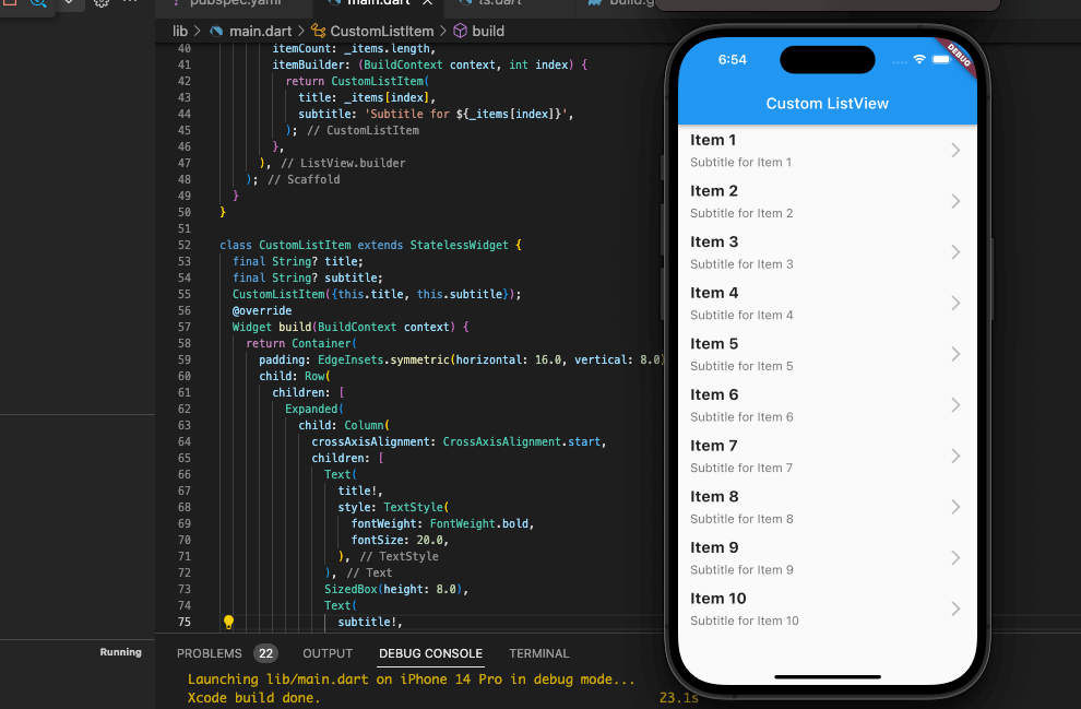
In this example, we have a CustomListView widget that contains a list of items. The list is displayed using a ListView.builder widget, which creates a list of CustomListItem widgets. Each CustomListItem widget displays a title and a subtitle for the item, as well as an arrow icon at the end of the row.
The CustomListItem widget is a stateless widget that takes in the title and subtitle as parameters. It uses a Container widget to create a row with a left-aligned column for the title and subtitle, and a right-aligned arrow icon. The TextStyle widget is used to style the title and subtitle text.
Load More ListView in Flutter:
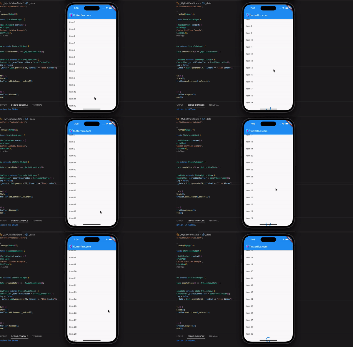
Using the ListView.builder constructor, a ScrollController, and a flag to keep track of whether you are presently loading more data, you may develop a “load more on scroll” functionality in Flutter ListView.
import 'package:flutter/material.dart';

void main() => runApp(FlutterfluxApp());

class FlutterfluxApp extends StatelessWidget {
  @override
  Widget build(BuildContext context) {
    return MaterialApp(
      title: 'Custom ListView Example',
      home: MyListView(),
    );
  }
}

class MyListView extends StatefulWidget {
  @override
  _MyListViewState createState() => _MyListViewState();
}

class _MyListViewState extends State {
  final ScrollController _scrollController = ScrollController();
  bool _isLoading = false;
  List _data = List.generate(50, (index) => "Item $index");

  @override
  void initState() {
    super.initState();
    _scrollController.addListener(_onScroll);
  }

  @override
  void dispose() {
    _scrollController.dispose();
    super.dispose();
  }

  void _onScroll() {
    if (!_isLoading &&
        _scrollController.position.pixels ==
            _scrollController.position.maxScrollExtent) {
      // Start loading more data
      setState(() {
        _isLoading = true;
      });
      _loadMoreData();
    }
  }

  void _loadMoreData() {
    // Simulate a delay in loading more data
    Future.delayed(Duration(seconds: 2), () {
      setState(() {
        _isLoading = false;
        _data.addAll(
            List.generate(1000, (index) => "Item ${_data.length + index}"));
      });
    });
  }

  @override
  Widget build(BuildContext context) {
    return Scaffold(
        appBar: AppBar(
          title: Row(children: [
            Image.asset(
              'assets/logo.png',
              height: 30,
            ),
            Text('flutterflux.com')
          ]),
        ),
        body: ListView.builder(
          controller: _scrollController,
          itemCount: _data.length + (_isLoading ? 1 : 0),
          itemBuilder: (context, index) {
            if (index == _data.length) {
              // Show a loading indicator at the end of the list while loading more data
              return Center(
                child: CircularProgressIndicator(),
              );
            } else {
              return ListTile(
                title: Text(_data[index]),
              );
            }
          },
        ));
  }
}
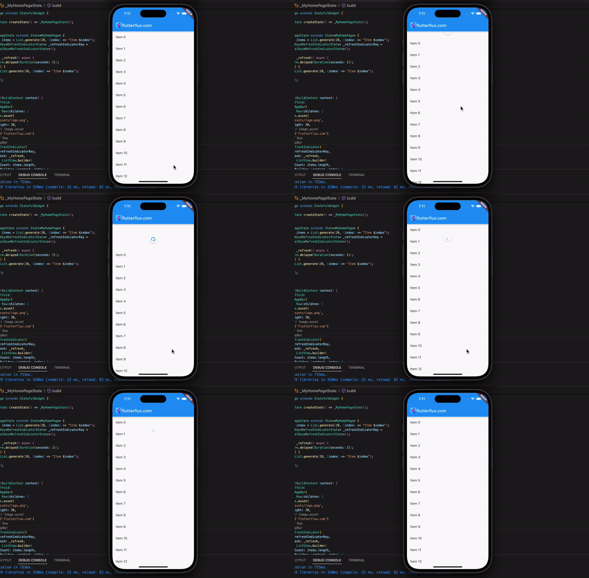
ListView in Flutter pull to refresh:
full example of a ListView in Flutter with pull-to-refresh functionality:
How to scroll a ListView in Flutter to a specific index:
import 'package:flutter/material.dart';

void main() {
  runApp(FlutterfluxApp());
}

class FlutterfluxApp extends StatelessWidget {
  final List items = List.generate(50, (index) => "Item $index");

  @override
  Widget build(BuildContext context) {
    return MaterialApp(
      home: Scaffold(
        appBar: AppBar(
          title: Text("ListView Scroll to Index Example"),
        ),
        body: ListView.builder(
          itemCount: items.length,
          itemBuilder: (context, index) {
            return ListTile(
              title: Text(items[index]),
            );
          },
          controller: ScrollController(),
        ),
        floatingActionButton: FloatingActionButton(
          child: Icon(Icons.arrow_downward),
          onPressed: () {
            // Scroll to the 10th item
            ScrollController().animateTo(
              10 * 56.0, // 56 is the height of each item
              duration: Duration(seconds: 1),
              curve: Curves.easeInOut,
            );
          },
        ),
      ),
    );
  }
}
We create a ListView in Flutter with 50 items and a FloatingActionButton that scrolls to the 10th item when pressed. The ScrollController’s animateTo method calculates the scroll position by multiplying the index by each item’s height (56 in this example).
Conclusion
ListView in Flutter lets developers show scrollable lists in their apps. Item builder, separator builder, and scroll controller are customizable. ListView in Flutter displays text, photos, and widgets. Every Flutter developer who wants to build a dynamic, responsive user interface needs ListView in Flutter.

