AlertDialog Flutter is a widget that shows a dialog with a title, content, and optional actions. It displays user notifications, cautions, and messages. The AlertDialog widget can be customized to include any widget in its content and actions.
Flutter AlertDialog widget is easy to use and implement. ShowDialog() and a constructor function that returns the AlertDialog widget produce an AlertDialog. Access the app’s context with the builder function’s BuildContext object.
To make an AlertDialog Flutter, follow these steps:
- Create a function to show the dialog:
void _showDialog() {
  showDialog(
    context: context,
    builder: (BuildContext context) {
      return AlertDialog(
        title: Text('Title'),
        content: Text('Content'),
        actions: [
          TextButton(
            child: Text('Cancel'),
            onPressed: () {
              Navigator.of(context).pop();
            },
          ),
          TextButton(
            child: Text('OK'),
            onPressed: () {
              // do something
              Navigator.of(context).pop();
            },
          ),
        ],
      );
    },
  );
}
- Call the function when you want to show the dialog:
ElevatedButton(
  child: Text('Show Dialog'),
  onPressed: _showDialog,
)
A simple AlertDialog Flutter with a header, some text, and two buttons will be generated. Modifying the AlertDialog’s appearance and functionality is as simple as adding or removing widgets from the window’s content.
complete example of creating and showing an AlertDialog Flutter:
import 'package:flutter/material.dart';

void main() {
  runApp(MyApp());
}

class MyApp extends StatelessWidget {
  @override
  Widget build(BuildContext context) {
    return MaterialApp(
      title: 'AlertDialog Demo',
      home: MyHomePage(),
    );
  }
}

class MyHomePage extends StatelessWidget {
  @override
  Widget build(BuildContext context) {
    return Scaffold(
      appBar: AppBar(
        title: Text('AlertDialog Demo'),
      ),
      body: Center(
        child: ElevatedButton(
          child: Text('Show Dialog'),
          onPressed: () {
            _showDialog(context);
          },
        ),
      ),
    );
  }

  void _showDialog(BuildContext context) {
    showDialog(
      context: context,
      builder: (BuildContext context) {
        return AlertDialog(
          title: Text('Delete Confirmation'),
          content: Text('Are you sure you want to delete this item?'),
          actions: [
            TextButton(
              child: Text('Cancel'),
              onPressed: () {
                Navigator.of(context).pop();
              },
            ),
            TextButton(
              child: Text('Delete'),
              onPressed: () {
                // do something
                Navigator.of(context).pop();
              },
            ),
          ],
        );
      },
    );
  }
}
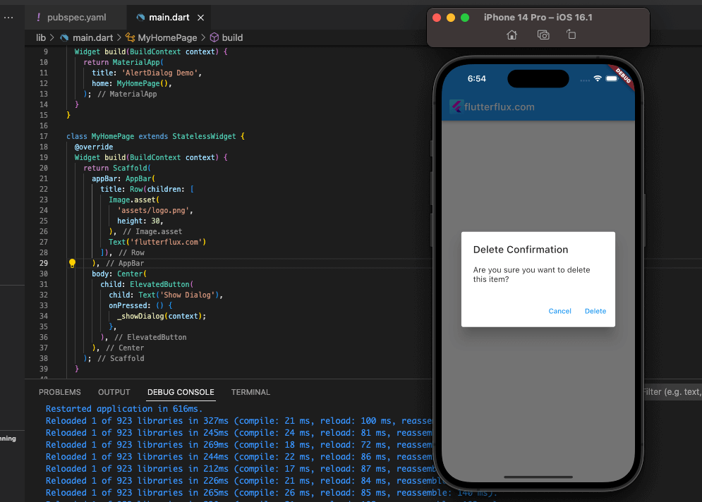
To illustrate, we’ll use a minimal app consisting of a single button that, when clicked, brings up an AlertDialog Flutter consisting of a title, message, and close button (Cancel and Delete). Clicking the Erase button gets rid of the dialogue box and lets the user proceed.
AlertDialog Flutter with Custom Design
Flutter AlertDialog widget may be customized using shape, background color, and other parameters to build a bespoke AlertDialog.
Example of Creating a Custom AlertDialog Flutter:
showDialog(
  context: context,
  builder: (BuildContext context) {
    return AlertDialog(
      shape: RoundedRectangleBorder(
        borderRadius: BorderRadius.circular(20.0),
      ),
      backgroundColor: Colors.white,
      title: Text(
        'Custom Dialog Title',
        style: TextStyle(
          fontSize: 20.0,
          fontWeight: FontWeight.bold,
          color: Colors.blue,
        ),
      ),
      content: Column(
        mainAxisSize: MainAxisSize.min,
        children: [
          Text(
            'Custom Dialog Content',
            style: TextStyle(
              fontSize: 18.0,
              color: Colors.black,
            ),
          ),
          SizedBox(height: 10.0),
          TextField(
            decoration: InputDecoration(
              hintText: 'Enter your name',
              border: OutlineInputBorder(),
            ),
          ),
        ],
      ),
      actions: [
        TextButton(
          child: Text(
            'Cancel',
            style: TextStyle(
              fontSize: 18.0,
              color: Colors.red,
            ),
          ),
          onPressed: () {
            Navigator.of(context).pop();
          },
        ),
        TextButton(
          child: Text(
            'OK',
            style: TextStyle(
              fontSize: 18.0,
              color: Colors.green,
            ),
          ),
          onPressed: () {
            // do something
            Navigator.of(context).pop();
          },
        ),
      ],
    );
  },
);
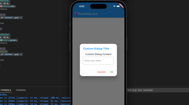
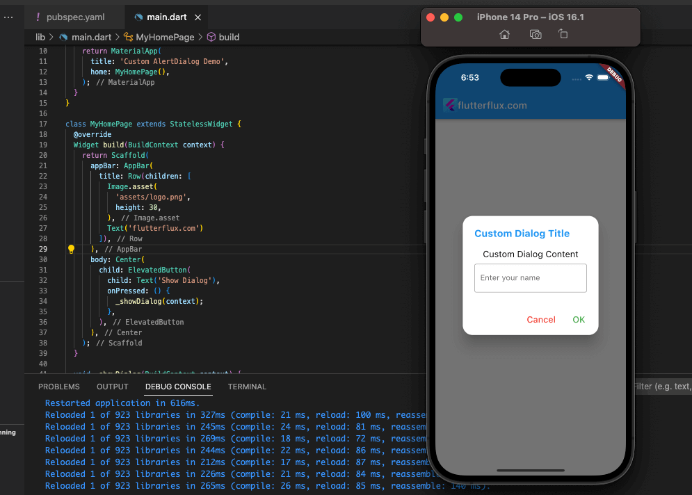
In this code, we’ll alter the look of the AlertDialog Flutter by making it a rounded rectangle with a white backdrop and modifying the fonts and colors used for the title and body text. We’re also changing the wording and appearance of the Cancel and OK buttons, and adding a text box to the content. Other widgets can be added to the content or actions, and their styles and characteristics can be modified to further personalize the AlertDialog widget.
Complete Example of Creating and Showing a Custom AlertDialog Flutter:
import 'package:flutter/material.dart';

void main() {
  runApp(MyApp());
}

class MyApp extends StatelessWidget {
  @override
  Widget build(BuildContext context) {
    return MaterialApp(
      title: 'Custom AlertDialog Demo',
      home: MyHomePage(),
    );
  }
}

class MyHomePage extends StatelessWidget {
  @override
  Widget build(BuildContext context) {
    return Scaffold(
      appBar: AppBar(
        title: Text('Custom AlertDialog Demo'),
      ),
      body: Center(
        child: ElevatedButton(
          child: Text('Show Dialog'),
          onPressed: () {
            _showDialog(context);
          },
        ),
      ),
    );
  }

  void _showDialog(BuildContext context) {
    showDialog(
      context: context,
      builder: (BuildContext context) {
        return AlertDialog(
          shape: RoundedRectangleBorder(
            borderRadius: BorderRadius.circular(20.0),
          ),
          backgroundColor: Colors.white,
          title: Text(
            'Custom Dialog Title',
            style: TextStyle(
              fontSize: 20.0,
              fontWeight: FontWeight.bold,
              color: Colors.blue,
            ),
          ),
          content: Column(
            mainAxisSize: MainAxisSize.min,
            children: [
              Text(
                'Custom Dialog Content',
                style: TextStyle(
                  fontSize: 18.0,
                  color: Colors.black,
                ),
              ),
              SizedBox(height: 10.0),
              TextField(
                decoration: InputDecoration(
                  hintText: 'Enter your name',
                  border: OutlineInputBorder(),
                ),
              ),
            ],
          ),
          actions: [
            TextButton(
              child: Text(
                'Cancel',
                style: TextStyle(
                  fontSize: 18.0,
                  color: Colors.red,
                ),
              ),
              onPressed: () {
                Navigator.of(context).pop();
              },
            ),
            TextButton(
              child: Text(
                'OK',
                style: TextStyle(
                  fontSize: 18.0,
                  color: Colors.green,
                ),
              ),
              onPressed: () {
                // do something
                Navigator.of(context).pop();
              },
            ),
          ],
        );
      },
    );
  }
}
This basic app’s button, when touched, displays a tailored AlertDialog with a rounded rectangle form, white backdrop color, and tailored title, content, and buttons. There is a spot for the reader to sign their name in the text. When the user confirms their selection by clicking OK, the dialog box disappears and the user is free to proceed.
Conclusion
Developers can display pop-up dialogs in their apps with Flutter’s AlertDialog widget. It makes presenting vital information or asking for input easy and adaptable.
Developers can modify dialogs with text, graphics, buttons, and more using AlertDialog. It also lets you change the dialog’s design, color, orientation, and size.
AlertDialog also includes callbacks to manage user events like button pushes and update the app’s status. To enhance the user experience, it offers animation options.
In conclusion, Flutter developers may utilize the AlertDialog widget to construct pop-up dialogs that improve app functionality and usability. It’s easy to use, adaptable, and offers callbacks and animation choices to assist developers achieve their goals. read too ElevatedButton Flutter: How to use it?

