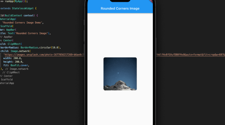
By utilizing the BorderRadius class, you can create Rounded Corner Image in Flutter. Images in Flutter are created with sharp corners by default, but you may change this by adjusting the border radius.
Using Flutter ClipRRect, CustomPainter widget and the BorderRadius class, you can easily generate images with rounded corners. For a rounded rectangle, the ClipRRect widget uses the border radius you specify. There are several ways to add Rounded Corner Image in Flutter.
Here are some of the most common methods:
ClipRRect Widget
The ClipRRect widget is the simplest and most direct method of giving an Rounded Corner Image in Flutter. ClipRRect restricts the shape of the widget it is clipped to to a rounded rectangle of the specified radius.
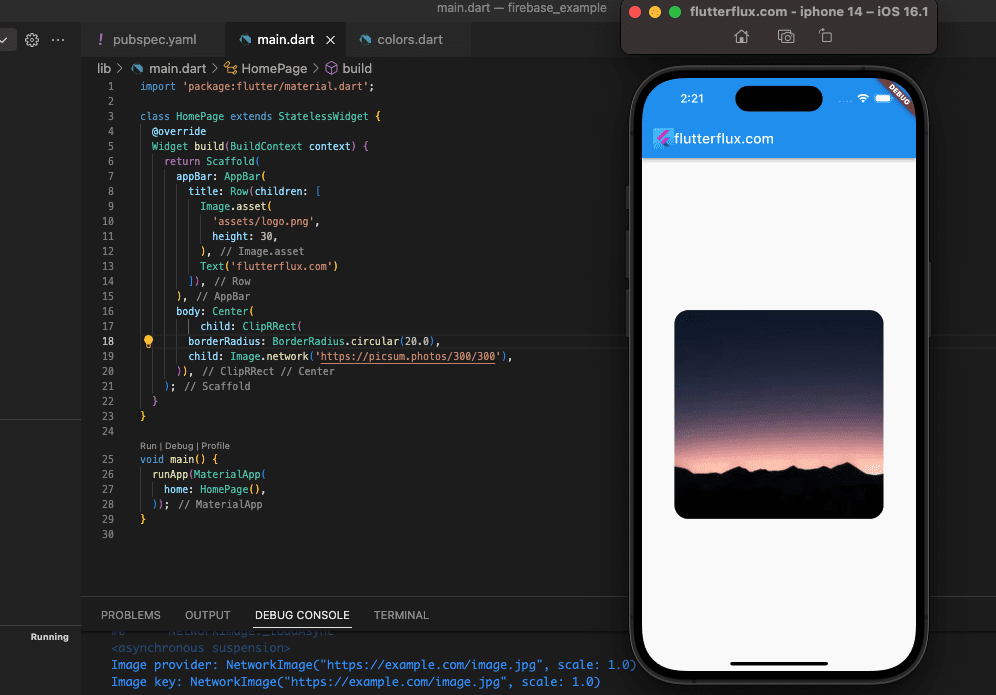
Example:
ClipRRect(
        borderRadius: BorderRadius.circular(10),
        child: Image.network(
          'https://picsum.photos/300/300',
          fit: BoxFit.cover,
        ),
      )
In this example, we’re using the BorderRadius.circular constructor to generate a circular border radius with a radius of 20. You can vary the radius to make the corners more or less rounded. The Image.network widget is used to display the image, and we’re setting the fit attribute to BoxFit.cover to make sure the image covers the entire ClipRRect widget.
You can also use other sorts of BorderRadius constructors to make rounded rectangles with varied corner radii, such as BorderRadius. only to provide various radii for each corner.
BoxDecoration Widget
The BoxDecoration widget lets you set a custom border radius for the image container, giving it rounded corners.
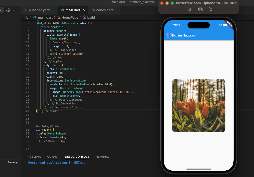
Example:
 Container(
        height: 300,
        width: 300,
        decoration: BoxDecoration(
          borderRadius: BorderRadius.circular(20),
          image: DecorationImage(
            image: NetworkImage('https://picsum.photos/300/300'),
            fit: BoxFit.cover,
          ),
        ),
      )
By using BoxDecoration borderRadius property, we can make the corners circular with a radius of 20 in this case. In addition to uploading an image via the image property, we’re utilizing the fit property to specify BoxFit.cover such that the image fills the whole Container widget.
The versatile BoxDecoration widget allows you to add gradients, shadows, and borders to your content, among other visual effects. To enhance the look of your Flutter app, mix BoxDecoration options to create intricate graphics.
CustomPainter
By drawing a unique form into the image with a CustomPainter, you may better manage the Rounded Corner Image in Flutter.
Example:
class RoundedCornerImage extends StatelessWidget {
  final String imageUrl;
  final double radius;
  RoundedCornerImage({required this.imageUrl, required this.radius});
  @override
  Widget build(BuildContext context) {
    return CustomPaint(
      painter: RoundedCornerImagePainter(radius: radius),
      child: Image.network(imageUrl),
    );
  }
}

class RoundedCornerImagePainter extends CustomPainter {
  final double radius;
  RoundedCornerImagePainter({required this.radius});
  @override
  void paint(Canvas canvas, Size size) {
    final rect = Rect.fromLTRB(0, 0, size.width, size.height);
    final path = Path()
      ..addRRect(RRect.fromRectAndRadius(rect, Radius.circular(radius)));
    canvas.clipPath(path);
  }

  @override
  bool shouldRepaint(CustomPainter oldDelegate) => false;
}
Simply input the image’s URL and the radius you’d like to round off the corner with the RoundedCornerImage widget:
RoundedCornerImage(imageUrl: 'https://example.com/image.jpg', radius: 10.0)
Flutter ClipRRect widget makes rounding image edges easy. Create Rounded Corner Image in Flutter by wrapping an Image widget with ClipRRect and selecting the radius. Create a border and edit the image with the BoxDecoration widget. These tools make Flutter app images look great.

