ElevatedButton Flutter is a Material Design elevated button. It is a button widget that appears raised from the surface of the screen, with a shadow behind it, to provide a visual cue that the button can be pressed.
How to Use ElevatedButton Flutter
To create an ElevatedButton Flutter, you can use the following code:
ElevatedButton(
  onPressed: () {
    // Do something when the button is pressed
  },
  child: Text('Press me'),
)
How to style Elevatedbutton Flutter
To style the ElevatedButton Flutter look, you can define more attributes. For instance, you can modify the button’s hue, form, and font design, among various other aspects.
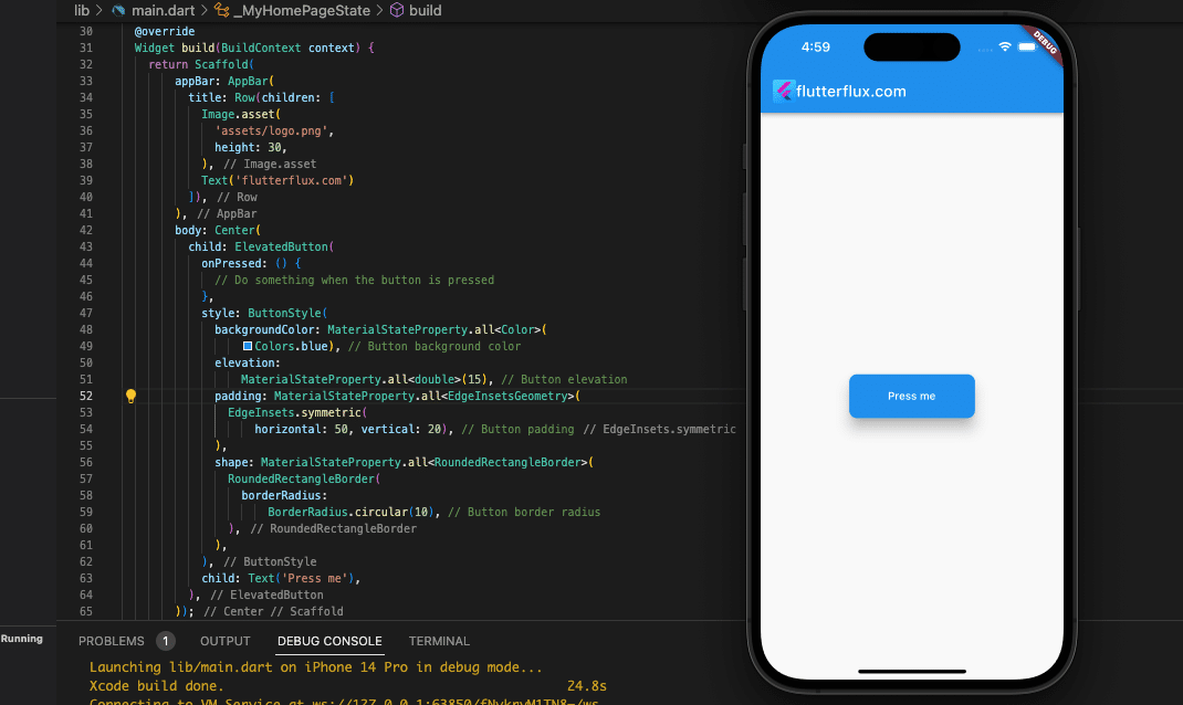
Take a look at this code snippet, which illustrates how to customize a few of these features:
ElevatedButton(
            onPressed: () {
              // Do something when the button is pressed
            },
            style: ButtonStyle(
              backgroundColor: MaterialStateProperty.all(
                  Colors.blue), // Button background color
              elevation:
                  MaterialStateProperty.all(15), // Button elevation
              padding: MaterialStateProperty.all(
                EdgeInsets.symmetric(
                    horizontal: 50, vertical: 20), // Button padding
              ),
              shape: MaterialStateProperty.all(
                RoundedRectangleBorder(
                  borderRadius:
                      BorderRadius.circular(10), // Button border radius
                ),
              ),
            ),
            child: Text('Press me'),
          ),
The code above uses a ButtonStyle object to modify the appearance of the button at multiple levels (the style property). The backdrop color is blue, elevation is 5, horizontal padding is 50 pixels, and vertical padding is 20 pixels. Also, a 10 pixel border radius has been applied to create a rounded rectangle. Adding more characteristics to the ButtonStyle object will allow you to modify the button’s appearance in other ways.
Note that the MaterialStateProperty class is used to set a property’s value for the various states a button can have, such as being clicked or disabled. Here, we use MaterialStateProperty.all to assign the same value to each state. However, other methods of MaterialStateProperty can be used to assign unique values to each state. One example is MaterialStateProperty.resolveWith.
How to add ElevatedButton Flutter border color
you can add a border color to an ElevatedButton by specifying the side property of the shape parameter in the ButtonStyle instance.
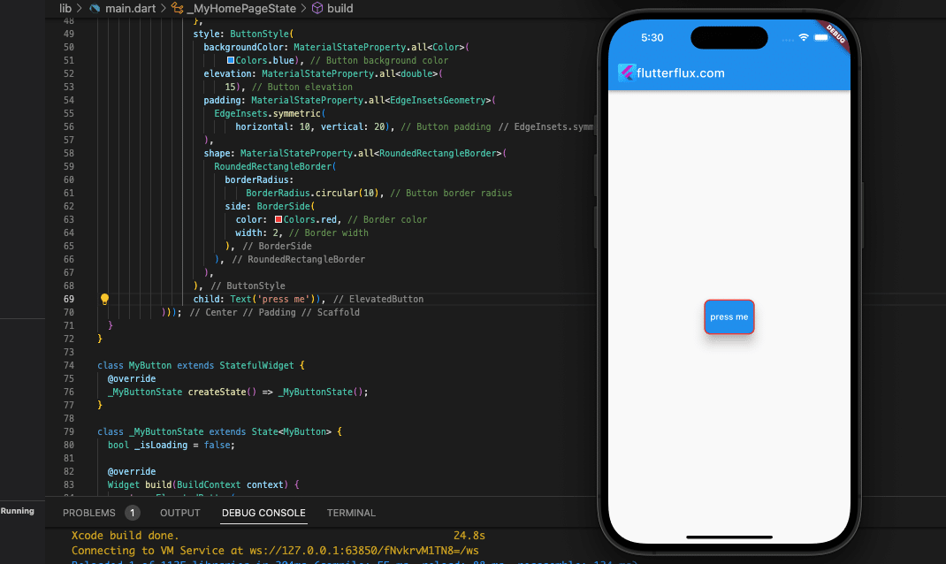
Example of how to add a border color to an ElevatedButton:
ElevatedButton(
            onPressed: () {
              // Do something when the button is pressed
            },
            style: ButtonStyle(
              backgroundColor: MaterialStateProperty.all(
                  Colors.blue), // Button background color
              elevation:
                  MaterialStateProperty.all(15), // Button elevation
              padding: MaterialStateProperty.all(
                EdgeInsets.symmetric(
                    horizontal: 50, vertical: 20), // Button padding
              ),
              shape: MaterialStateProperty.all(
                RoundedRectangleBorder(
                  borderRadius:
                      BorderRadius.circular(10), // Button border radius
                  side: BorderSide(
                    color: Colors.red, // Border color
                    width: 2, // Border width
                  ),
                ),
              ),
            ),
            child: Text('Press me'),
          ),
In the following example, the shape property is assigned to a RoundedRectangleBorder object that features a border defined with the side property. The side property requires a BorderSide instance that specifies the color and width of the border. In this case, the border is colored red and has a width of 2 pixels.
It’s worth noting that the shape property is assigned a MaterialStateProperty object to allow for the customization of the button styling appearance in various states. However, in this instance, the same instance of RoundedRectangleBorder is utilized for all states using MaterialStateProperty.all. If you wish to personalize the border color for different button states, you may use the MaterialStateProperty.resolveWith method to return a distinct instance of the RoundedRectangleBorder for each state.
ElevatedButton Flutter with Icon
To add an icon to an ElevatedButton, you can use a Row widget to wrap the button’s child and include an text and icon widgets.
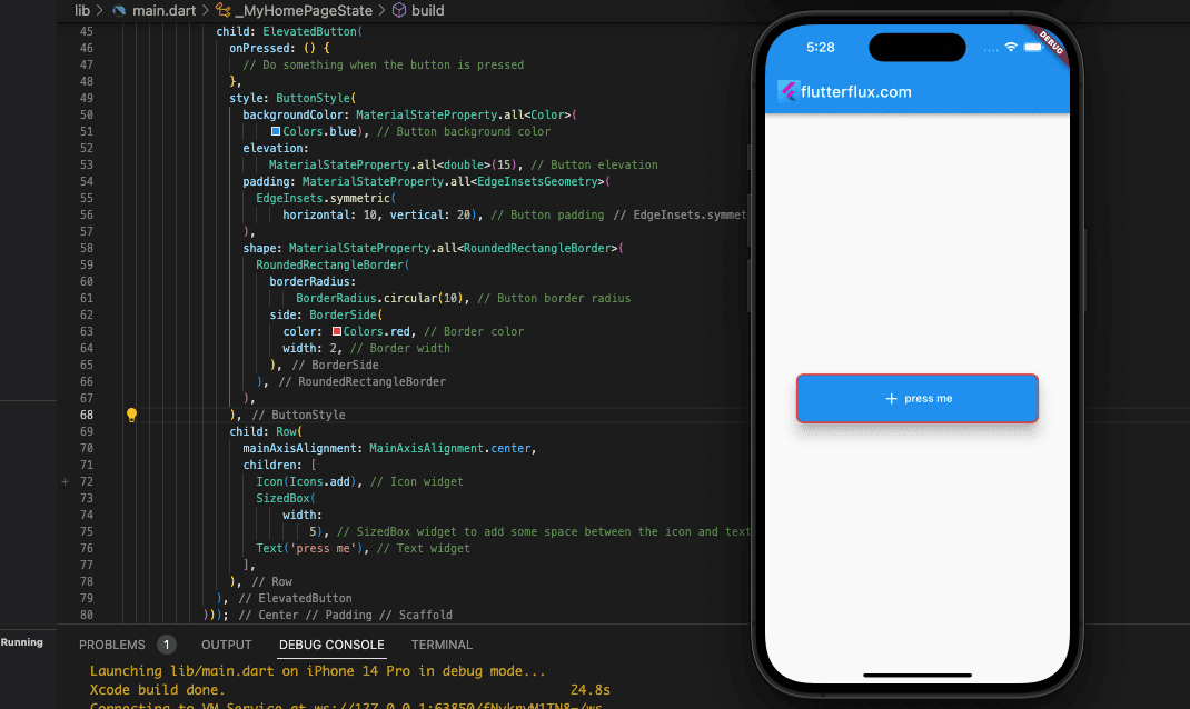
The following code provides an example:
ElevatedButton(
                onPressed: () {
                  // Do something when the button is pressed
                },
                style: ButtonStyle(
                  backgroundColor: MaterialStateProperty.all(
                      Colors.blue), // Button background color
                  elevation:
                      MaterialStateProperty.all(15), // Button elevation
                  padding: MaterialStateProperty.all(
                    EdgeInsets.symmetric(
                        horizontal: 10, vertical: 20), // Button padding
                  ),
                  shape: MaterialStateProperty.all(
                    RoundedRectangleBorder(
                      borderRadius:
                          BorderRadius.circular(10), // Button border radius
                      side: BorderSide(
                        color: Colors.red, // Border color
                        width: 2, // Border width
                      ),
                    ),
                  ),
                ),
                child: Row(
                  mainAxisAlignment: MainAxisAlignment.center,
                  children: [
                    Icon(Icons.add), // Icon widget
                    SizedBox(
                        width:
                            5), // SizedBox widget to add some space between the icon and text
                    Text('press me'), // Text widget
                  ],
                ),
              ),
In this example, we have an ElevatedButton Flutter with a child property that is a Row widget. The Row widget contains an Icon widget and a Text widget. The Icon widget displays the press me icon from the Icons class, while the Text widget displays text next to the icon.
To center the Icon and Text widgets horizontally, the mainAxisAlignment property of the Row widget is set to MainAxisAlignment.center.
The appearance of the Icon and Text widgets can be customized by adjusting their respective properties such as the icon size, color, and text style.
ElevatedButton Flutter with Loading Indicator
Rather than using an ElevatedButton to show a loading indicator, you may use a Stack widget that contains both the button and the indicator. When the button is pressed, a boolean flag is set to indicate that it is in the loading state, and the user interface is refreshed to reflect this.
Example code snippet that shows how to implement an ElevatedButton with a loading indicator:
import 'dart:async';
import 'package:flutter/material.dart';

Future main() async {
  WidgetsFlutterBinding.ensureInitialized();

  runApp(MyApp());
}

class MyApp extends StatelessWidget {
  @override
  Widget build(BuildContext context) {
    return MaterialApp(
      title: 'Flutter Demo',
      theme: ThemeData(
        primarySwatch: Colors.blue,
      ),
      home: MyHomePage(),
    );
  }
}

class MyHomePage extends StatefulWidget {
  @override
  _MyHomePageState createState() => _MyHomePageState();
}

class _MyHomePageState extends State {
  @override
  Widget build(BuildContext context) {
    return Scaffold(
        appBar: AppBar(
          title: Row(children: [
            Image.asset(
              'assets/logo.png',
              height: 30,
            ),
            Text('flutterflux.com')
          ]),
        ),
        body: Padding(
            padding: EdgeInsets.symmetric(horizontal: 40),
            child: Center(child: MyButton())));
  }
}

class MyButton extends StatefulWidget {
  @override
  _MyButtonState createState() => _MyButtonState();
}

class _MyButtonState extends State {
  bool _isLoading = false;

  @override
  Widget build(BuildContext context) {
    return ElevatedButton(
      onPressed: _isLoading ? null : _handleButtonPress,
      child: _isLoading
          ? SizedBox(
              width: 20,
              height: 20,
              child: CircularProgressIndicator(
                strokeWidth: 2,
                valueColor: AlwaysStoppedAnimation(Colors.white),
              ),
            )
          : Text('Press me'),
    );
  }

  void _handleButtonPress() async {
    setState(() {
      _isLoading = true;
    });

    // Perform some time-consuming operation here, such as a network call
    await Future.delayed(Duration(seconds: 3));

    setState(() {
      _isLoading = false;
    });
  }
}
This example features the MyButton widget that includes a boolean _isLoading variable indicating whether the button is in a loading state. The onPressed property of the ElevatedButton is set to the _handleButtonPress method that executes when the button is pressed.
The child property of the ElevatedButton Flutter displays either a Text or a CircularProgressIndicator widget, based on the value of _isLoading. If _isLoading is
true, the child property shows a CircularProgressIndicator widget that displays a spinning loading indicator. If false, it displays a Text widget showing the button text.
Upon button press, the _handleButtonPress method sets _isLoading to true to signify the loading state. Next, it performs a time-consuming operation such as a network call and sets _isLoading back to false once the operation completes. The setState method updates the UI to display the loading indicator during the time-consuming operation.
Keep in mind that the appearance of the CircularProgressIndicator widget can be customized by modifying its properties, such as the color and stroke width. You can also use a different loading indicator widget if needed.
Conclusion
ElevatedButton widget creates a button that appears to be slightly elevated. You can use the ElevatedButton widget in your Flutter project by importing the material library and making a new instance of the widget with the appropriate settings. The behavior of the button upon being pressed can be specified by adding a onPressed callback function.
Adding the ElevatedButton material library to your Flutter project is the first step in using the widget. Once the library has been imported, you can create a new instance of the ElevatedButton widget and give it the appropriate settings. Add a onPressed callback function to specify what should happen when the button is pressed.

