Button in Flutter is a piece of the UI, when tapped or clicked triggers some sort of action. The ElevatedButton, TextButton, and OutlinedButton widget are used to create buttons in Flutter. The text, color, form, and size of buttons, among other things, can all be changed with these widgets. Any operation, from moving to a new screen to submitting a form to running a function, can be initiated by clicking a button.
In Flutter, a button represents an actionable piece of the user interface. A button’s text, icon, or both can be styled, colored, and shaped anyway the designer sees fit.
List of the types of Button in Flutter you can use:
ElevatedButton
Flutter ElevatedButton is a Material Design button that floats above the display and highlights or splashes in response to user input.
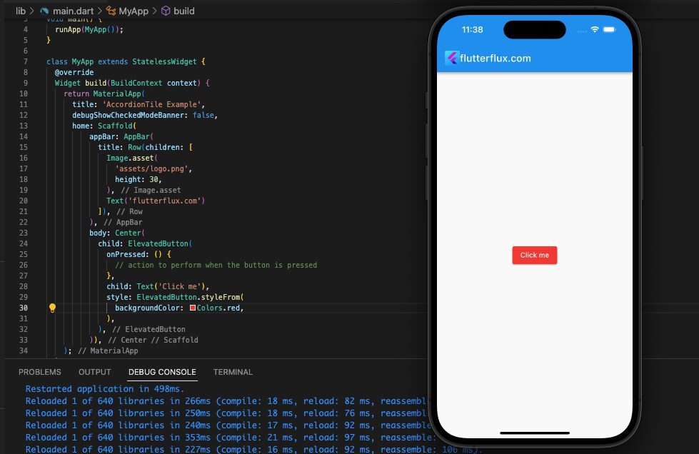
Example of how to use ElevatedButton in Flutter:
ElevatedButton(
  onPressed: () {
    // action to perform when the button is pressed
  },
  child: Text('Click me'),
)
By providing supplementary criteria, the ElevatedButton appearance can also be altered. As an illustration, the style option enables you to alter the button color:
ElevatedButton(
  onPressed: () {
    // action to perform when the button is pressed
  },
  child: Text('Click me'),
  style: ElevatedButton.styleFrom(
    primary: Colors.red,
  ),
)
As a result, an ElevatedButton with a red backdrop will be produced. Other visual details, such as the button height, border form, and text style, are also modifiable.
TextButton
With the Flutter framework, a text button can be made using the TextButton widget. It’s part of Flutter’s Material library and was made with Google’s Material Design principles in mind.
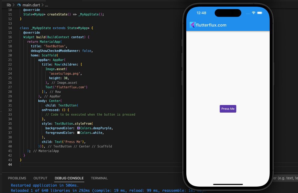
Example of how to use TextButton in Flutter:
TextButton(
            onPressed: () {
              // Code to be executed when the button is pressed
            },
            style: TextButton.styleFrom(
              backgroundColor: Colors.blue,
              foregroundColor: Colors.white,
            ),
            child: Text('Press Me'),
          )
You’ll end up with a blue button with white lettering. The style parameter offers a wide variety of additional customization choices; for details, see the official Flutter reference.
OutlinedButton
The Flutter library includes an OutlinedButton widget for making buttons with a border outline. It’s part of Flutter’s Material library, so you know it’s built to meet Google’s standards for user interface design.
Example of how to use OutlinedButton in Flutter:
OutlinedButton(
  onPressed: () {
    // Code to be executed when the button is pressed
  },
  style: OutlinedButton.styleFrom(
    side: BorderSide(color: Colors.blue),
    textStyle: TextStyle(color: Colors.blue),
  ),
  child: Text('Press Me'),
)
By utilizing the style parameter, you can customize the appearance of the button with various options. In this case, the button will feature blue text and a border outlined in blue. To explore additional customization possibilities, refer to the official Flutter documentation.
IconButton
In the Flutter framework, IconButton is realized via the IconButton widget. It’s part of Flutter’s Material library and was built to follow Google’s Material Design specs.
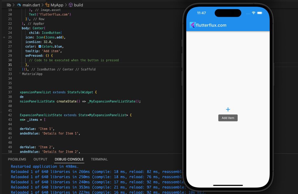
Example of how to use IconButton in Flutter:
IconButton(
  icon: Icon(Icons.add),
  iconSize: 32.0,
  color: Colors.blue,
  tooltip: 'Add item',
  onPressed: () {
    // Code to be executed when the button is pressed
  },
)
IconButton can be enlarged using the iconSize argument, the icon color can be changed using the color parameter, and a tooltip can be defined using the tooltip parameter to display when the user hovers over the button. The official Flutter documentation has further information on available customization options.
DropdownButton
The DropdownButton widget compiles a drop-down menu’s worth of options. As a part of the Flutter Material library, it was designed to follow the guidelines of Material Design.
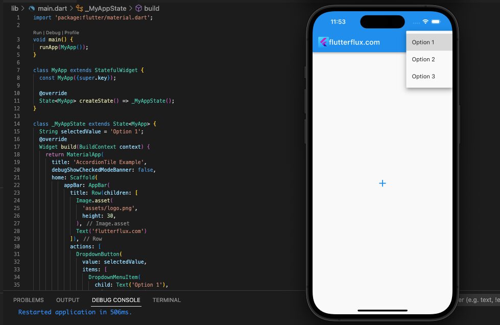
Example of how to use DropdownButton in Flutter:
String selectedValue = 'Option 1';

DropdownButton(
  value: selectedValue,
  items: [
    DropdownMenuItem(
      child: Text('Option 1'),
      value: 'Option 1',
    ),
    DropdownMenuItem(
      child: Text('Option 2'),
      value: 'Option 2',
    ),
    DropdownMenuItem(
      child: Text('Option 3'),
      value: 'Option 3',
    ),
  ],
  onChanged: (value) {
    setState(() {
      selectedValue = value;
    });
  },
)
FloatingActionButton
The FloatingActionButton widget in the Flutter framework allows developers to make a floating, circular button that is used to initiate the app’s principal action. It’s part of Flutter’s Material library and was made with Google’s Material Design principles in mind.
Here are the different types of FloatingActionButton in Flutter:
- Regular FloatingActionButton: This is the default type of FloatingActionButton in Flutter. It is a circular button with an icon in the center that floats above the UI.
You can use the FloatingActionButton class to create a regular FloatingActionButton.
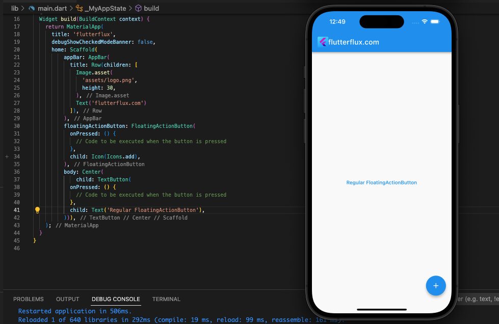
FloatingActionButton(
  onPressed: () {
    // Code to be executed when the button is pressed
  },
  child: Icon(Icons.add),
)
In this example, the onPressed callback is triggered when the FloatingActionButton is pressed. You can replace the comment with your own code to perform the desired action.
- Extended FloatingActionButton: An extended FloatingActionButton is a rectangular button with text and/or an icon that appears below the button.
You can use the FloatingActionButton.extended constructor to create an extended FloatingActionButton.
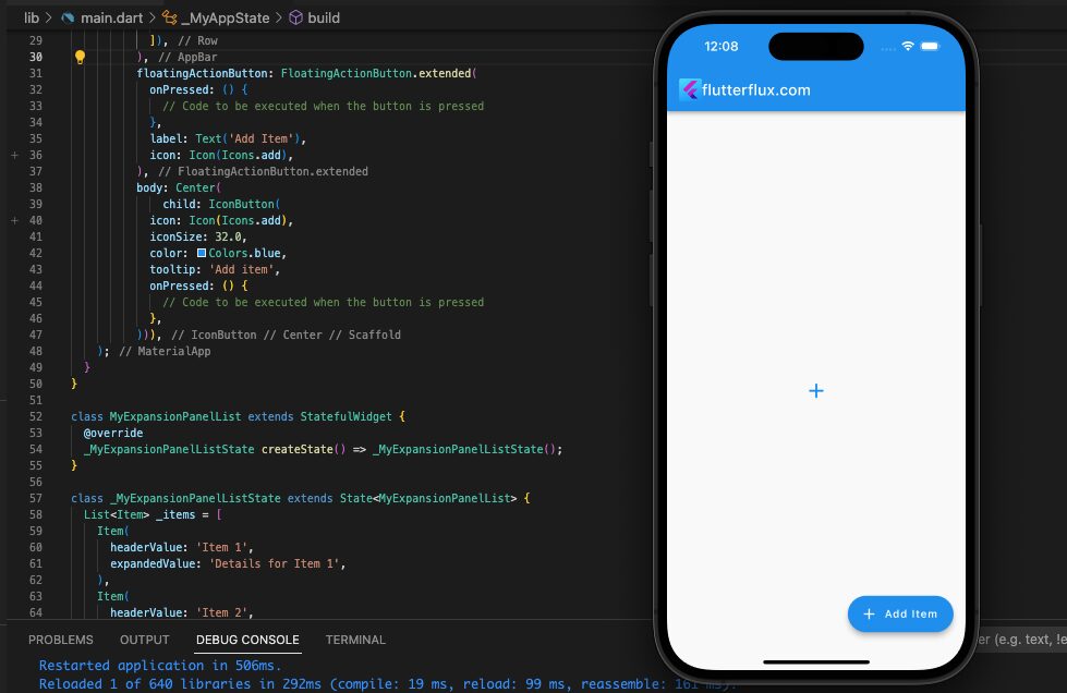
FloatingActionButton.extended(
  onPressed: () {
    // Code to be executed when the button is pressed
  },
  label: Text('Add Item'),
  icon: Icon(Icons.add),
)
The label parameter specifies the text underneath the button, and the icon parameter specifies the button icon.
- Mini FloatingActionButton: A mini FloatingActionButton is a smaller version of the regular FloatingActionButton.
To generate a smaller version of the standard FloatingActionButton, use the class and set the tiny option to true.
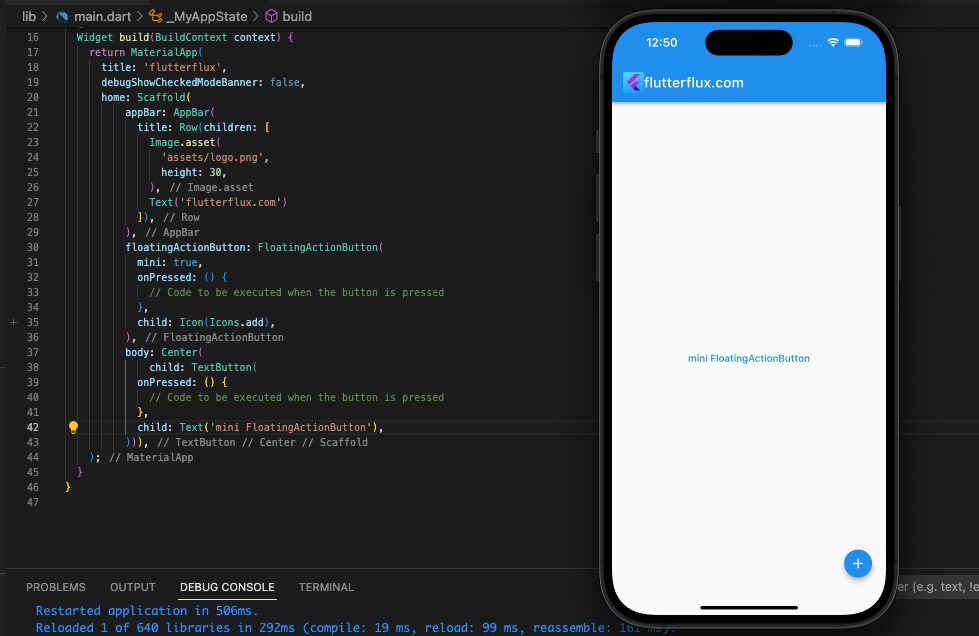
FloatingActionButton(
  onPressed: () {
    // Code to be executed when the button is pressed
  },
  mini: true,
  child: Icon(Icons.add),
)
In this example, the mini parameter is set to true to create a mini FloatingActionButton.
- Custom FloatingActionButton: You can also create custom FloatingActionButton by creating your own widget and styling it as desired.
These are the different types of FloatingActionButton in Flutter. You can customize the appearance of FloatingActionButton using additional parameters such as backgroundColor, foregroundColor, tooltip, and elevation.
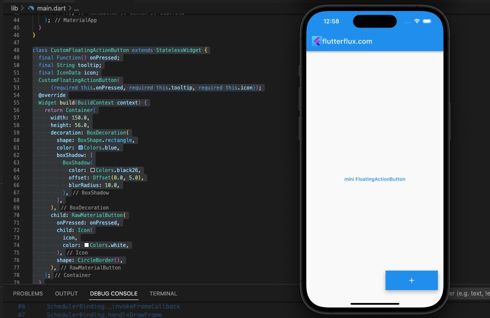
import 'package:flutter/material.dart';

void main() {
  runApp(MyApp());
}

class MyApp extends StatefulWidget {
  const MyApp({super.key});

  @override
  State createState() => _MyAppState();
}

class _MyAppState extends State {
  @override
  Widget build(BuildContext context) {
    return MaterialApp(
      title: 'flutterflux',
      debugShowCheckedModeBanner: false,
      home: Scaffold(
          appBar: AppBar(
            title: Row(children: [
              Image.asset(
                'assets/logo.png',
                height: 30,
              ),
              Text('flutterflux.com')
            ]),
          ),
          floatingActionButton: CustomFloatingActionButton(
            onPressed: () {
              // Code to be executed when the button is pressed
            },
            tooltip: 'Custom Button',
            icon: Icons.add,
          ),
          body: Center(
              child: TextButton(
            onPressed: () {
              // Code to be executed when the button is pressed
            },
            child: Text('mini FloatingActionButton'),
          ))),
    );
  }
}

class CustomFloatingActionButton extends StatelessWidget {
  final Function() onPressed;
  final String tooltip;
  final IconData icon;
  CustomFloatingActionButton(
      {required this.onPressed, required this.tooltip, required this.icon});
  @override
  Widget build(BuildContext context) {
    return Container(
      width: 150.0,
      height: 56.0,
      decoration: BoxDecoration(
        shape: BoxShape.rectangle,
        color: Colors.blue,
        boxShadow: [
          BoxShadow(
            color: Colors.black26,
            offset: Offset(0.0, 5.0),
            blurRadius: 10.0,
          ),
        ],
      ),
      child: RawMaterialButton(
        onPressed: onPressed,
        child: Icon(
          icon,
          color: Colors.white,
        ),
        shape: CircleBorder(),
      ),
    );
  }
}
you can use the CustomFloatingActionButton widget in your app like this:
CustomFloatingActionButton(
  onPressed: () {
    // Code to be executed when the button is pressed
  },
  tooltip: 'Custom Button',
  icon: Icons.add,
)
There are many other customization options available with the FloatingActionButton widget, so be sure to check out the official Flutter documentation for more information.
ToggleButton
A ToggleButton in Flutter app is a button that can have two different states, usually on and off. It functions like a checkbox or a switch, but it can actually flip between several different states. ToggleButton is a widget that allows developers to modify the button’s appearance and behavior.
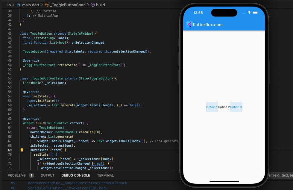
To create a ToggleButton in Flutter, you can use the ToggleButtons widget. Here is complete example:
import 'package:flutter/material.dart';

void main() {
  runApp(MyApp());
}

class MyApp extends StatefulWidget {
  const MyApp({super.key});

  @override
  State createState() => _MyAppState();
}

class _MyAppState extends State {
  @override
  Widget build(BuildContext context) {
    return MaterialApp(
      title: 'flutterflux',
      debugShowCheckedModeBanner: false,
      home: Scaffold(
          appBar: AppBar(
            title: Row(children: [
              Image.asset(
                'assets/logo.png',
                height: 30,
              ),
              Text('flutterflux.com')
            ]),
          ),
          body: Center(
              child: ToggleButton(
            labels: ['Option 1', 'Option 2', 'Option 3'],
            onSelectionChanged: (selections) {
              // Code to be executed when the selection is changed
            },
          ))),
    );
  }
}

class ToggleButton extends StatefulWidget {
  final List labels;
  final Function(List) onSelectionChanged;

  ToggleButton({required this.labels, required this.onSelectionChanged});

  @override
  _ToggleButtonState createState() => _ToggleButtonState();
}

class _ToggleButtonState extends State {
  List? _selections;

  @override
  void initState() {
    super.initState();
    _selections = List.generate(widget.labels.length, (_) => false);
  }

  @override
  Widget build(BuildContext context) {
    return ToggleButtons(
      children: List.generate(
          widget.labels.length, (index) => Text(widget.labels[index])),
      isSelected: _selections!,
      onPressed: (index) {
        setState(() {
          _selections![index] = !_selections![index];
          if (widget.onSelectionChanged != null) {
            widget.onSelectionChanged(_selections!);
          }
        });
      },
    );
  }
}
CupertinoButton
CupertinoButton is a widget in Flutter’s Cupertino library that creates a button with an iOS-style design. This button is styled to match the look and feel of the iOS operating system.
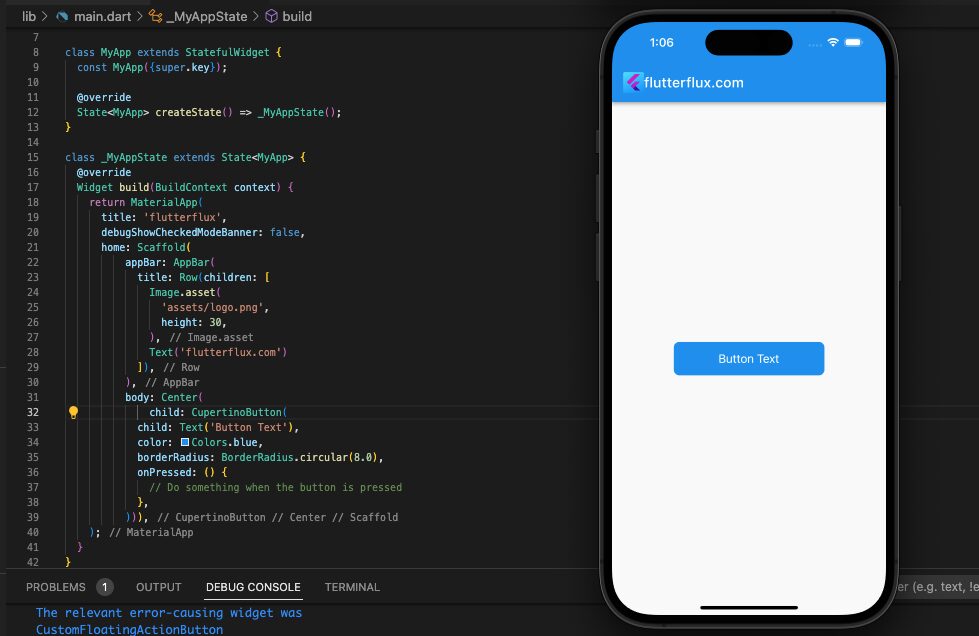
To use CupertinoButton in your Flutter app, you’ll need to first import the Cupertino library:
import 'package:flutter/cupertino.dart';
Then, you can create a CupertinoButton with the following syntax:
CupertinoButton(
  child: Text('Button Text'),
  color: Colors.blue,
  borderRadius: BorderRadius.circular(8.0),
  onPressed: () {
    // Do something when the button is pressed
  },
)
This would create a blue Button in Flutter with rounded corners when using the iOS-style design of the Cupertino library.
RawMaterialButton
Flutter RawMaterialButton is a readily available widget that showcases a Button in Flutter with a material design theme. It is ideal for creating interactive buttons that alter color, elevation, or shape based on user input.
Example code snippet that demonstrates how to generate a RawMaterialButton in Flutter:
RawMaterialButton(
  onPressed: () {
    // Action to be performed when the button is pressed
  },
  elevation: 2.0,
  fillColor: Colors.blue,
  splashColor: Colors.white,
  child: Padding(
    padding: const EdgeInsets.symmetric(vertical: 12.0, horizontal: 24.0),
    child: Row(
      mainAxisSize: MainAxisSize.min,
      children: [
        Icon(
          Icons.favorite,
          color: Colors.white,
        ),
        SizedBox(
          width: 8.0,
        ),
        Text(
          'Like',
          style: TextStyle(
            color: Colors.white,
            fontSize: 16.0,
            fontWeight: FontWeight.bold,
          ),
        ),
      ],
    ),
  ),
  shape: RoundedRectangleBorder(
    borderRadius: BorderRadius.circular(24.0),
  ),
);
Conclusion
One of the most popular widgets for use in creating Button in Flutter. To accommodate the design requirements of the application, flutter buttons come in a number of different forms and with a number of different possibilities for customization. Moreover, Flutter has dedicated widgets for use as icon buttons and action buttons. Thus, the button is one of the widgets you need to master if you want to create a Flutter app. read too Rotate image in Flutter

