Create Card Widget in Flutter – The Flutter Card Widget displays content and allows users to interact with it. You may use it to display data like a product, an event, or a contact, and change its look anyway you like by including images, text, or buttons. The Card class in Flutter allows for the quick creation of card widgets with a flexible interface for adding content and design.
Features of Card Widget in Flutter:
- child: The card’s primary theme centers on the little recipient. Such widgets as Column, Row, and Container are just a few of many that meet the criteria.
- elevation: The double-valued “elevation” represents the card’s shadow depth. At a larger value, the shadow will be more noticeable.
- shape: The card’s outline, as a ShapeBorder. Rectangular with rounded corners is the default shape.
- color: hue Identifies the card’s primary backdrop color.
- borderOnForeground: If true, the border of the card will be painted on top of the child widget of the card; otherwise, it will be painted underneath.
Card Widget in Flutter Basic
Here’s a card with an image and some text widgets as an example of how to add a border in Flutter:
Card(
  elevation: 4.0,
  shape: RoundedRectangleBorder(
    borderRadius: BorderRadius.circular(10.0),
  ),
  color: Colors.white,
  child: Column(
    children: [
      Image.asset(
        'assets/images/my_image.png',
        width: double.infinity,
        height: 200.0,
        fit: BoxFit.cover,
      ),
      Padding(
        padding: EdgeInsets.all(16.0),
        child: Text(
          'Card Title',
          style: TextStyle(fontSize: 20.0),
        ),
      ),
    ],
  ),
)
We have specified the elevation of the card as 4.0, resulting in a subtle shadow effect. Additionally, the card has been given rounded corners with a border radius of 10.0 by using the RoundedRectangleBorder shape.
To provide a white background to the Card Widget in Flutter, we have set its color property to Colors.white. An image has been included within the card using the Image.asset widget, with its width set to double.infinity and height to 200.0. The BoxFit.cover value has been assigned to the fit property of the Image widget to ensure the image occupies the entire space.
Lastly, a title has been added to the card using the Text widget with a font size of 20.0. The title has been enclosed within a Padding widget with EdgeInsets.all(16.0) to introduce some padding around it.
Card Widget in Flutter Border
The shape parameter of a Card widget allows you to modify its border. You can use a predefined shape like RoundedRectangleBorder or create your own with the ShapeBorder object accepted by the shape parameter.
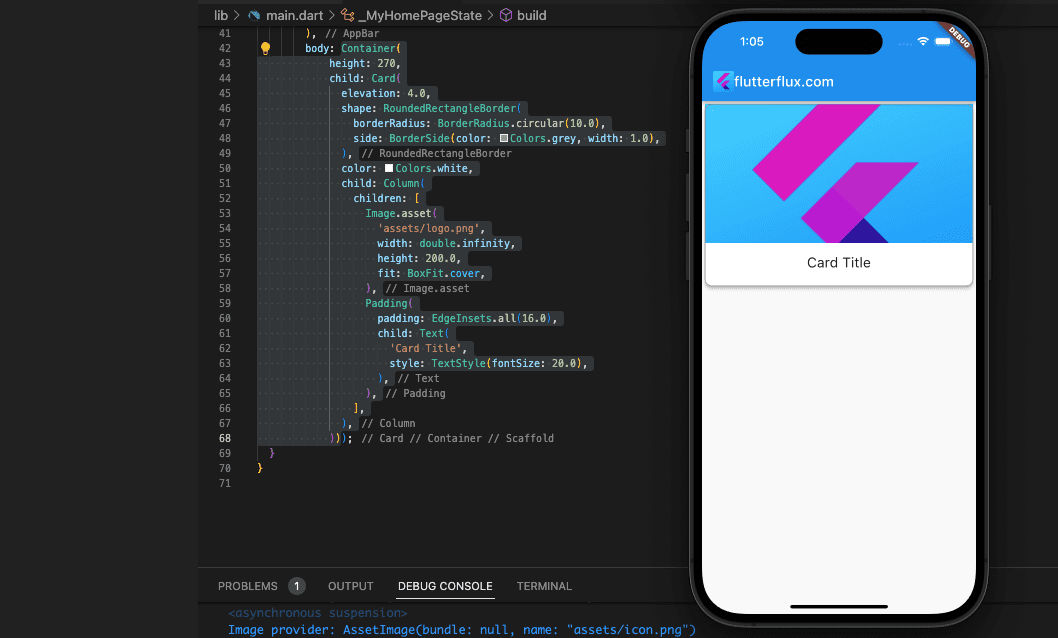
Example of how to set a border on a Card widget in Flutter:
Container(
            height: 270,
            child: Card(
              elevation: 4.0,
              shape: RoundedRectangleBorder(
                borderRadius: BorderRadius.circular(10.0),
                side: BorderSide(color: Colors.grey, width: 1.0),
              ),
              color: Colors.white,
              child: Column(
                children: [
                  Image.asset(
                    'assets/logo.png',
                    width: double.infinity,
                    height: 200.0,
                    fit: BoxFit.cover,
                  ),
                  Padding(
                    padding: EdgeInsets.all(16.0),
                    child: Text(
                      'Card Title',
                      style: TextStyle(fontSize: 20.0),
                    ),
                  ),
                ],
              ),
            ))
In this code sample, we are modifying the shape of the Card Widget in Flutter by assigning a RoundedRectangleBorder with a border radius of 10.0 to the shape attribute. In addition, we’ve set the RoundedRectangleBorder's side property to a BorderSide object with a Colors.grey BorderColor and a width of 1.0. The result will be a one-pixel-thick gray border all the way around the card.
To modify the border further, you may adjust the color, width, and other properties of the BorderSide object. Alternatively, you can try different types of ShapeBorder objects, such as BeveledRectangleBorder, CircleBorder, or StadiumBorder, to produce distinct border shapes.
Card Widget in Flutter Animation Collapse
To animate the Card widget, Flutter provides a number of animation widgets and classes. AnimatedContainer, AnimatedOpacity, AnimatedPadding, and AnimatedPositioned are a few examples of animation widgets and classes. These widgets allow you to animate the visibility, alignment, size, and padding of the Card widget.
Here’s an example of animating the size and background color of a Card widget inside of an AnimatedContainer:
import 'dart:async';
import 'package:flutter/material.dart';
import 'DefaultFirebaseConfig.dart';

Future main() async {
  WidgetsFlutterBinding.ensureInitialized();

  runApp(MyApp());
}

class MyApp extends StatelessWidget {
  @override
  Widget build(BuildContext context) {
    return MaterialApp(
      title: 'Flutter Demo',
      theme: ThemeData(
        primarySwatch: Colors.blue,
      ),
      home: MyHomePage(),
    );
  }
}

class MyHomePage extends StatefulWidget {
  @override
  _MyHomePageState createState() => _MyHomePageState();
}

class _MyHomePageState extends State {
  @override
  Widget build(BuildContext context) {
    return Scaffold(
        appBar: AppBar(
          title: Row(children: [
            Image.asset(
              'assets/logo.png',
              height: 30,
            ),
            Text('flutterflux.com')
          ]),
        ),
        body: AnimatedCard());
  }
}

class AnimatedCard extends StatefulWidget {
  @override
  _AnimatedCardState createState() => _AnimatedCardState();
}

class _AnimatedCardState extends State {
  bool _isExpanded = false;

  @override
  Widget build(BuildContext context) {
    return GestureDetector(
        onTap: () {
          setState(() {
            _isExpanded = !_isExpanded;
          });
        },
        child: Padding(
          padding: EdgeInsets.symmetric(horizontal: 10, vertical: 20),
          child: AnimatedContainer(
            duration: Duration(milliseconds: 500),
            curve: Curves.easeInOut,
            width: double.infinity,
            height: _isExpanded ? 200.0 : 100.0,
            decoration: BoxDecoration(
              color: _isExpanded ? Colors.blue : Colors.grey,
              borderRadius: BorderRadius.circular(10.0),
            ),
            child: Column(
              mainAxisAlignment: MainAxisAlignment.center,
              children: [
                Text(
                  _isExpanded ? 'Expanded' : 'Collapsed',
                  style: TextStyle(
                    fontSize: 24.0,
                    color: Colors.white,
                  ),
                ),
              ],
            ),
          ),
        ));
  }
}
For demonstration purposes, we’ve developed an AnimatedCard StatefulWidget with an expanded/collapsed state indicated by the boolean _isExpanded variable. By placing the Card widget inside an AnimatedContainer, its size and background color will animate in response to changes in the _isExpanded variable.
The animation will play for 500 milliseconds, and we’ve used the Curves.easeInOut curve to make it smooth transitions between frames. The card’s height is increased to 200.0 and its background color is changed to Colors.blue if _isExpanded is true. Setting the card’s height to 100.0 and the background color to Colors.grey indicates that _isExpanded is false.
To detect when the card has been tapped, we’ve created a GestureDetector and set the _isExpanded variable to true or false. Properties of an AnimatedContainer are animated in sync with shifts in the _isExpanded variable.
Flutter other animation widgets and classes allow you to animate the Card widget opacity, padding, and position with the same ways.
Card Widget in Flutter Flip Animation
The AnimatedSwitcher widget in conjunction with a RotationTransition widget can be used to generate a card-flipping animation in Flutter.
The following is an example implementation:
import 'package:flutter/material.dart';

void main() {
  runApp(MyApp());
}

class MyApp extends StatelessWidget {
  @override
  Widget build(BuildContext context) {
    return MaterialApp(
      title: 'Card Flip Animation',
      home: Scaffold(
        appBar: AppBar(
        title: Row(children: [
          Image.asset(
            'assets/logo.png',
            height: 30,
          ),
          Text('flutterflux.com')
        ]),
      ),
        body: Center(
          child: CardWidget(),
        ),
      ),
    );
  }
}

class CardWidget extends StatefulWidget {
  @override
  _CardWidgetState createState() => _CardWidgetState();
}

class _CardWidgetState extends State {
  bool _isFront = true;

  @override
  Widget build(BuildContext context) {
    return GestureDetector(
      onTap: () {
        setState(() {
          _isFront = !_isFront;
        });
      },
      child: AnimatedSwitcher(
        duration: Duration(milliseconds: 500),
        transitionBuilder: (Widget child, Animation animation) {
          final rotateAnim = Tween(begin: 0.0, end: 1.0).animate(animation);
          return RotationTransition(
            turns: rotateAnim,
            child: child,
          );
        },
        child: _isFront
            ? FrontCardWidget()
            : BackCardWidget(),
      ),
    );
  }
}

class FrontCardWidget extends StatelessWidget {
  @override
  Widget build(BuildContext context) {
    return RotatedBox(
      quarterTurns: 0,
      child: Container(
        width: 200,
        height: 200,
        color: Colors.red,
        child: Center(
          child: Text(
            'Front of Card',
            style: TextStyle(
              fontSize: 24,
              color: Colors.white,
            ),
          ),
        ),
      ),
    );
  }
}

class BackCardWidget extends StatelessWidget {
  @override
  Widget build(BuildContext context) {
    return RotatedBox(
      quarterTurns: 2,
      child: Container(
        width: 200,
        height: 200,
        color: Colors.blue,
        child: Center(
          child: Text(
            'Back of Card',
            style: TextStyle(
              fontSize: 24,
              color: Colors.white,
            ),
          ),
        ),
      ),
    );
  }
}
The CardWidget is a widget with a state that includes an AnimatedSwitcher. The switcher displays either the FrontCardWidget or the BackCardWidget depending on the value of the _isFront variable. Both FrontCardWidget and BackCardWidget are StatelessWidgets that wrap a Container with a specific size and background color. They both show text in the center of the container. To make the widgets appear to flip when tapped, the FrontCardWidget and BackCardWidget are rotated 180 degrees around the Y-axis using the RotatedBox widget.
Conclusion
For creating functional and beautiful UIs, the Flutter Card widget is an indispensable tool. It simplifies the creation of intricate layouts for developers and offers a wide range of aesthetic tweaks for a really personalized experience. read too Firebase auth in Flutter

