Theme Color in Flutter- Flutter uses themes to give an app a consistent visual style across its entirety. Themes can include everything from colors and fonts to text styles and backgrounds. The term “theme color” refers to a shade of color that is used repeatedly throughout an app.
If you wish to specify a theme color in Flutter with the hexadecimal value #FF5733, you can do so by creating a Color object with that value or by using one of the predefined colors offered by Flutter; the respective code is shown below.
Color myThemeColor = Color(0xFFFF5733);
Flutter also provides pre-defined colors that you can use instead, such as Colors.red:
Color myThemeColor = Colors.red;
Once the theme color in Flutter scheme has been set, it may be used throughout the app simply by making reference to the corresponding color variable. As a background color in a container widget, for instance:
Container(
  color: myThemeColor,
  // other properties
)
As an alternative, you can utilize the color of the defined theme to set the text color:
Text(
  'Hello, world!',
  style: TextStyle(
    color: myThemeColor,
    // other properties
  ),
)
To modify the default theme color in Flutter, the following steps can be followed:
- Go to your Flutter project’s main.dart file.
- To find the MaterialApp widget, which is typically the root widget of your app, press Ctrl+F.
- To specify a new theme, locate the theme property in the MaterialApp widget and fill out the appropriate fields in a ThemeData object.
- To change the primary color of the theme, edit the primaryColor property of the ThemeData object. Example code for making it red:
MaterialApp(
  theme: ThemeData(
    primaryColor: Colors.red,
  ),
  //...
)
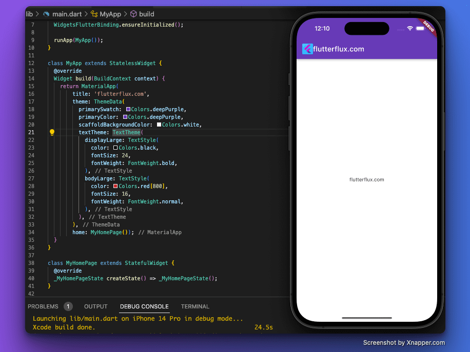
If you want to change the colors of multiple parts of the ThemeData object at once, you may do so by making a new ThemeData object and setting the properties of that object to the new colors. Eexample:
class MyApp extends StatelessWidget {
  @override
  Widget build(BuildContext context) {
    return MaterialApp(
        title: 'flutterflux.com',
        theme: ThemeData(
          primaryColor: Colors.deepPurple,
          colorScheme: ColorScheme.fromSwatch(),
          scaffoldBackgroundColor: Colors.grey[200],
          textTheme: TextTheme(
            displayLarge: TextStyle(
              color: Colors.black,
              fontSize: 24,
              fontWeight: FontWeight.bold,
            ),
            bodyLarge: TextStyle(
              color: Colors.grey[800],
              fontSize: 16,
              fontWeight: FontWeight.normal,
            ),
          ),
        ),
        home: MyHomePage());
  }
}
This example, we’ve set the primaryColor to blue, the colorScheme to orange, the scaffoldBackgroundColor to a light gray, and the textTheme to include a custom displayLarge style with a black color and a bold font weight, and a custom bodyLarge style with a dark gray color and a normal font weight.
To apply your newly-created ThemeData object throughout your whole app, simply set the theme property of the MaterialApp widget to the object. You may then modify the colors and styles as you see fit.
Conclusion
Theme Color in Flutter can improve your app’s look. Keeping a consistent color scheme throughout your app’s UI makes it look professional and polished, which benefits consumers.
Flutter app color schemes can be customized using the ThemeData and Color classes. These classes let you set your app’s widgets’ background, primary, and colorScheme.
theme color in Flutter schemes should reflect your app’s population, devices, and brand. Colors should match the app’s concept and attract users. To create a cohesive design, use your brand’s colors.

